Media Insights
Overview
For all the media question blocks available in the survey of quantitative study, you will find analytics for facial tracking and eye tracking based on the tracking technology selected while creating the study. In this article, we'll provide you with an overview of the media dashboard and the different metrics available in it.
Overall Media Dashboard ✨
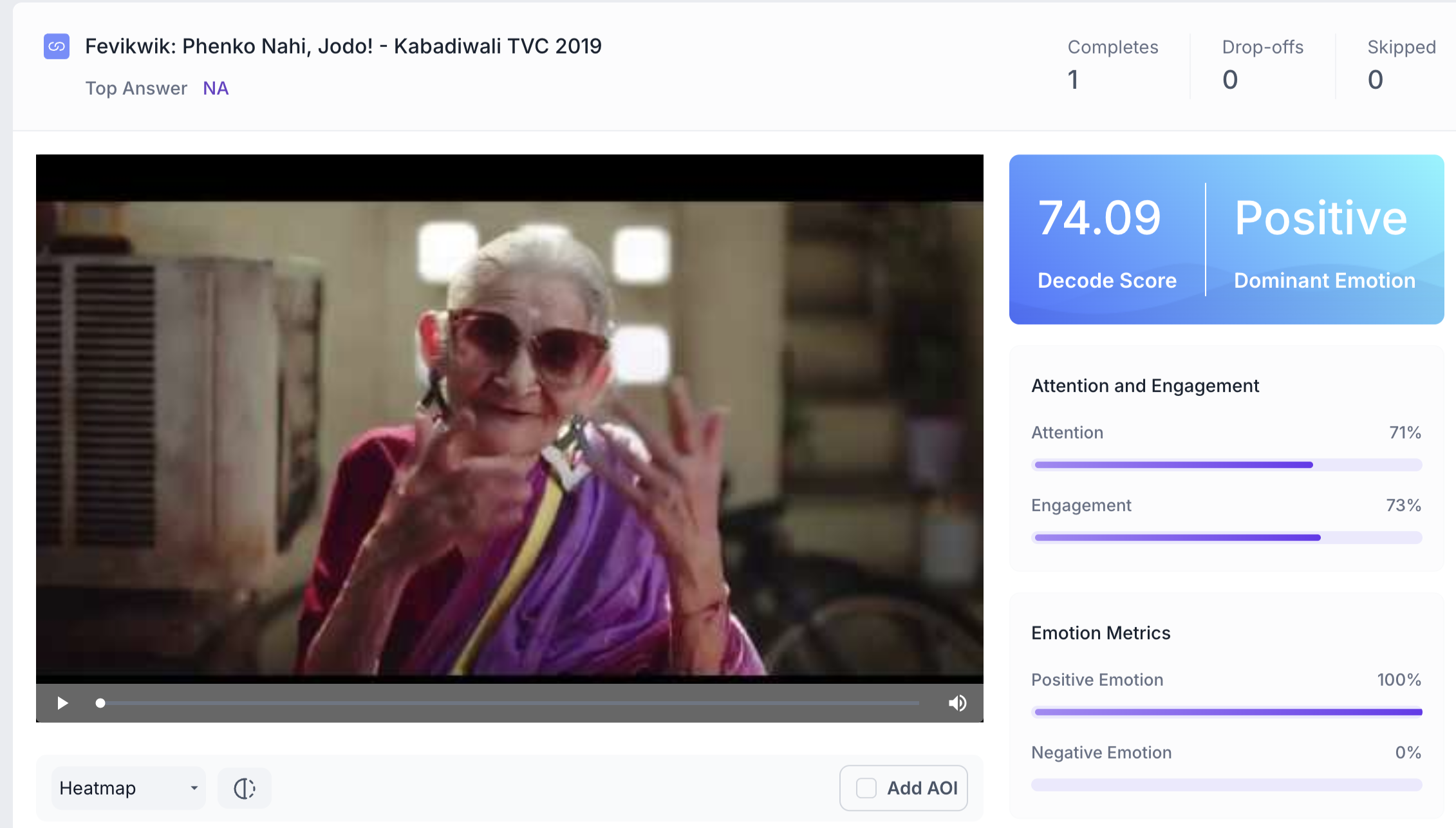
In the Overall Media Dashboard, you will find the uploaded media and insights about Decode score, Dominant Emotion, Emotions felt, and other metrics such as Attention and Engagement.
The first thing available in the dashboard is the media's overall performance compared to the other media in the same category. The overall score of your media is compared with the category-wise benchmark scores available on our platform.
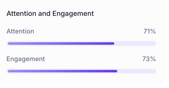
Attention and Engagement
Attention: Attention is calculated based on head pose and eye gaze.
Engagement: Measures the sum total of the emotional reactions evoked by the user at a particular second.
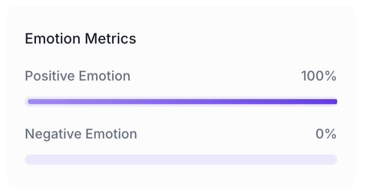
Emotion Responses
The overall percentage of users, whether they felt positive or negative while watching the media. The score is calculated by averaging the emotions of each user over the media length.
Positive Emotions calculation: Sum of happiness and surprise.
Negative emotion calculation: Sum of Anger, Disgust and Contempt (Fear and sadness are not included in negative emotion, as these emotions need to be considered within the context of the media and can be shown as standalone emotions).
Second-by-Second Media Performance ✨
In this dashboard, you will find a second-by-second analysis of emotions and respondents' attention and engagement in line graphs, as well as the heatmap and transparency map captured using eye-tracking technology.
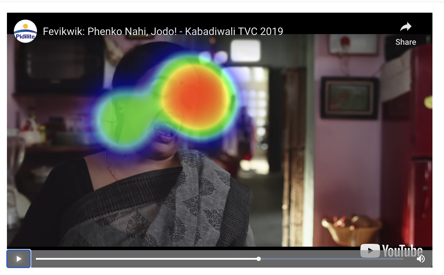
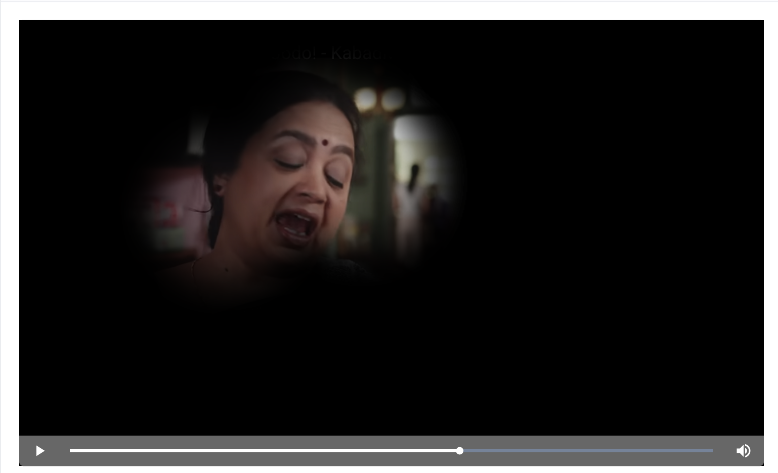
Heatmap and Transparency Map
Heat map: A heat map is a visual representation of areas that were viewed most by the respondents. It uses a VIBGYOR gradient to change colour and intensity, with brighter colours highlighting areas that were viewed more often by the respondents. This can be used to identify the most viewed parts in the media.
Transparency map: Just like Heat maps, Transparency maps are also plotted using the respondents' Gaze Points on top of the media. But instead of using varying colour intensities, the media is made transparent where the gaze points aggregate.
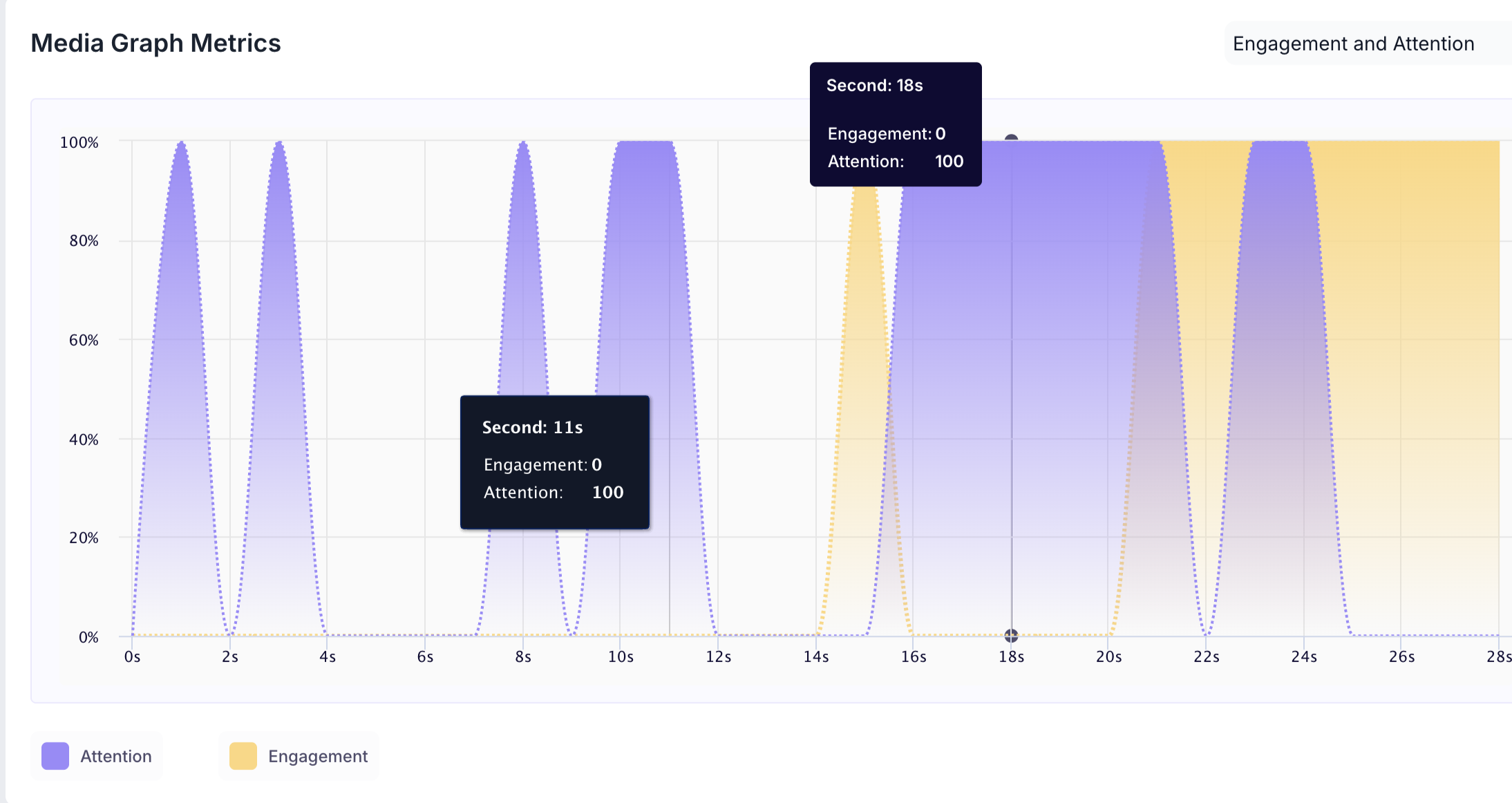
Engagement and Attention Chart
It provides the viewer's second-by-second attention, engagement and emotion scores. The chart is presented as a line graph to see the scores hover over the timelines; a small information box will appear with the scores for that second.
The x-axis represents the length of the media in seconds, and the y-axis represents the score on a scale of 0 to 100.
The colour conventions are also added to the graph. i.e. Purple line represents attention scores, and the orange line represents engagement scores
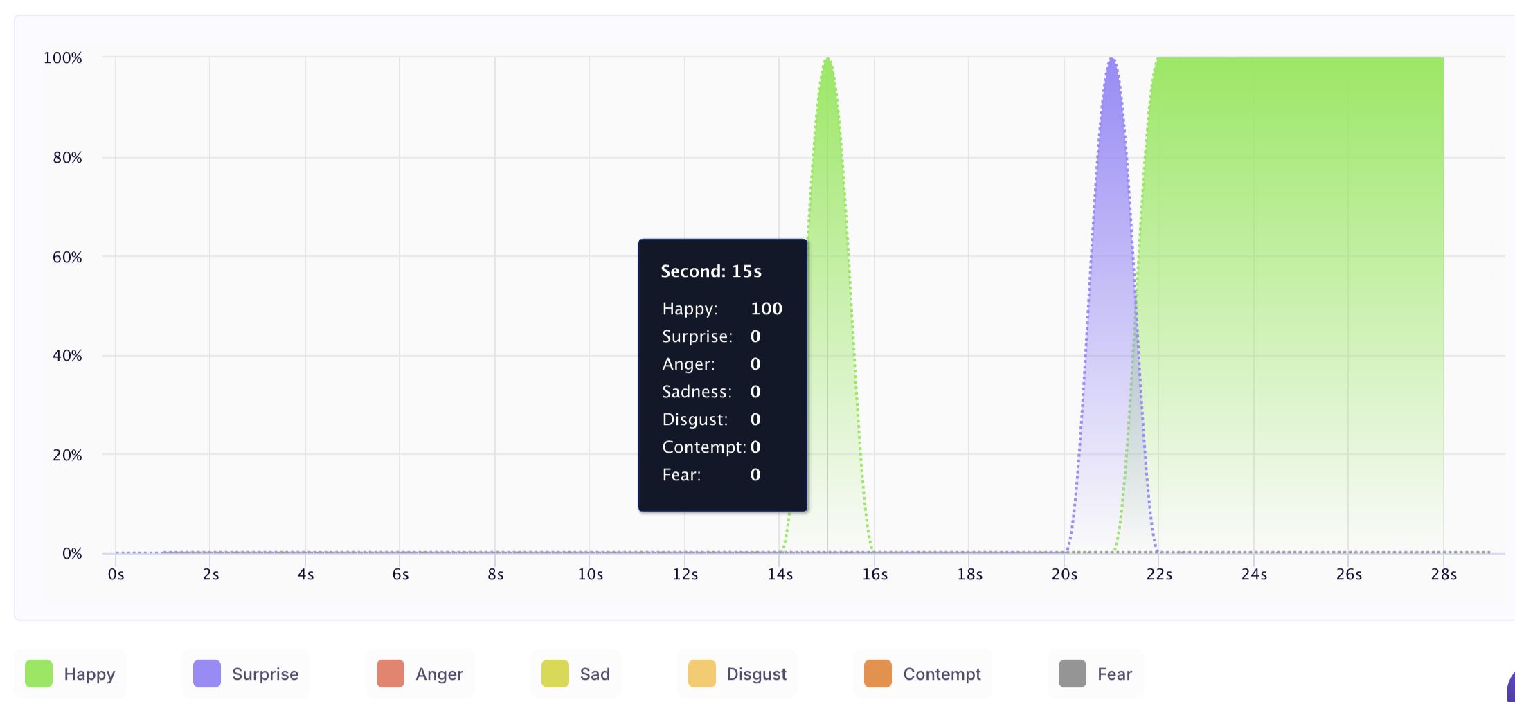
Emotion Analysis
This graph provides information about the respondent's emotions throughout the media. It displays what emotions the respondents display at a particular second while watching the media.
The x-axis represents the length of the media in seconds, and the y-axis represents the score on a scale of 0 to 100.
The colour convention chart is present on the top of the graph.
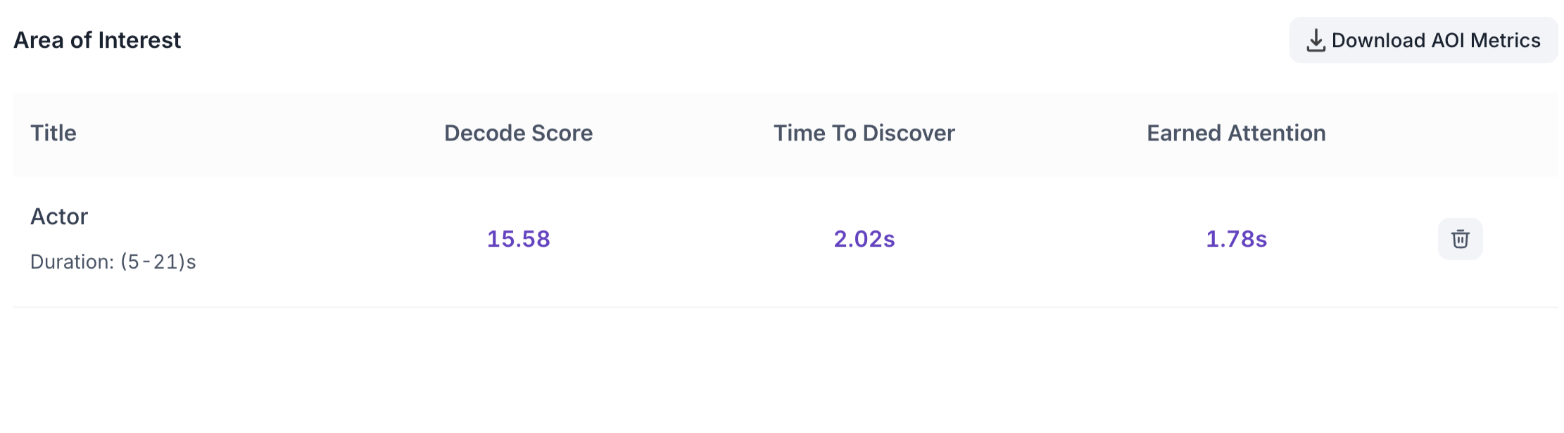
Areas Of Interest (AOI's)
It provides users with deeper insights on user interactions using precise AOI tracking. Just draw a box on the video or image to highlight the area of interest and save it to uncover valuable insights into user engagement, preferences, and behaviour.
This helps improve user experiences and enables informed decisions, providing enhanced precision and understanding through AOI.