
AI Creatives - Insights
Overview
Once a creative is processed, click it in the left panel to open the results view. The results are organised across the scores at the top, the visual view in the centre, and two tabs in the right panel: AI Summary and Prediction.
Scores
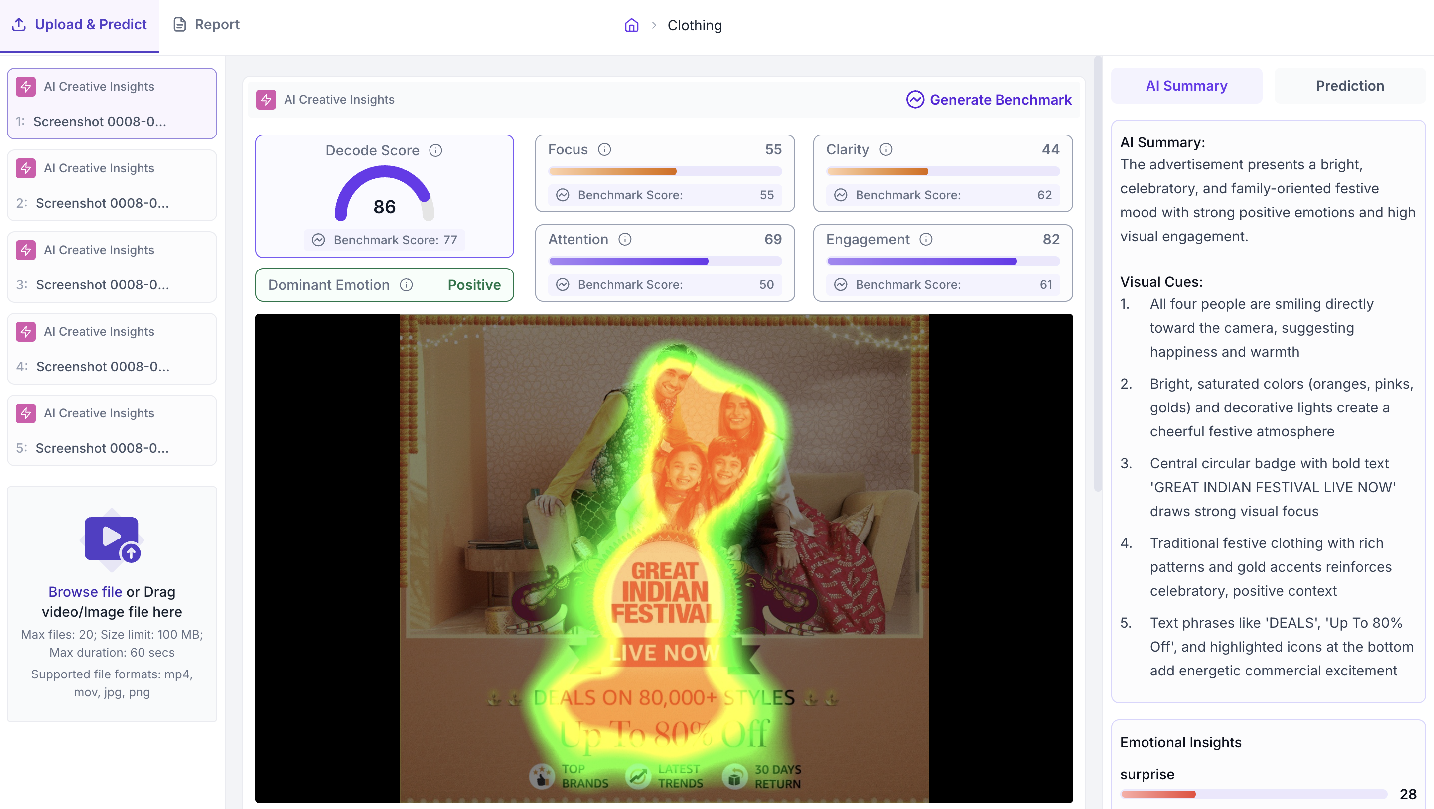
The scores section shows five metrics for the creative. Each metric has a Benchmark Score below it, which is the average score for creatives in the same category and sub category. Read the Benchmark Score alongside each metric to understand whether the creative is above or below the norm for its category.
1. Decode Score
The overall performance score for the creative, from 0 to 100. If the Decode Score is above the benchmark, the creative is performing well overall. If it is below the benchmark, use the individual metric scores below to identify which specific areas need improvement.
2. Focus
Shows whether the creative gets viewer attention to the right elements such as the offer, CTA or logo. A score below the benchmark means viewers are not looking at the intended elements. Open the Heatmap in the visual view to see exactly where attention is landing.
3. Clarity
Shows how easy it is for a viewer to read and understand the core message quickly. A score below the benchmark means something in the creative is making the message harder to process. Common causes are low contrast between text and background, too many visual elements competing for attention, or information presented in an unclear order.
4. Attention
Shows how strongly the creative attracts the eye. A high Attention score means the creative is effective at stopping a viewer. When comparing multiple versions of a creative, use this score to identify which version performs best on initial impact.
5. Engagement
Shows whether viewers stay engaged with the creative after their initial attention is captured. Read this alongside the Attention score. A creative with a high Attention score but a low Engagement score is attracting viewers but not holding them, which means the message may not be reaching them fully.
6. Dominant Emotion
Shows the strongest emotional response the creative is predicted to produce in viewers. Check this against the intended tone of the campaign. If the dominant emotion does not match what the campaign is trying to communicate, the creative may need to be revised.
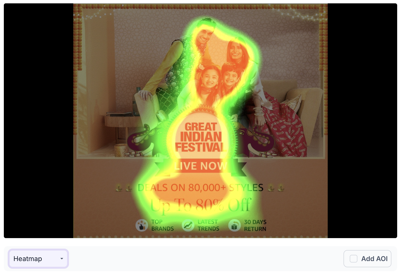
Visual View
The visual view shows the creative in the centre of the results page. Use the dropdown below the creative to switch between Original, Heatmap and Fogmap.
1. Original
Shows the creative as uploaded with no overlay applied. Use this to see the creative as it is before switching to an attention view.

2. Heatmap
An overlay that shows where viewers are looking across the creative. Red and yellow areas receive the most attention. Green areas receive less. Use this to check whether attention is going to the elements that matter, such as the offer, logo or CTA, or whether it is going elsewhere.
3. Fogmap
An overlay that shows the areas of the creative that viewers are least likely to notice. Areas covered by the fog are predicted to receive little or no attention. Use this to check whether any important elements such as the CTA, price or logo are sitting in areas that viewers are unlikely to look at.

4. Area of Interest
Area of Interest lets you mark specific regions of the creative to measure how much attention each region receives. Click Add AOI, draw a region on the creative, give it a name and select the AOI type that best describes the element. The available types are Branding, Product, CTA, Headline and Body Text.
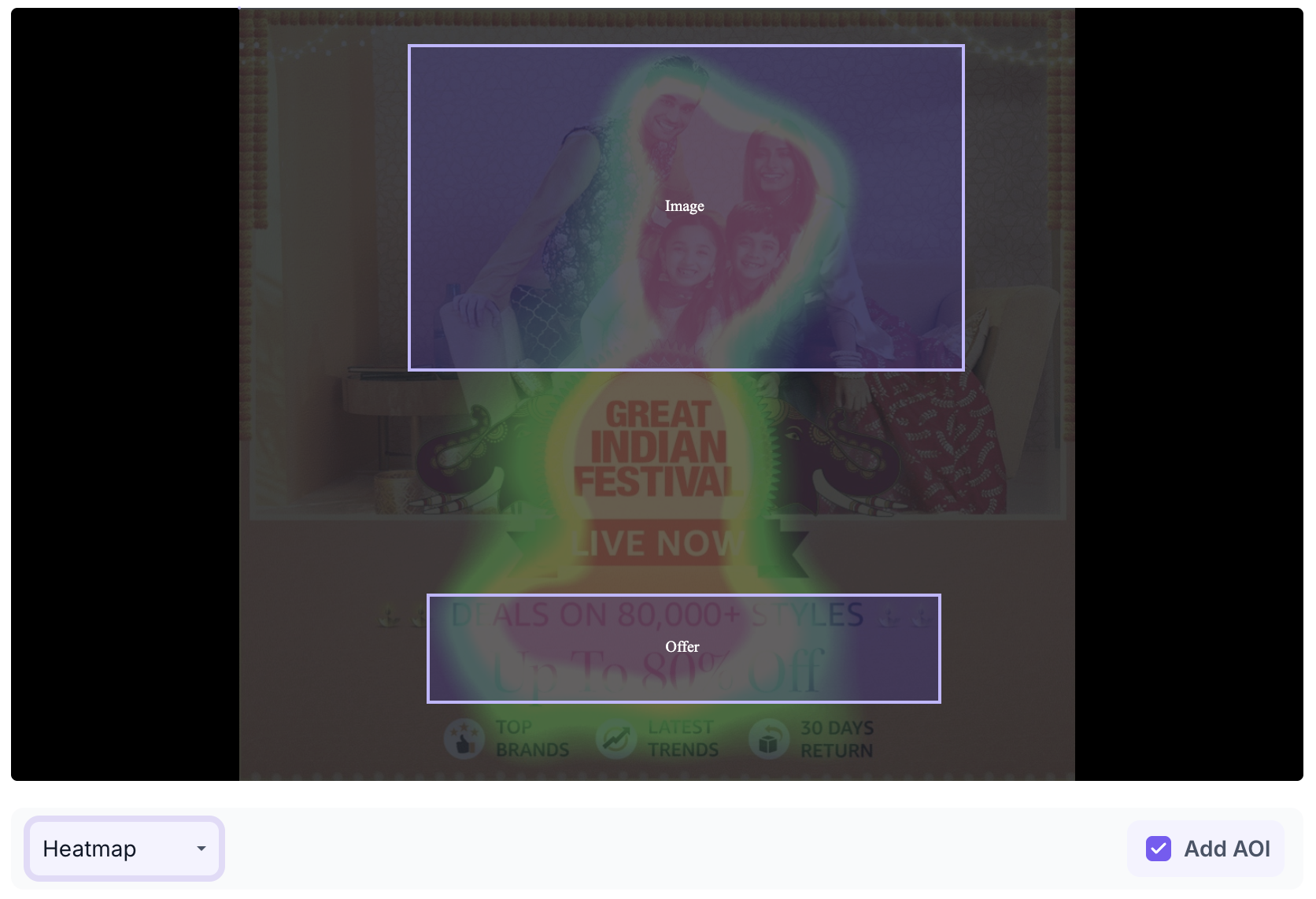
Each area you add shows two values. Time to Discover is how many seconds it takes for a viewer to first notice that area. Attention is the percentage of total viewing time spent looking at that area after it has been noticed.
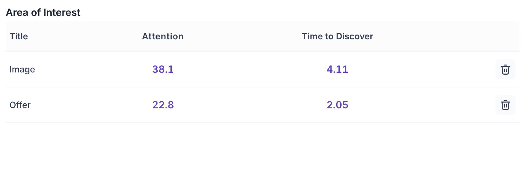
Use Area of Interest when you want precise data on a specific element rather than reading the overall heatmap. For example, use it to check how quickly viewers reach the discount offer, or what share of total attention the brand logo is receiving.
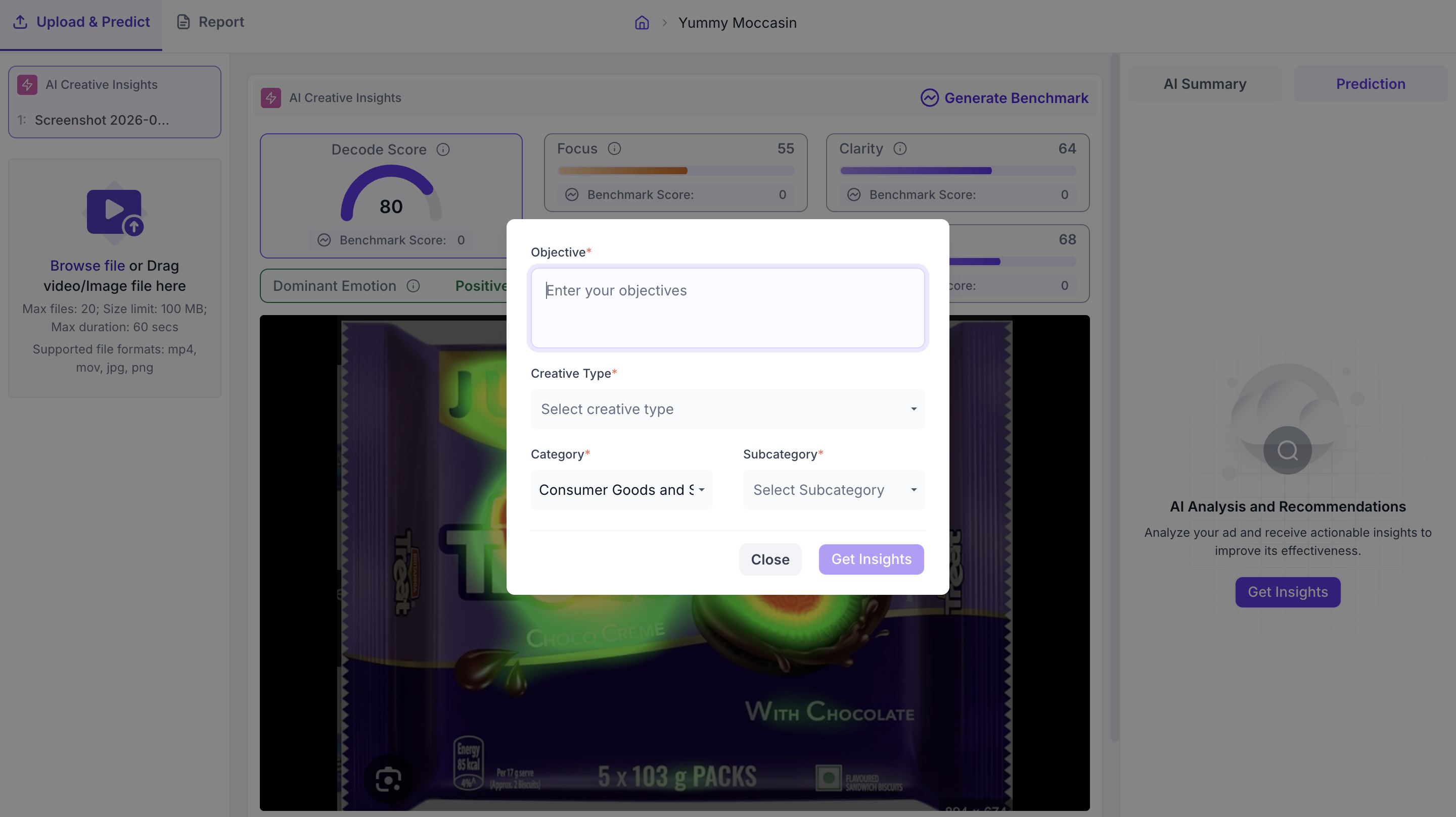
5. Generate Benchmark
Clicking Generate Benchmark opens a panel where you select the Category, Sub-Category and Type of Creative. These fields tell Decode what kind of creative is being evaluated so the analysis and recommendations are relevant to that context. Once you have made your selections, click Get Benchmark to run the analysis.
AI Summary Tab
The AI Summary tab appears in the right panel. It contains three sections.
AI Summary
The AI Summary shows what Decode has identified about the creative - the message it is communicating, the visual elements driving that message, and the overall direction of the creative. Use this to quickly understand what the creative is saying before going into the individual scores.
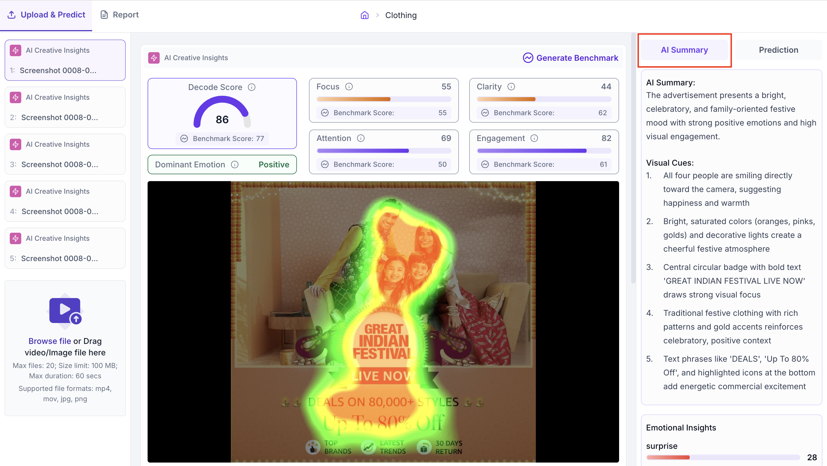
Visual Cues
A list of specific visual elements in the creative such as colour, faces, text placement or imagery, with a description of how each element contributes to the overall impression. Use this to understand which specific parts of the creative are driving the tone and emotional response identified in the AI Summary.
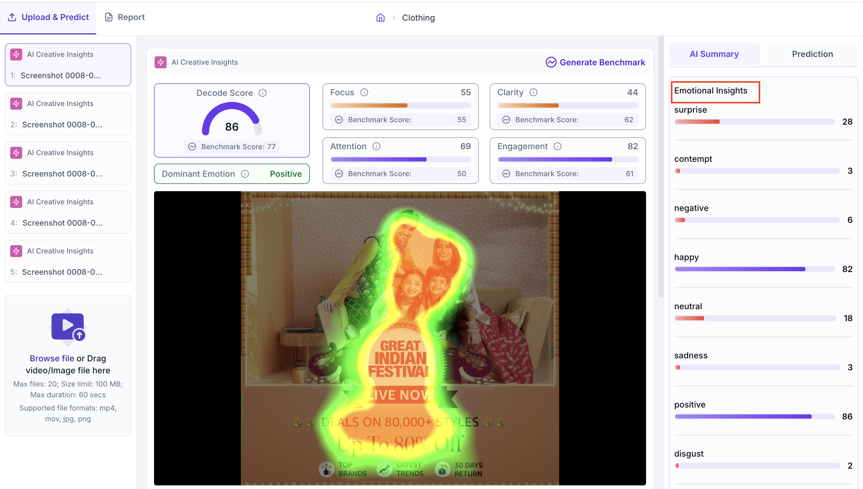
Emotional Insights
A breakdown of the predicted emotional responses the creative is likely to trigger. Each emotion is shown as a score. The emotion with the highest score is the dominant emotion. Use this to check whether the emotional tone the creative is communicating matches what you intended for the audience and the campaign objective.
Prediction Tab
The Prediction tab is in the right panel alongside the AI Summary tab. To generate detailed insights, click AI Analysis & Recommendations. Enter the objective for the creative, select the Creative Type, Category and Sub-Category, then click Get Insights. If the Category, Sub-Category and Creative Type are already filled from the upload step, you only need to enter the objective before clicking Get Insights.
Analysis
The Analysis section shows an Advertising Layout Review for the creative. It covers Layout, Clarity, Focus and Text-Visual Balance. Each area gives a plain description of what is working and what is not in that aspect of the creative. Use this to understand the specific design and layout factors that are affecting the scores before looking at the recommendations.
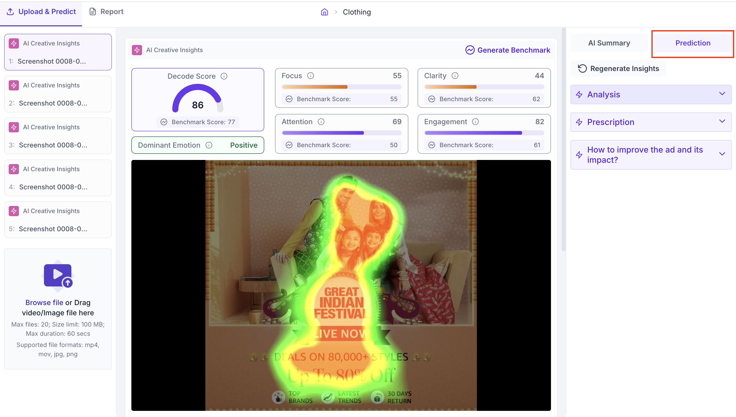
Prescription
The Prescription section shows an Advertisement Performance Report. It includes an Introduction that describes the objective of the creative and a Current Media Performance assessment that identifies the issues affecting Focus, Attention and Clarity. Use this to understand the overall performance picture before reading the design recommendations.
How to improve the ad and its impact
This section shows a Design Recommendations Report with specific, actionable suggestions for improving the creative. Each recommendation covers one aspect of the design such as Primary Focus, Color Adjustment, Visual Hierarchy, Reduce Clutter or Call to Action, with a description of what to change and why it would improve performance.

Use these recommendations when briefing a design team on revisions, or when deciding which version of a creative to take forward for further testing.