Date Question Block
Overview
The Date and Time block collects responses that require a specific date, time or both. Use this in consumer research when you need to capture purchase dates, availability, scheduling preferences or event recall.
Block Details
Date Only Input: Use this when you only need the participant to enter a specific date such as a product purchase date or an appointment date.
Date & Time Input: Use this when both date and time are required. For example, when capturing preferred delivery slots or time-specific usage.
Enter the Question: To personalise a question using an answer from a previous block, type @ in the question field. A list of earlier questions will appear. Select the one you want to pipe from.
Example:
Previous question: Which of these services have you used recently?
Options: Swiggy Instamart, Zomato, Blinkit, Zepto
Date and Time block: When did you use @Which of these services have you used recently?
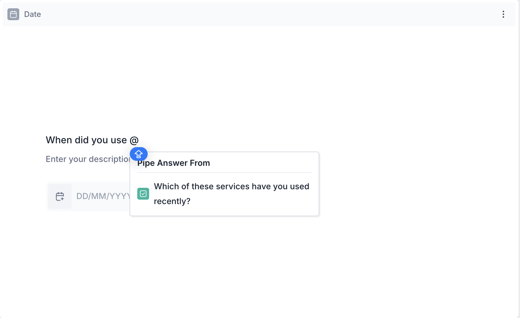
If the respondent selected Swiggy Instamart, the question will appear as:
When did you use Swiggy Instamart?

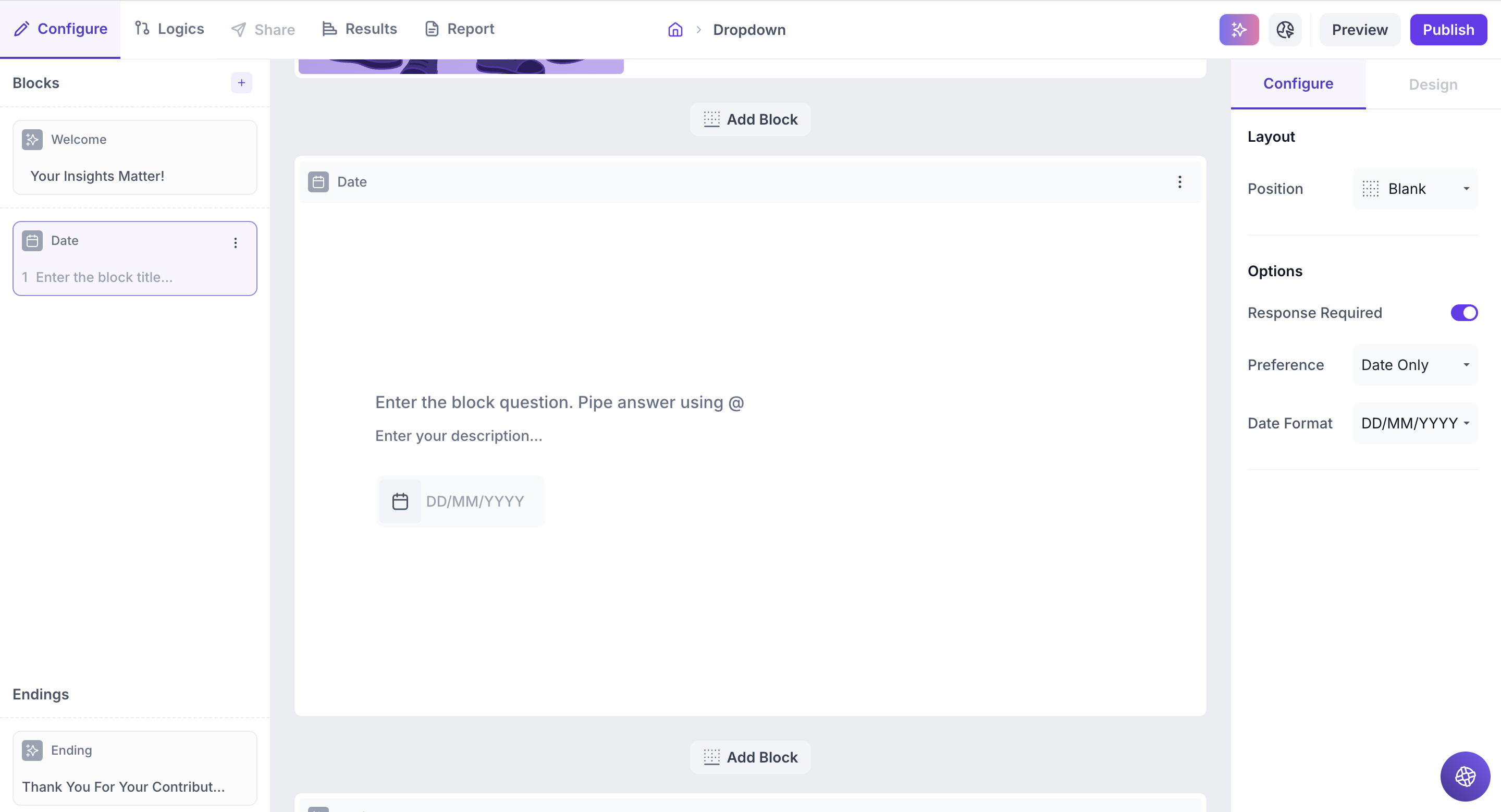
Properties
You can configure the Date & Time block using the following properties in the right-side panel:
Layout: You can add an image (e.g., a calendar, delivery icon, brand logo, or event visual) to the block by selecting a layout position.
To add an image, select a layout position from the right panel. By default, the layout is set to Blank. To enable image upload, select a different layout option:
- Left
- Right
- Top
Upload or Select an Image: Once a layout is selected, you'll see an option to:
- Upload an image from your device
- Choose from predefined images available in the platform’s image library.
Options
1. Response Required (Enabled by default): This setting ensures respondents must select an option before proceeding to the next question. You can disable it if you want to make the question optional.
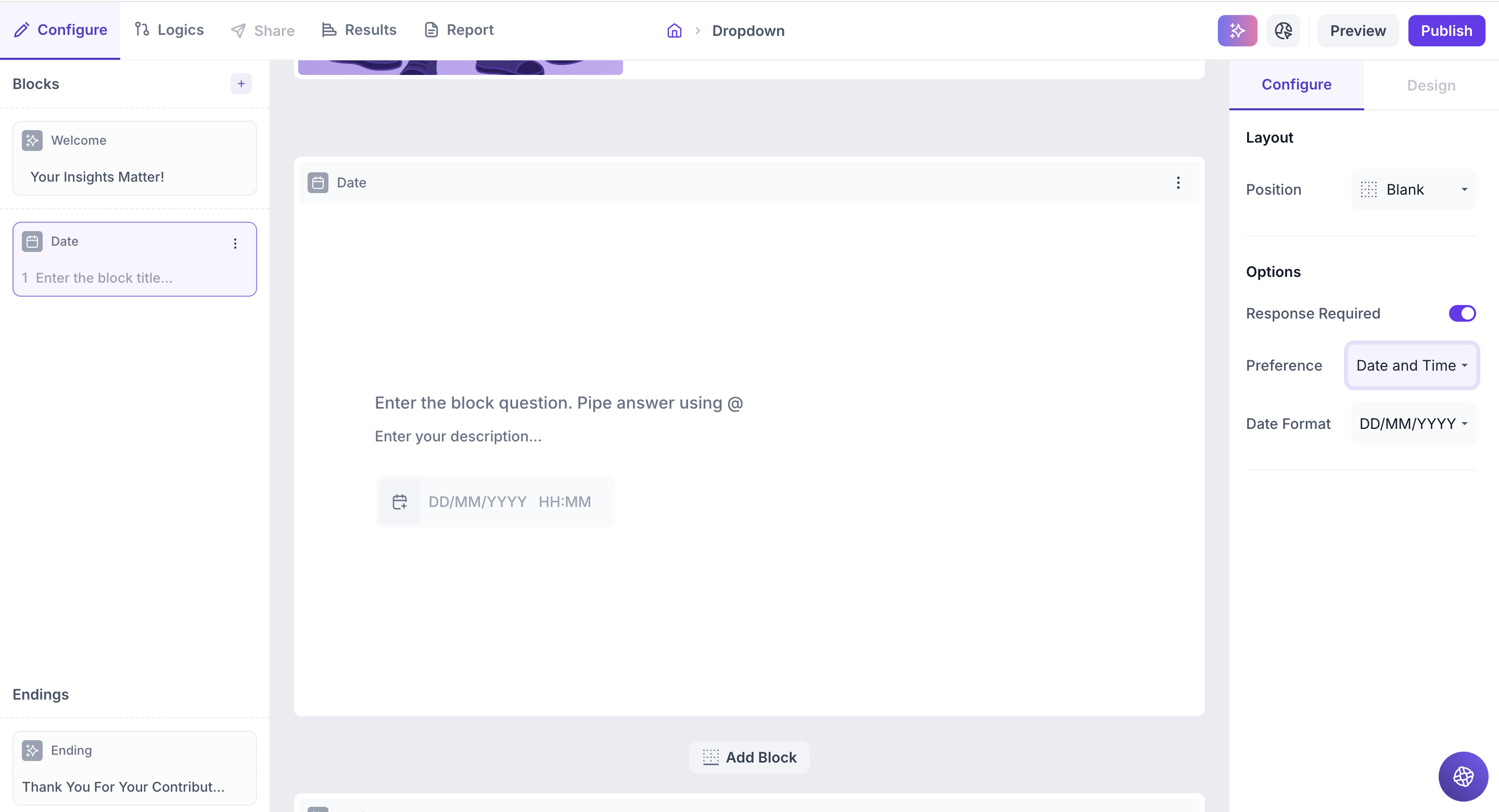
Preference: Choose whether the input should collect:
- Date only
- Date and Time
If Date only is selected: You can choose the display format as below:
- DD/MM/YYYY
- MM/DD/YYYY
- YYYY/MM/DD
The calendar input will reflect the selected format, and respondents can also manually enter the date using the same format.
If Date and Time is selected:
- Respondents can pick both date and time (HH:MM) from a single combined calendar-time picker.
- Manual entry is also supported after a selection is made.
Result
Once your study is live and responses are collected, you can view the results of the Date question block in a visual and insightful format.
Overall Results
1. Top Summary
This section provides an overview of how your study performed:
- Total Blocks – Number of question blocks included in the study
- Total Responses – Count of completed responses across all blocks
- Screened Out – Respondents who didn’t qualify based on screener logic
- Dropped Off – Respondents who exited the study midway
- Completion Rate – % of respondents who completed the full study
- Drop-Off Rate – % of respondents who exited before completion
2. Study-Level Download
- Download all collected response data at the study level, covering every block and question.
3. Filter Responses
Use the filter panel at the top of the results view to analyze specific respondent segments.
You can filter based on:
- Answers from previous questions
- Device type (e.g., mobile, desktop)
- Browser used (e.g., Chrome, Safari)
This helps uncover trends and insights within specific user groups.
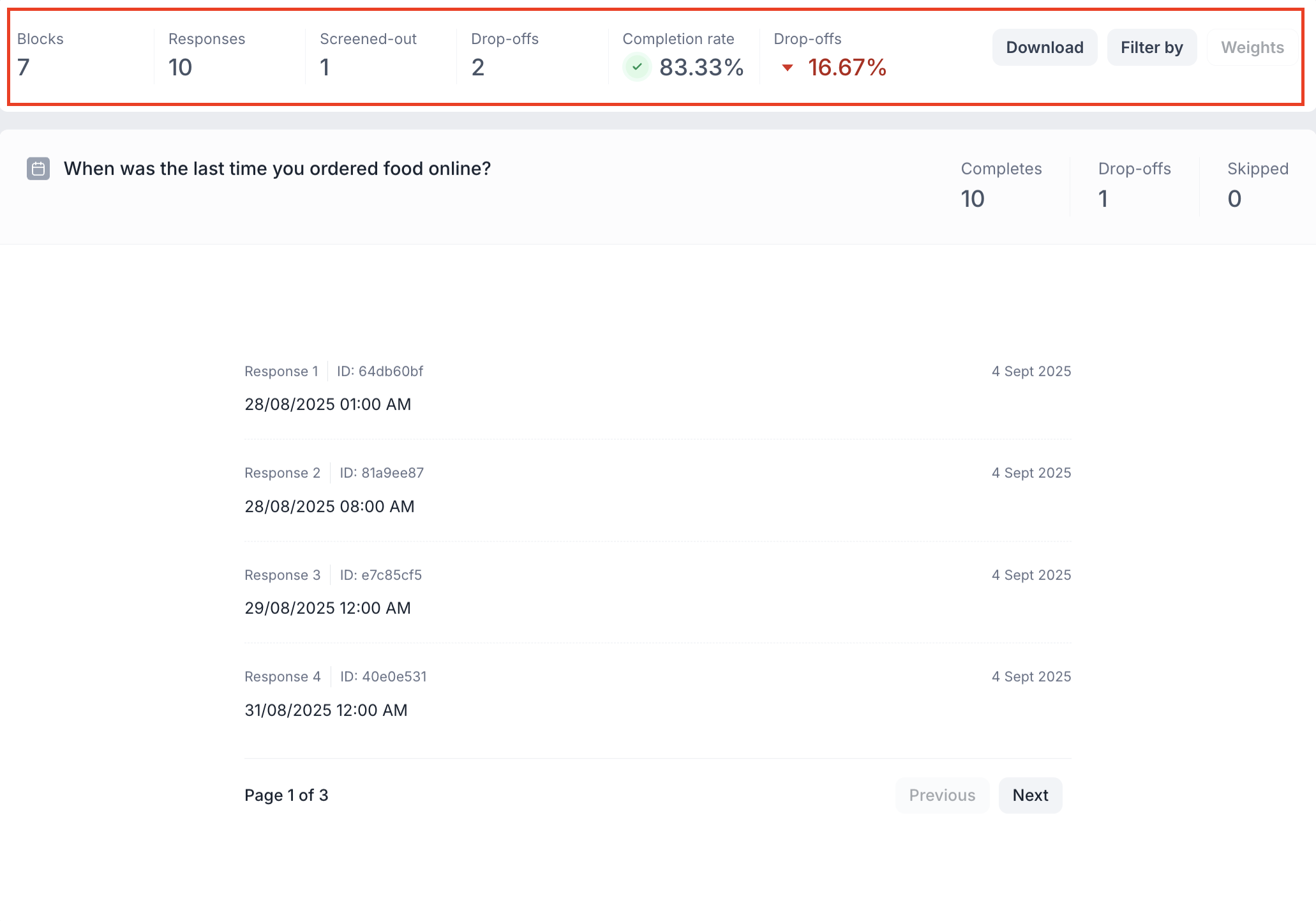
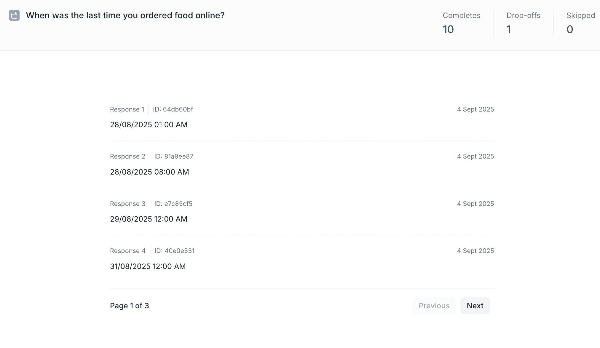
Date Question Block Results
1. Response Summary
- Completed – Number of respondents who answered the question.
- Drop-off – Respondents who exited the study before reaching this block.
- Skipped – Number of respondents who viewed but didn’t respond.
2. Response-Wise View
Each respondent’s selection is displayed individually.
- Date Selected – The exact date chosen by the respondent.
- Time Selected – The exact time chosen (if time selection was enabled).
- Response Date – The date when the response was submitted.