Dropdown Question Block
Overview
A Dropdown question block displays a list of choices in a dropdown menu, allowing respondents to select their answer. This format helps reduce visual clutter and is especially useful when you have a long list of options.
By default, the dropdown allows respondents to select only one option, but you can enable multi-select in the block properties if needed.
Block Details
Enter the Question: To personalise a question using an answer from a previous block, type @ in the question field. A list of earlier questions will appear. Select the one you want to pipe from.
Example:
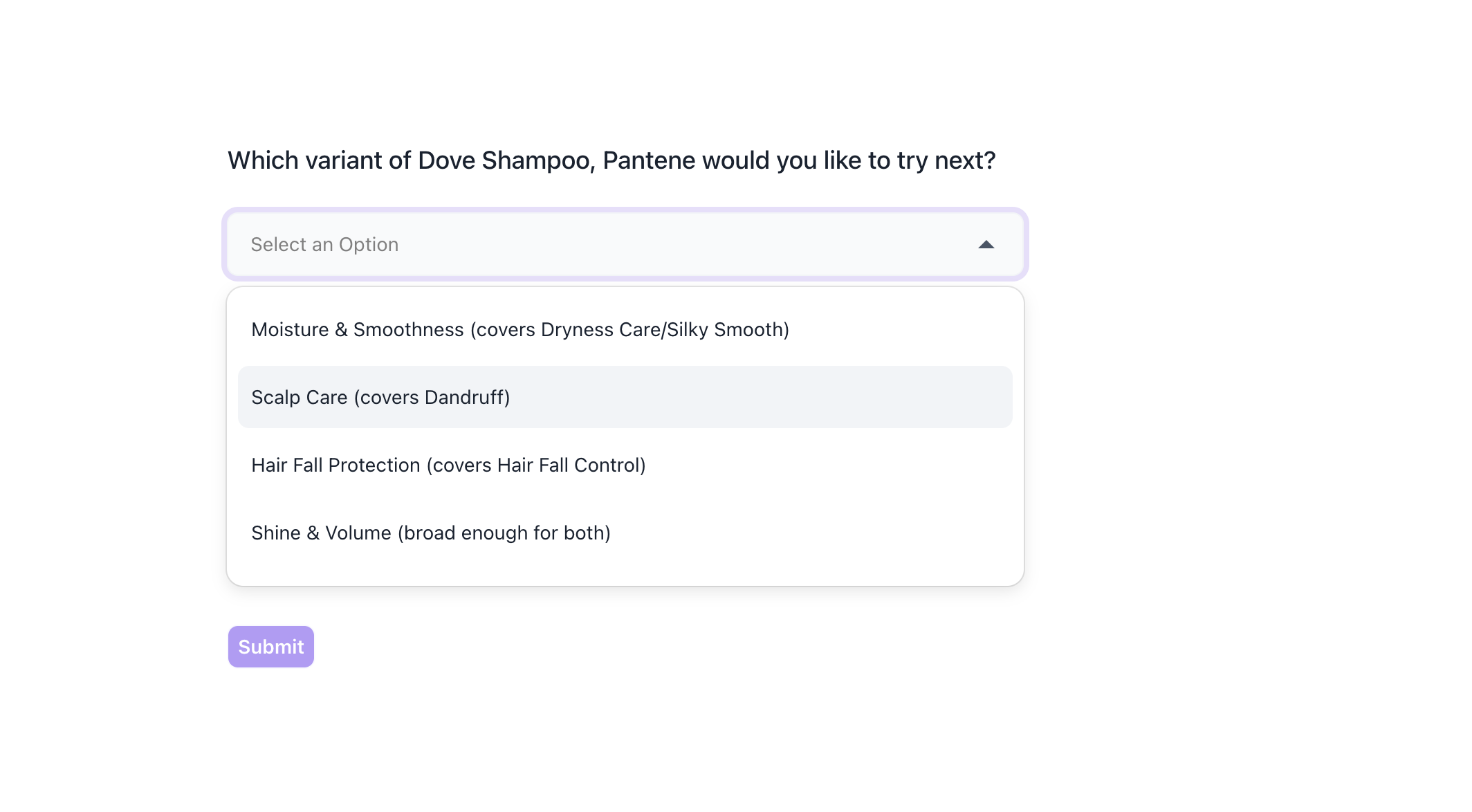
Previous Question: Which brand do you use regularly?
Options: Dove Shampoo, Head & Shoulders, Pantene, Clinic Plus, Sunsilk and Tresemmé .
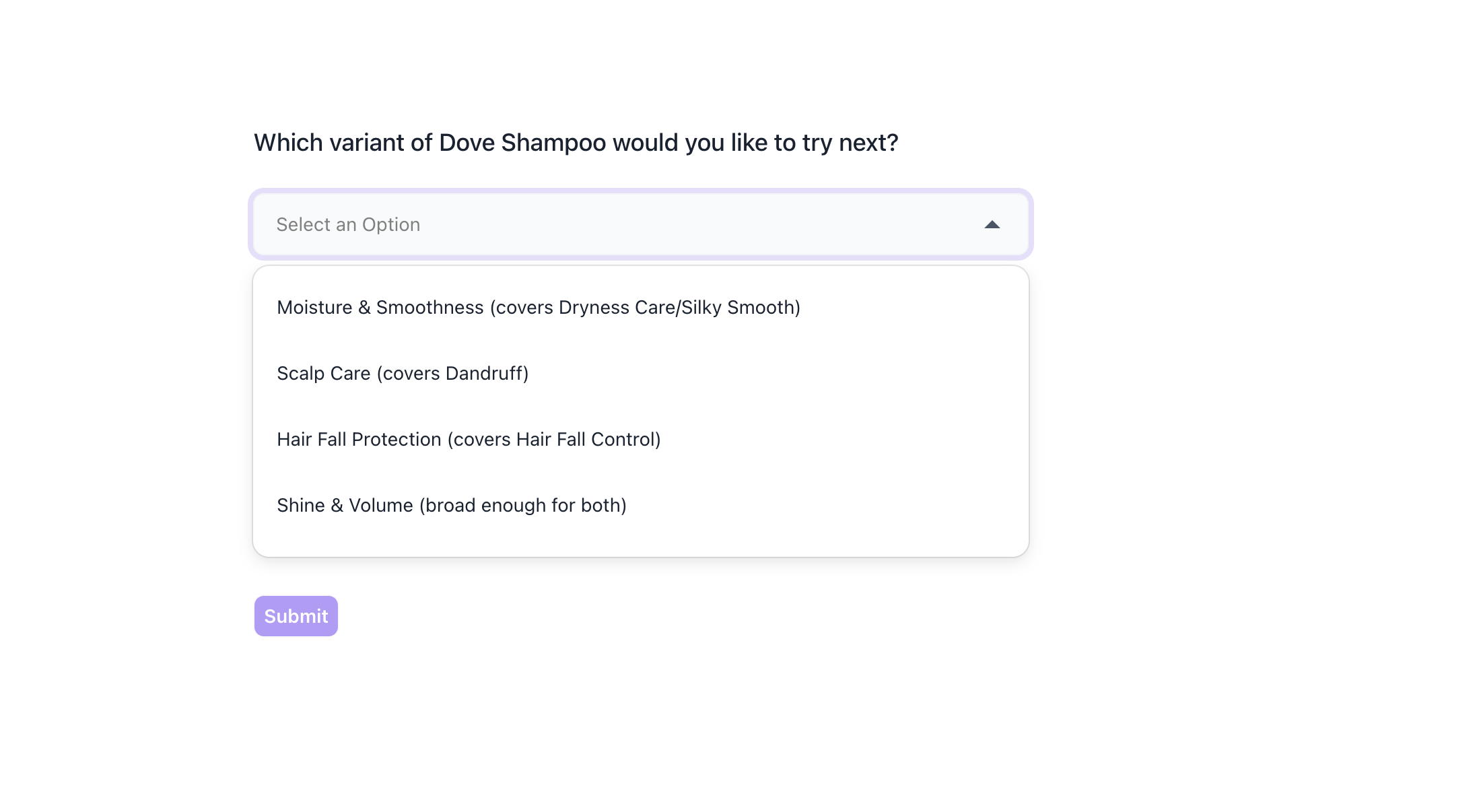
Dropdown Question: Which variant of @Which brand do you use regularly? would you like to try next?
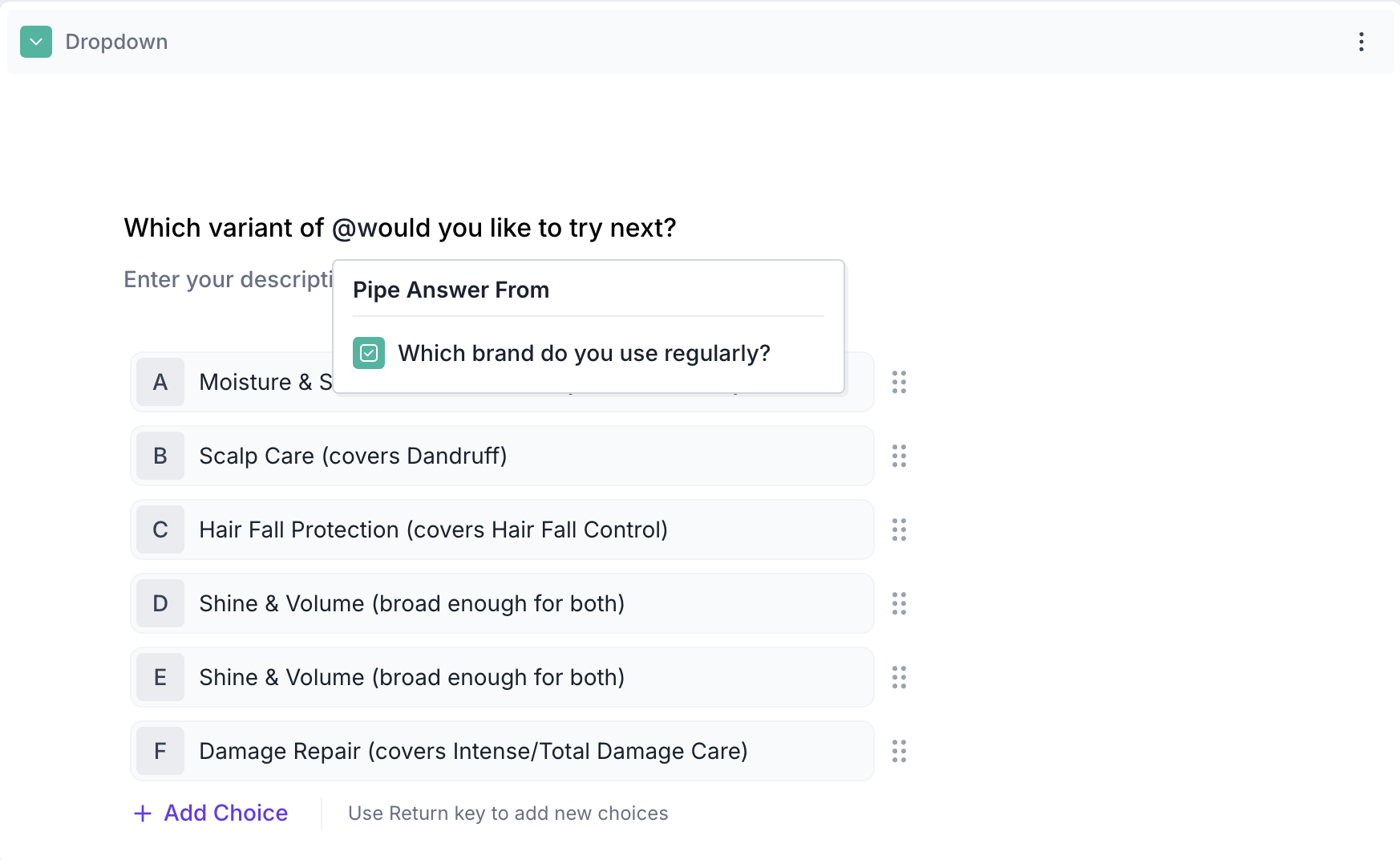
If the respondent selected Dove Shampoo in previous question, then dropdown question will appear as, Which variant of Dove Shampoo would you like to try next?
If previous block is also Dropdown / Multiple choice block and Multiple selection option is enabled, then Respondents view will be as below:
Respondents View: If they selected Dove Shampoo and Pantene in previous question, then dropdown question will appear as, Which variant of Dove Shampoo,Pantene would you like to try next?
Properties
The Dropdown block offers several configuration options in the right-side Properties panel, giving you flexibility in how the question behaves and how responses are collected.
Layout: You can add an image such as a product packshot, brand logo or category icon to the block by selecting a layout position.
1. To add an image, select a layout position from the right panel. By default, the layout is set to Blank. To enable image upload, select a different layout option:
- Left
- Right
- Top
2. Upload or Select an Image: Once a layout is selected, you'll see an option to:
- Upload an image from your device
- Choose from predefined images available in the platform’s image library.
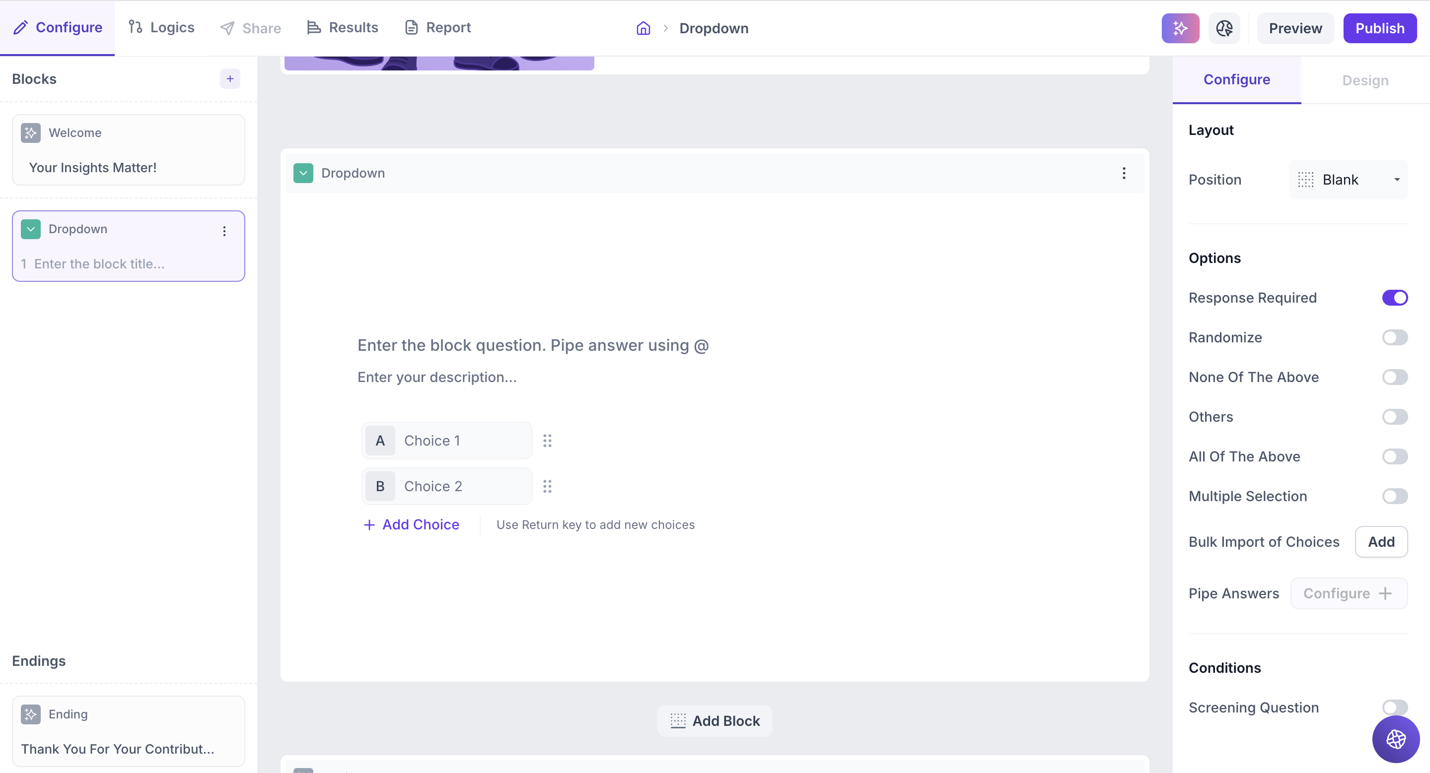
Options
1. Response Required (Enabled by default): This setting ensures respondents must select an option before proceeding to the next question. You can disable it if you want to make the question optional.
2. Randomize: Shuffles the order of the dropdown options each time a respondent views the question, helping reduce selection bias.
3. None of the Above: Adds a “None of the above” option to the end of the list. Selecting this indicates that none of the other choices apply to the respondent.
4. Others: Adds an “Other” option at the end of the list. Respondents can type in a custom response if none of the listed choices apply.
5. Multiple Selection: Enable this option to allow respondents to select more than one option from the dropdown list.
6. All of the Above: Adds an “All of the above” option that, when selected, indicates the respondent is choosing all listed options.
7. Bulk Import of Choices: Quickly add multiple answer options by entering one per line. Simply type an option, press Enter, and continue until all options are added.
8. Pipe Answers: Use this option to dynamically display choices from a previous question block. Supported block types include:
- Dropdown
- Multiple Select
- Ranking
You can choose to display:
- All choices
- Selected choices
- Unselected choices
This allows you to personalize or condition follow-up questions based on earlier responses.
9. Screening Question: Use this to qualify or disqualify respondents based on their answers.
Single Selection: Choose one or more valid options. Respondents must select a valid option to continue; otherwise, they will be redirected to the Screen out block.
Multiple Selection: When both Screening Question and Multiple Selection are enabled, you can choose between:
- At least : The respondent must select at least one valid option.
- Exactly: The respondent must select only the valid option(s) to qualify.
Result
Once your study is live and responses are collected, you can view the results of the Dropdown question block in a visual and insightful format.
Overall Results
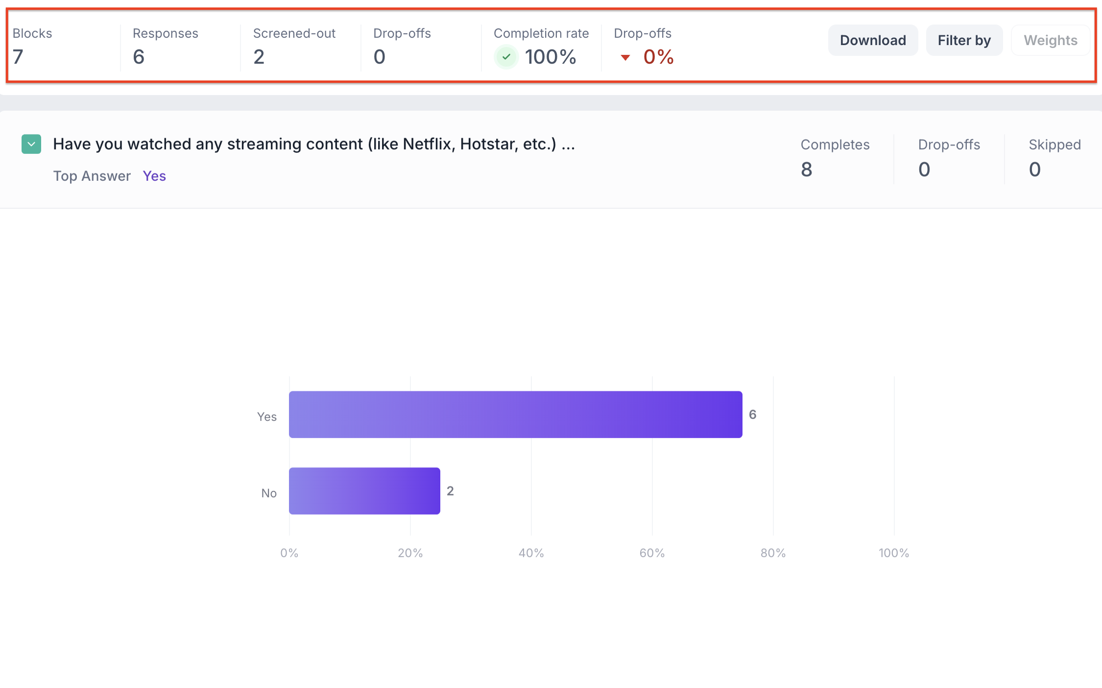
1. Top Summary
This section provides an overview of how your study performed:
- Total Blocks – Number of question blocks included in the study
- Total Responses – Count of completed responses across all blocks
- Screened Out – Respondents who didn’t qualify based on screener logic
- Dropped Off – Respondents who exited the study midway
- Completion Rate – % of respondents who completed the full study
- Drop-Off Rate – % of respondents who exited before completion
2. Study-Level Download
- Download all collected response data at the study level, covering every block and question.
3. Filter Responses
Use the filter panel at the top of the results view to analyze specific respondent segments.
You can filter based on:
- Answers from previous questions
- Device type (e.g., mobile, desktop)
- Browser used (e.g., Chrome, Safari)
This helps uncover trends and insights within specific user groups.
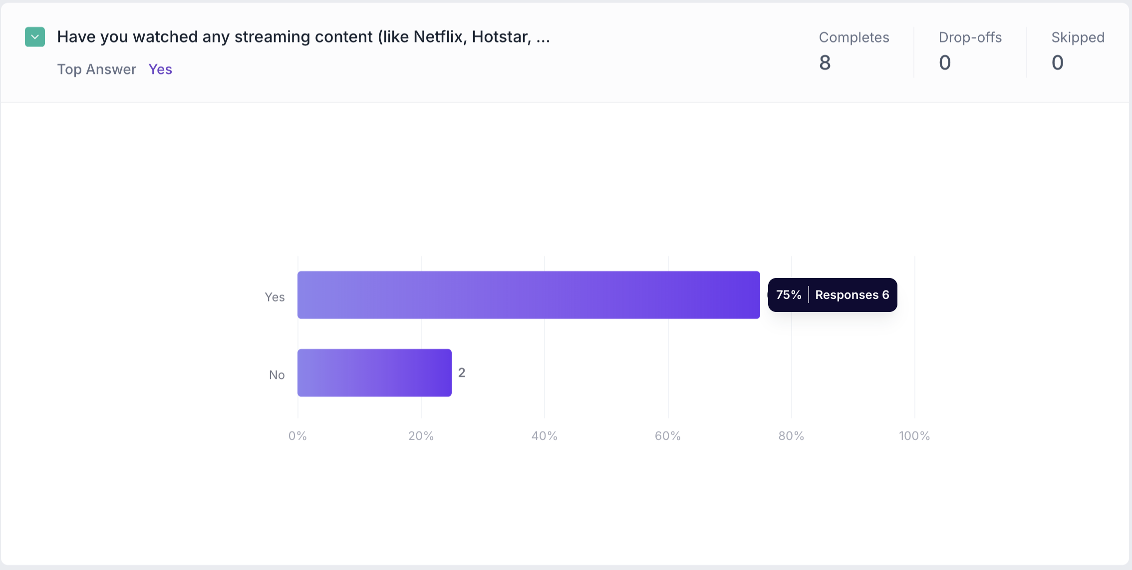
Dropdown Question Block Results
1. Response Summary
- Completed – Number of respondents who answered the question.
- Drop-off – Respondents who exited the study before reaching this block.
- Skipped – Number of respondents who viewed but didn’t respond.
2. Bar Graph View
Responses are shown in a bar chart, with each bar representing an answer option.
For each bar, the following details are shown:
- Number of responses
- Percentage of total responses
The top selected answer appears just below the question title.