Prototype Block - Insights
Overview
Once your study is live and responses are collected, you can view the results in the Results tab. Prototype Test results include block level performance metrics, navigation path data across every screen and detailed screen level attention and interaction data.
RESULTS
Once the study is live and responses are collected, you can view the results in the Results tab.
Block Level Summary
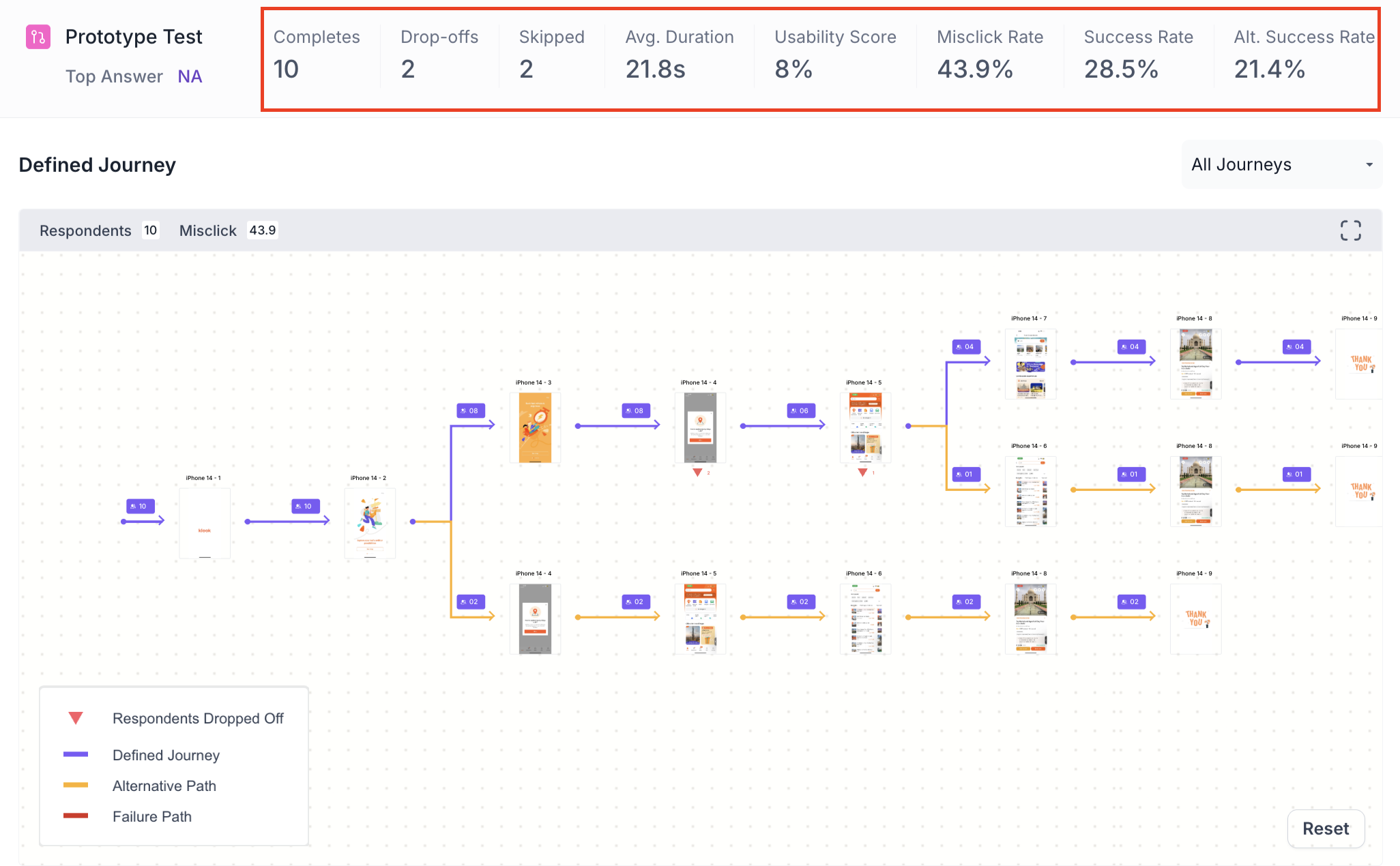
The following metrics are displayed at the top of the Prototype Test block results, as shown below.
- Completes: Number of participants who completed this block.
- Drop offs: Participants who exited the study before reaching this block.
- Skipped: Participants who viewed the block but did not respond.
- Avg Duration: Average time participants spent navigating the prototype. Use this to understand the overall effort required to complete the task. A significantly higher value may indicate the prototype is difficult to navigate.
- Usability Score: An overall score reflecting how usable the prototype was, calculated from success rate, misclick rate, average duration and drop off rate. A score above 80 indicates good usability. Use this as a quick benchmark to assess overall prototype performance.
- Misclick Rate: Percentage of clicks made outside the designated interactive areas. A high misclick rate indicates participants expected elements to be clickable that were not. Use this to identify screens that need clearer interactive affordances.
- Success Rate: Percentage of participants who successfully reached the goal screen. Use this to understand how many participants were able to complete the task as intended.
- Alt. Success Rate: Percentage of participants who reached the goal screen using an alternate path rather than the defined path. Use this to understand whether participants found alternative ways to complete the task that may be worth validating
Note
Alt. Success Rate is available for Defined Path only
Journey Tree
The Journey Tree shows the navigation paths taken by all participants across every screen in the prototype. Each screen shows the number of participants who visited it. The colour of each path indicates the journey outcome, as shown below.
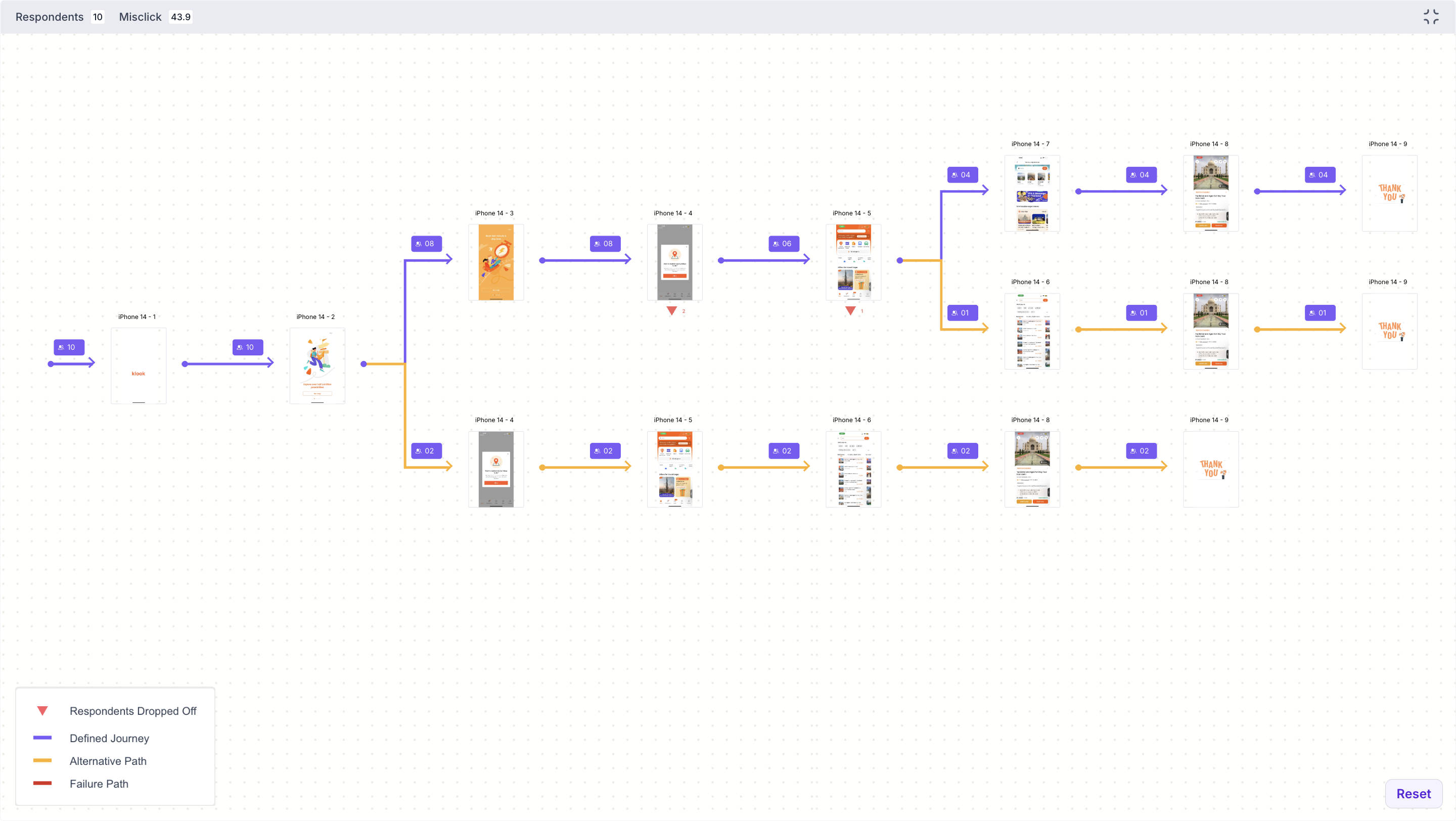
- Purple line: Participants who followed the Defined Journey
- Orange line: Participants who took an Alternative Path and still reached the goal screen
- Red line: Participants who took a path that did not reach the goal screen
- Red triangle marker: Number of participants who dropped off at that screen
For Exploratory Path, there are no alternate paths. Each journey is recorded as either a success, where the participant reached the goal screen, or a failure, where they did not.
Use the dropdown to view all journeys or select a specific journey to view it individually. Use the expand option to view the full journey tree in detail.
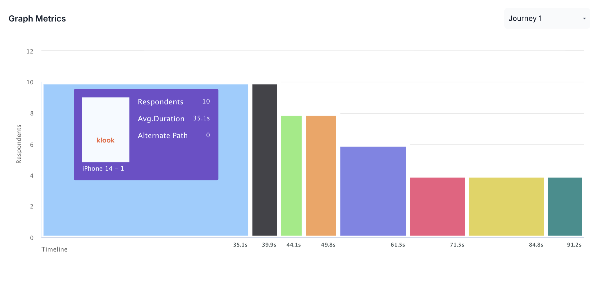
Graph Metrics
The Graph Metrics section shows a bar chart of participant engagement across screens for a selected journey. Each bar represents a screen in the prototype.
- Y axis: Number of respondents who visited that screen
- X axis: Timeline showing the average duration at each point
Hover over a bar to see the screen name, number of respondents, average duration and alternate path count for that screen. Use the dropdown to select a specific journey to view, as shown below.
Performance Breakdown
The Performance Breakdown shows all screens side by side. For each screen, the following metrics are shown.
- Average Time: Average time participants spent on this screen. A significantly higher value compared to other screens may indicate confusion or difficulty finding the next step.
- Misclick Rate: Percentage of clicks made outside interactive areas on this screen. Use this to identify screens where participants struggled to find the right element to interact with.
- Drop off Rate: Percentage of participants who exited the prototype from this screen. A high drop off rate highlights screens where participants abandoned the task, which may point to a confusing layout or unclear next step.
- Usability Score: Overall usability score for this screen based on the above metrics. Use this to quickly identify which screens performed well and which need improvement
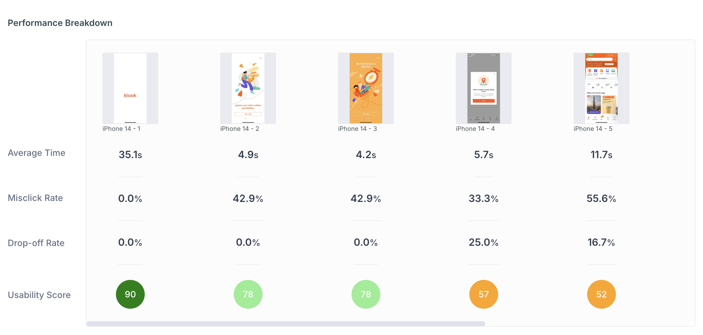
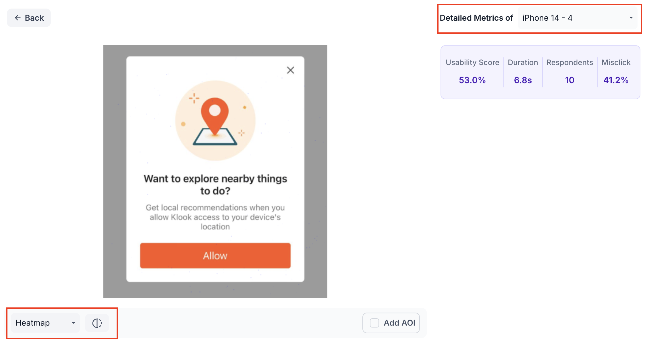
Click a specific screen to view its detailed metrics, as shown below.
Within the detailed view, use the dropdown to navigate to a different screen. Use the view selector to switch between the following views.
- Heatmap: Displays aggregated gaze intensity using a colour gradient from cool to warm. Warmer colours highlight areas that received the most visual attention. Use this to understand which parts of the screen drew the most attention. The heatmap display can be adjusted using the Radius, Shadow and Blur sliders.
- Scroll: Shows how far participants scrolled on this screen. Use this to understand how much of the screen participants actually viewed.
- Clicks: Shows where participants clicked on this screen. Use this to identify which elements participants interacted with most.
- Misclicks: Highlights clicks made outside designated interactive areas. Use this to identify elements that participants expected to be clickable but were not.
- Emotion Metrics: Shows the emotional response of participants while viewing this screen, broken down as Positive, Negative and Neutral. Use this to understand how participants felt at each stage of the prototype.
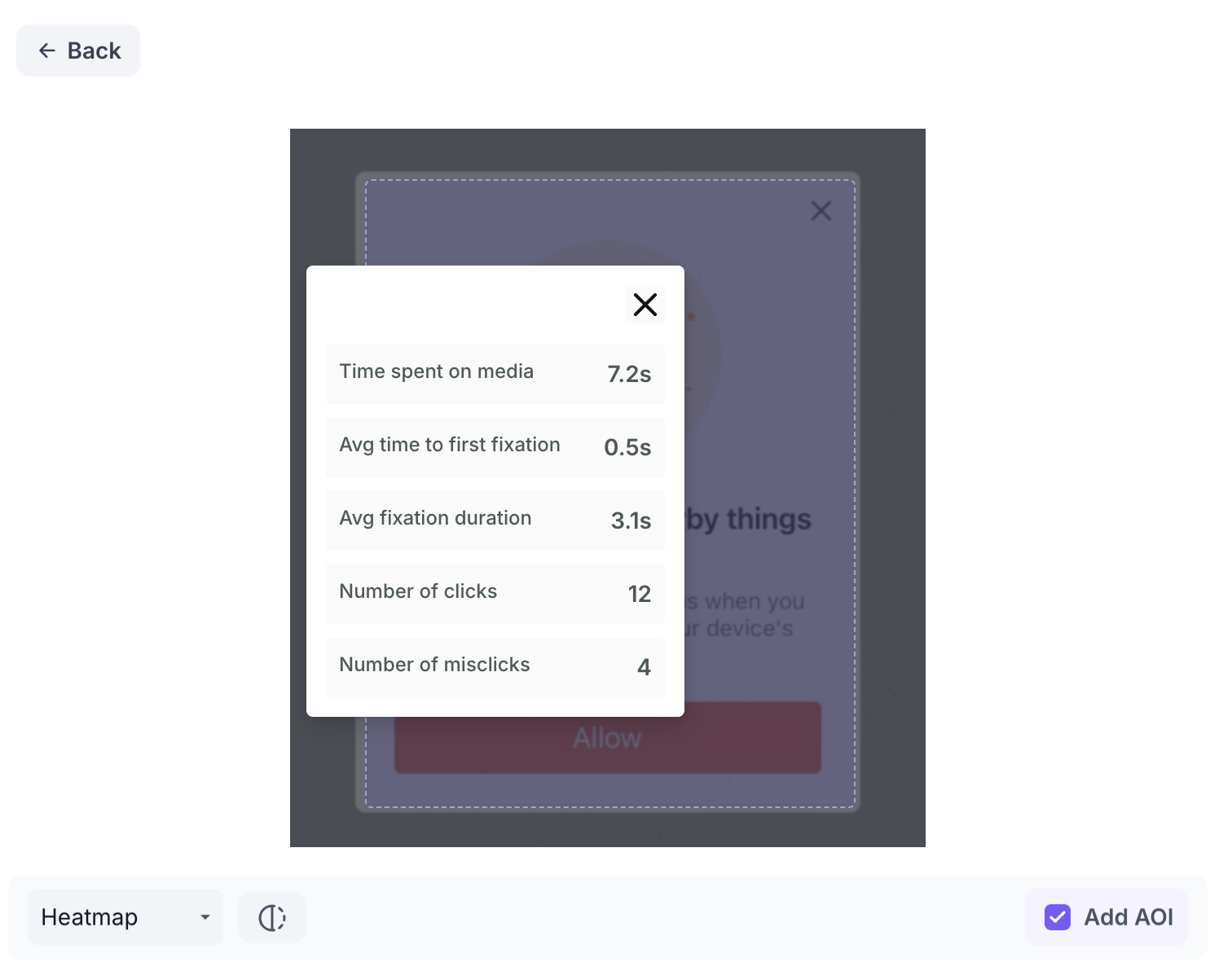
Click Add AOI to draw a box over a specific area of the screen and give it a name. The following metrics are shown for each AOI.
- Time Spent on Media: Total time participants spent looking at this area. Use this to understand how much attention the area received overall.
- Avg Time to First Fixation: Average time taken for participants to first notice this area. A lower value indicates the area was noticed quickly.
- Avg Fixation Duration: Average length of time participants held their gaze on this area. A higher value indicates the area held attention for longer.
- Number of Clicks: Total clicks within this area. Use this to understand how often participants interacted with this element.
- Number of Misclicks: Clicks within this area that fell outside interactive elements. A high misclick count indicates participants expected something in this area to be clickable but it was not
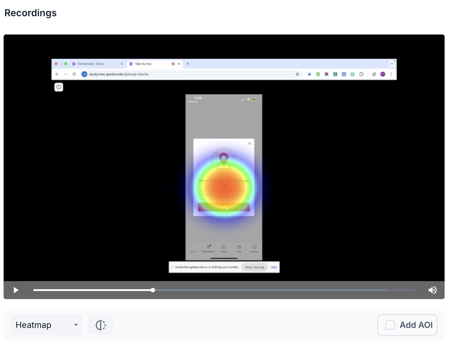
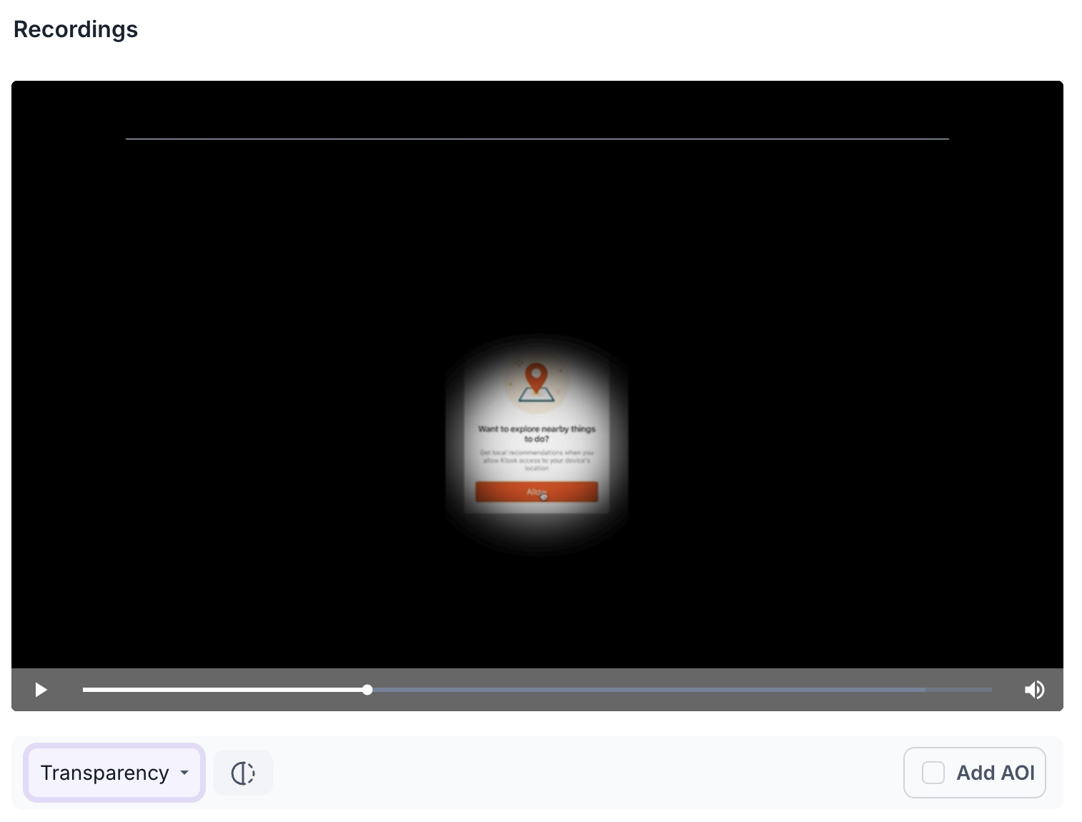
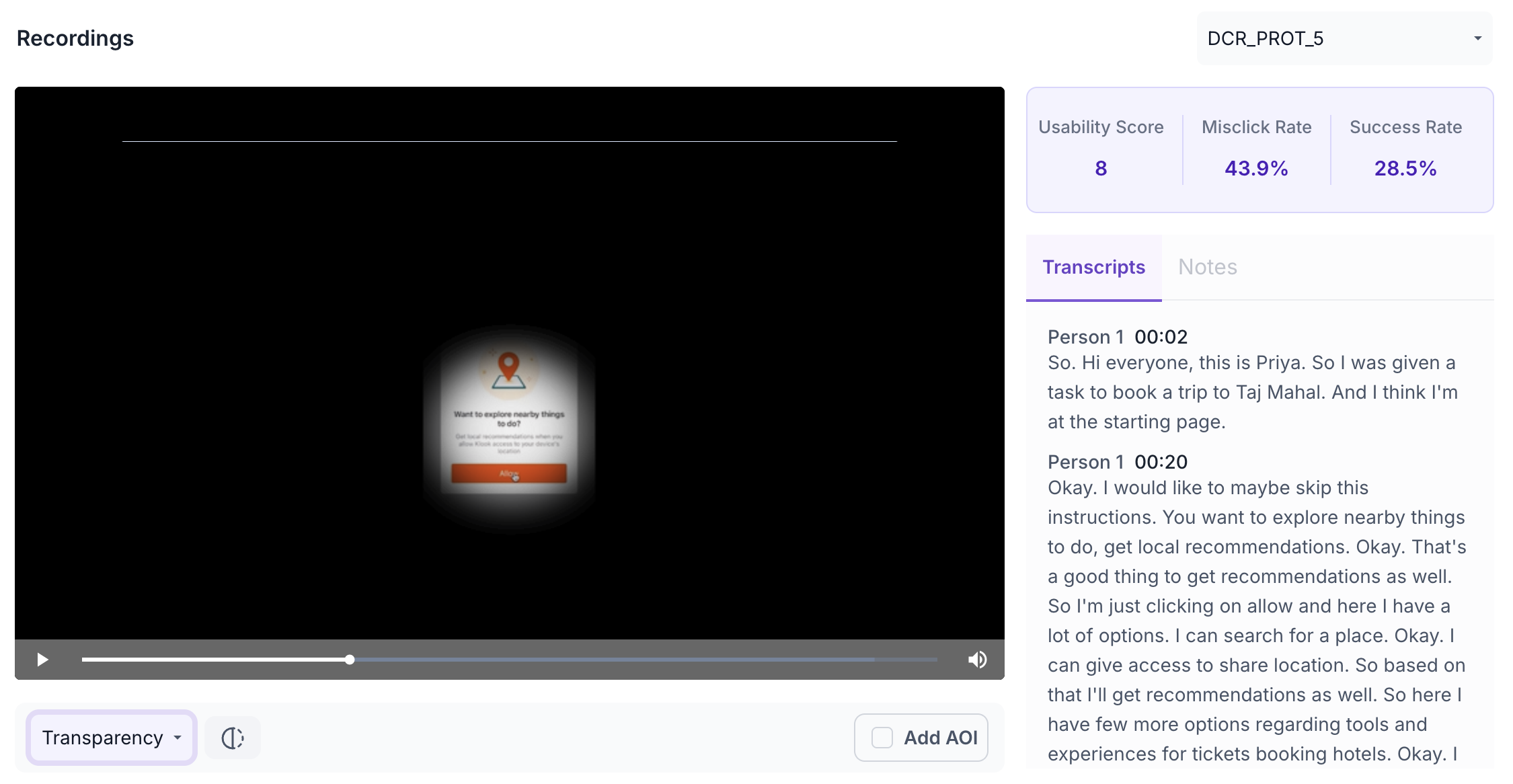
Recordings
The Recordings section shows screen recordings of individual participant sessions. Recordings are available for desktop participants only. Use the dropdown to select a specific participant recording.
The following metrics are shown for each recording.
- Usability Score: Overall usability score for this participant's session. Use this to understand how well this individual participant was able to navigate the prototype and complete the task.
- Misclick Rate: Percentage of misclicks during this session. Use this to understand how often this participant clicked on non-interactive elements, which may indicate confusion with the prototype layout.
- Success Rate: Percentage of participants who successfully reached the goal screen during this session. Use this to understand overall task completion across all participants.
The recording is displayed with a heatmap overlay showing where the participant looked. Use the view selector below the video to switch between Heatmap and Transparency Map views.
Heatmap
Transparency Map
Use the Transcripts tab to read an auto-generated transcript of what the participant said during the session.
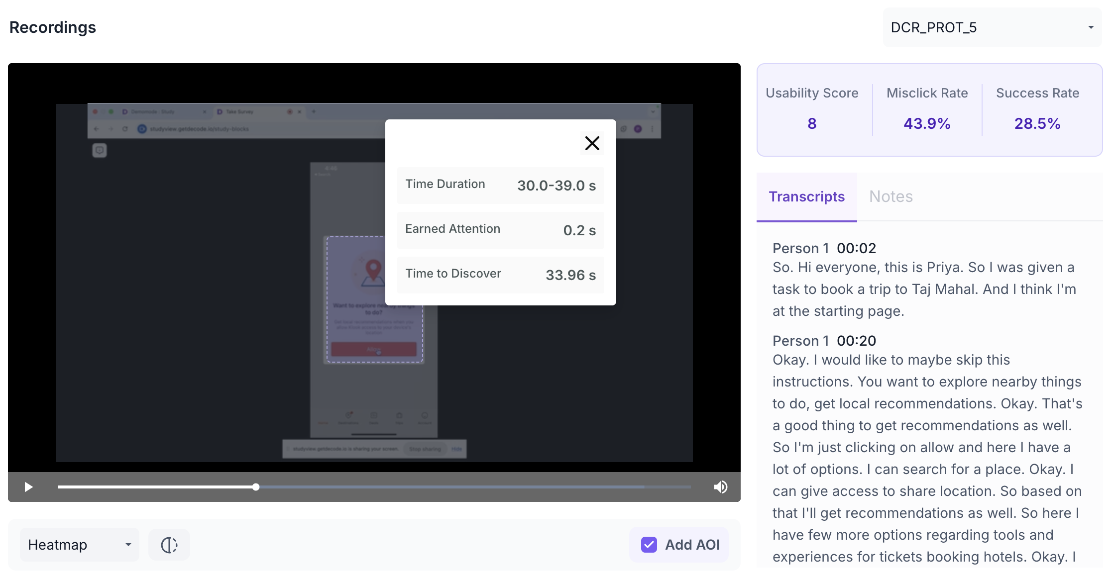
AOI
Click Add AOI to draw a box over a specific area of the recording. Give the AOI a name and set the duration using the slider. The following metrics are shown for each AOI.
- Time Duration: The time range covered by the AOI. Use this to focus your analysis on a specific moment in the session, such as when a key element appeared on screen.
- Earned Attention: Total attention received within the selected area during the set duration. Use this to understand how much of the participant's focus the area captured within the defined time window.
- Time to Discover: Average time taken for the participant to first look at this area. A lower value indicates the area drew attention quickly within the session