Conjoint Block in Decode
What is Conjoint Analysis?
Conjoint Analysis is a research technique used to identify which features or attributes are most important to your target audience. Instead of asking direct questions like Do you prefer free shipping, it presents combinations of product features and asks participants to choose between them.
This approach reflects how people evaluate multiple options in real-life scenarios and helps you understand the preferences and priorities behind their choices. It is commonly used to optimise pricing, feature packaging and product offerings.
How It Works in Decode
Decode automates bundle generation, randomises combinations to reduce bias and presents results in dashboards that identify:
- Which features your audience values the most
- How much impact price has on their decision
- What mix of features and pricing works best
How to Set Up a Conjoint Study
To configure a Conjoint Study in Decode:
- Create a new study or use an existing one
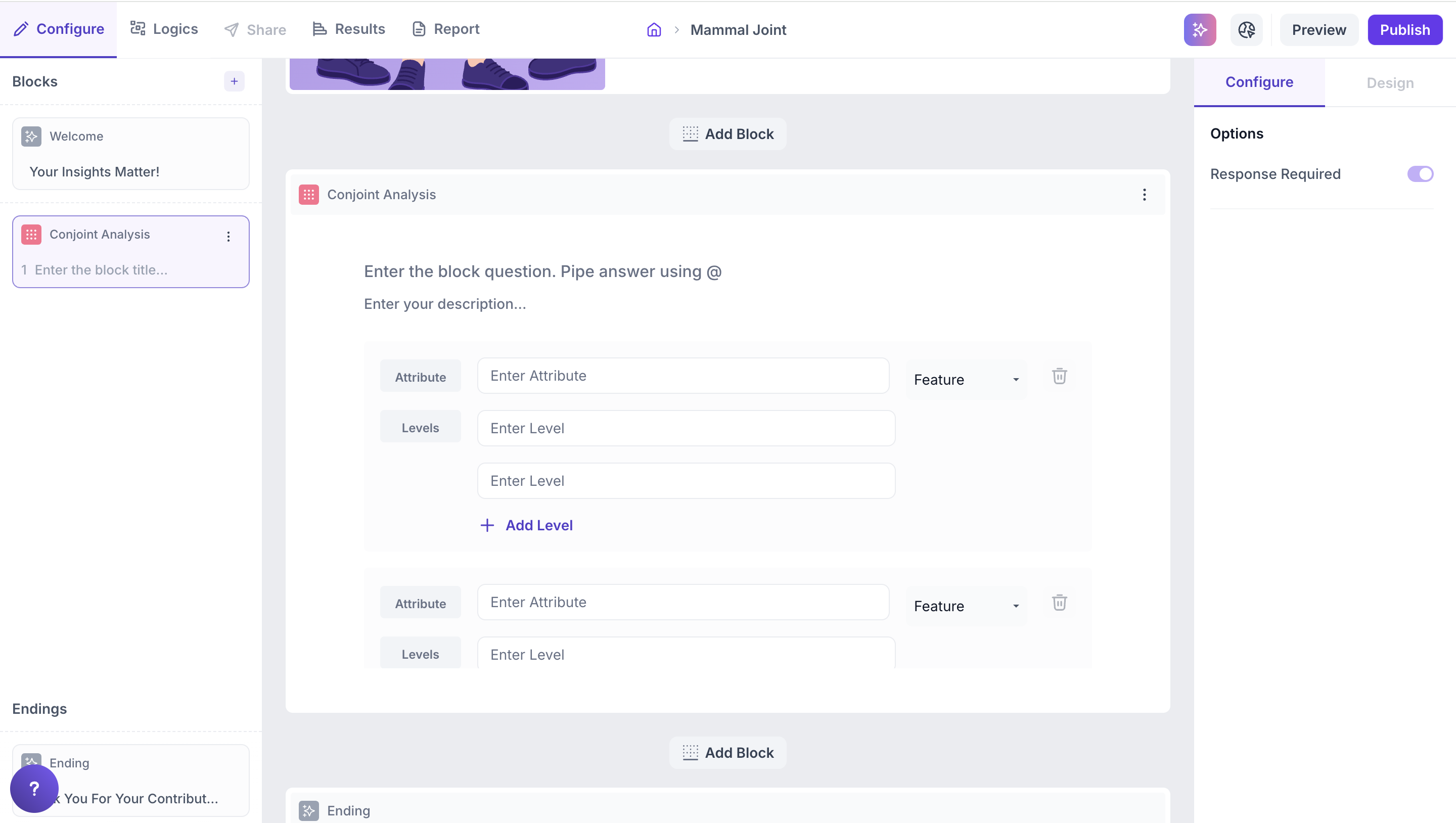
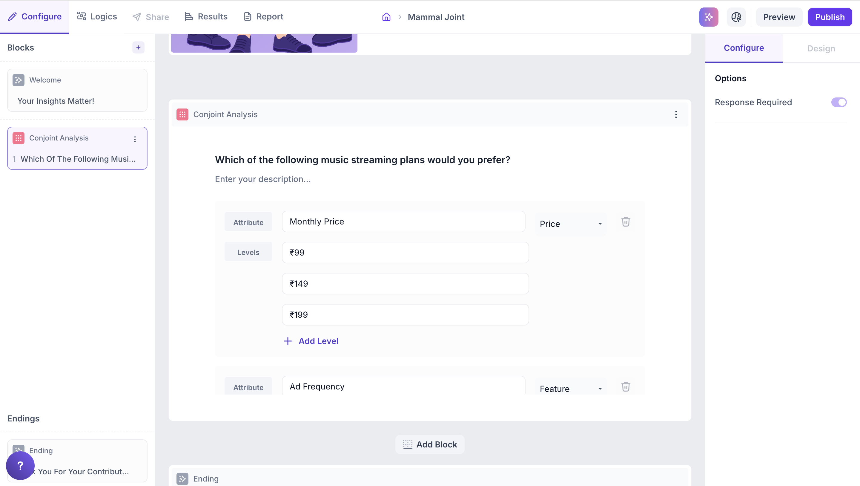
- Add a Conjoint block from the question types
- Define attributes and levels. The total number of combinations generated depends on the number of attributes multiplied by levels. The system will auto-generate combinations and show up to 60 per respondent across 15 pages with 4 bundles each.
- Select attribute type: From the dropdown, choose whether each attribute should be treated as a Feature or Price.
Examples:
- Attribute: Brand and Levels: Brand A, Brand B
- Attribute: Price and Levels: ₹299, ₹399, ₹499
- Attribute: Shipping and Levels: Free, ₹50, ₹99
Note
You can add up to 10 attributes. Each attribute can have up to 10 levels.
How Logic Works in Decode
In Decode, Conjoint Analysis simulates real-world trade-off decisions. The logic works as follows:
1. Combinations are auto-generated: Based on the attributes and levels you define, the platform generates a set of unique combinations (also called bundles or concepts).
2. Each page shows 4 bundles: Respondents will see 4 different combinations per page and must select the one they prefer.
3. Up to 60 combinations per respondent: The platform supports up to 15 pages (60 combinations total) per respondent.
4. Randomized display: Bundles are randomized across pages to reduce bias and improve data quality.
5. Response data is analyzed: The platform uses statistical modeling to determine:
- The relative importance of each attribute (e.g., brand, price).
- The utility score (also called part-worth) for each level (e.g., ₹299, Free Shipping).
This analysis helps identify what truly influences customer preference.
Properties
Response Required (Enabled by default): This setting is enabled by default and cannot be edited. Respondents must select one option to proceed to the next question.
Participant Experience
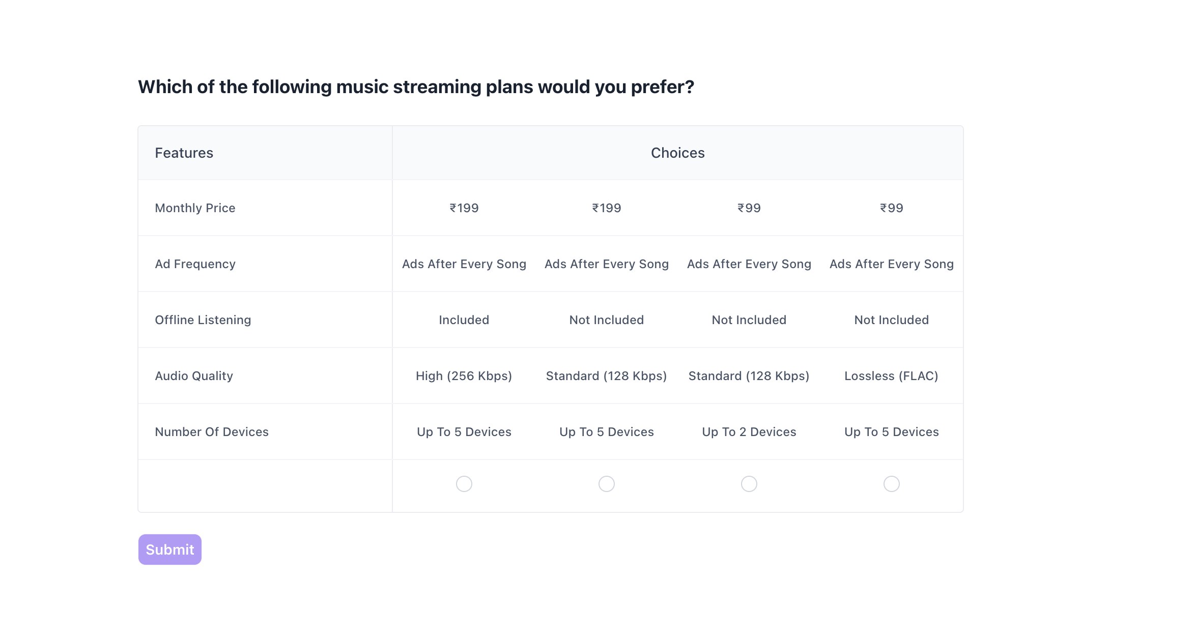
Decode presents participants with a structured layout for comparing options.
- Clear visual grouping: Each page shows 4 distinct options side by side, each representing a unique combination of features (also known as a “bundle” or “concept”).
- Feature-first layout: Attributes such as Price, Ad Frequency, Offline Listening, Audio Quality, and Number of Devices are listed vertically on the left for easy comparison across all options.
- One required selection per page: Respondents are required to choose one preferred option on each page before proceeding.
- Pages shown depend on attribute and level inputs: The number of pages a respondent sees (up to 15) depends on how many unique combinations can be generated from the attributes and levels configured.
This structured and consistent experience helps respondents easily compare and evaluate options resulting in better quality data.
Results:
Once your Conjoint study is live and responses are collected, you can view the results in the Results tab.
Overall Results
1. Top Summary
This section provides an overview of how your study performed:
- Total Blocks – Number of question blocks included in the study
- Total Responses – Count of completed responses across all blocks
- Screened Out – Respondents who did not qualify based on screener logic
- Dropped Off – Respondents who exited the study midway
- Completion Rate – Percentage of respondents who completed the full study
- Drop-Off Rate – Percentage of respondents who exited before completion
2. Study-Level Download
- Download all collected response data at the study level, covering every block and question.
3. Filter Responses
Use the filter panel at the top of the results view to analyze specific respondent segments.
You can filter based on:
- Answers from previous questions
- Device type (e.g., mobile, desktop)
- Browser used (e.g., Chrome, Safari)
This helps uncover trends and insights within specific user groups.
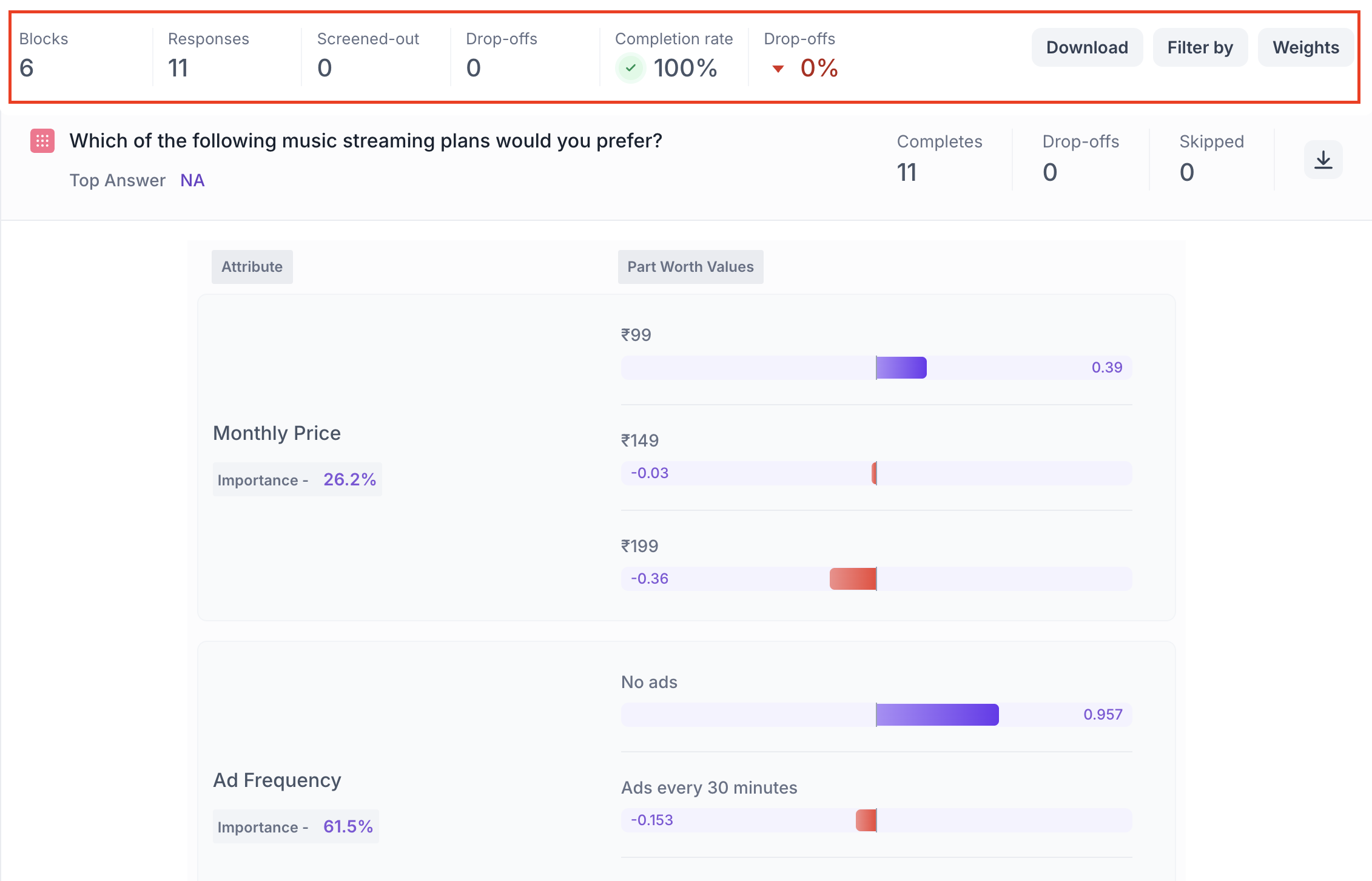
Conjoint Block Results
1. Response Summary
- Completed – Number of respondents who answered the question.
- Drop-off – Respondents who exited the study before reaching this block.
- Skipped – Number of respondents who viewed but did not respond.
- Download Report – Download the full response-level data for detailed offline analysis
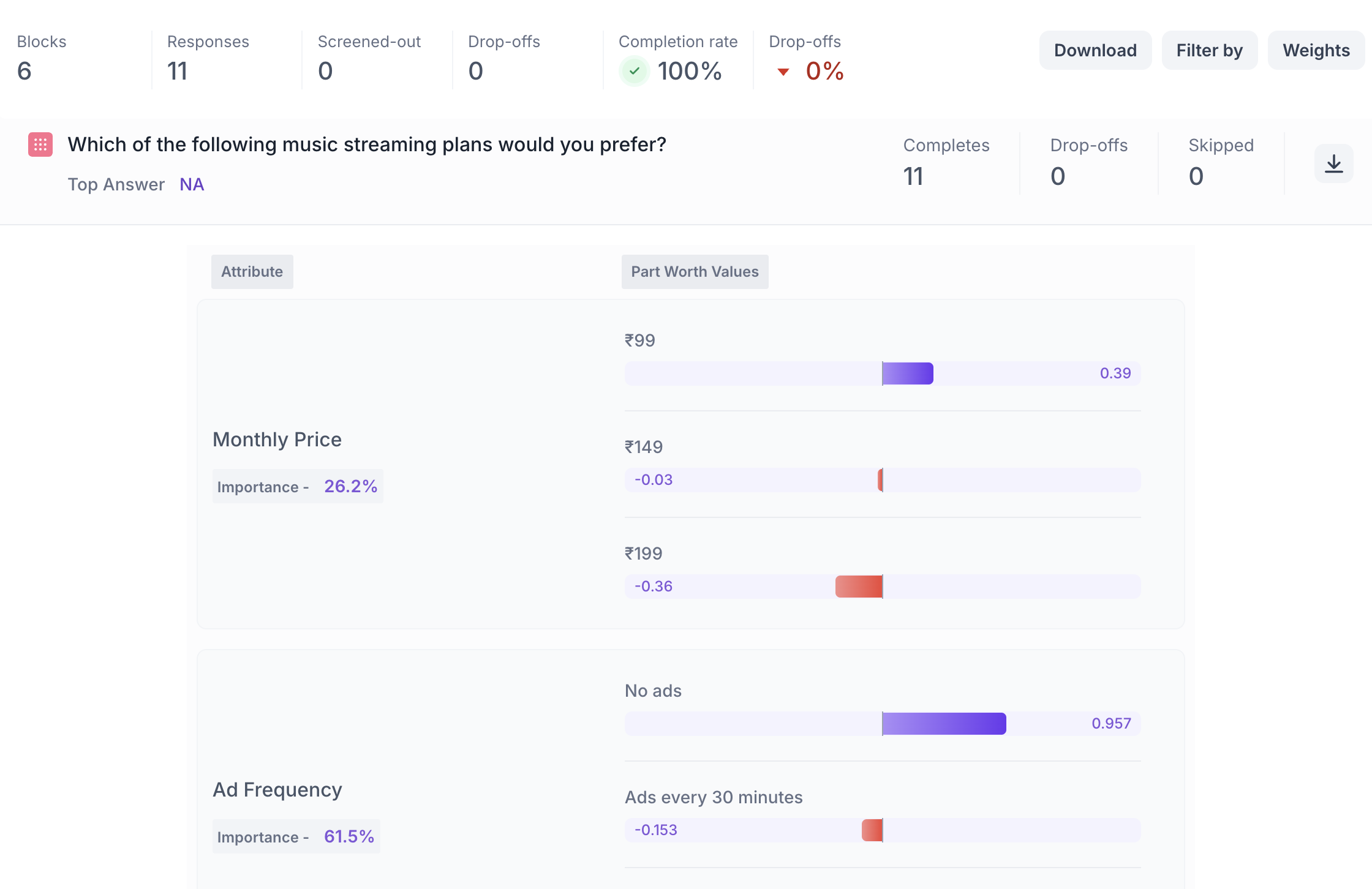
2. Attribute Importance
Each attribute (e.g., Price, Ad Frequency, Audio Quality) is assigned an Importance Score shown as a percentage (%).
- Higher percentage = greater impact on decision-making
- Helps identify what matters most to your audience
Example: If Ad Frequency has an Importance Score of 61.5%, it means it was the strongest driver of preference among all attributes.
3. Part-Worth Utility Scores (Level Preference)
Each level within an attribute (e.g., ₹99 or ₹199 under Price) is given a Utility Score that reflects how much it influenced the choice.
- Positive values = more preferred
- Negative values = less preferred
- Visual bars indicate strength and direction (e.g., purple = liked, red = disliked)
Note: Utility scores are relative and can only be compared within the same attribute not across different attributes.