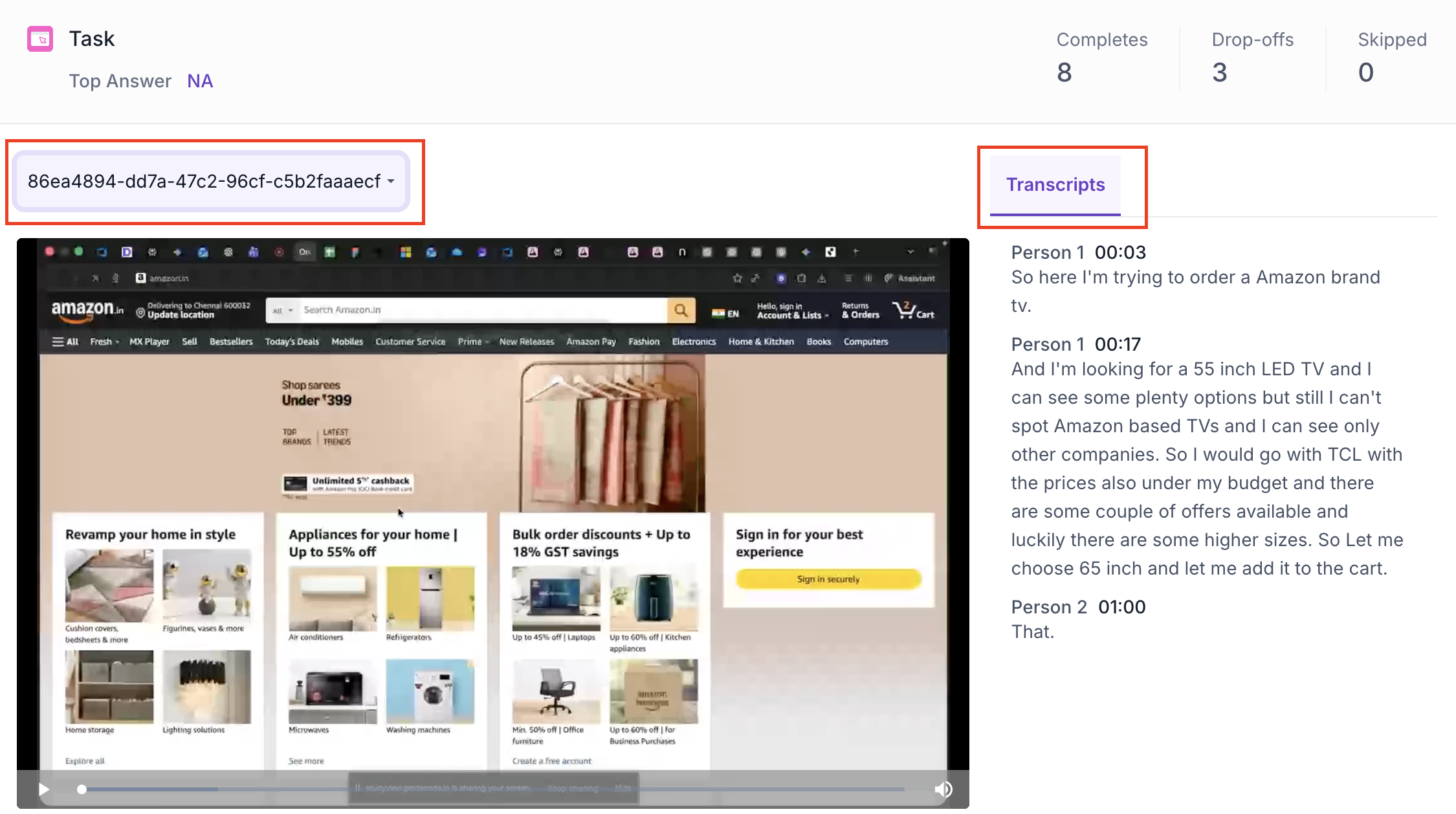
Task Block - Insights
Overview
Once your study is live and responses are collected, you can view the results in the Results tab. Task results include a recording of each participant session, navigation path data, feedback ratings and attention and emotion metrics.
BLOCK SUMMARY
The following metrics are displayed at the top of the Task block results.
- Completes: Number of participants who completed this block
- Drop offs: Participants who exited the study before reaching this block
- Skipped: Participants who viewed the block but did not respond
RECORDING AND TRANSCRIPT
Each participant session is available as a screen recording. Use the dropdown to select a specific participant recording. The recording shows the participant navigating the website in real time.
If the participant spoke during the session, an auto-generated transcript is shown alongside the recording, timestamped and broken down by speaker.
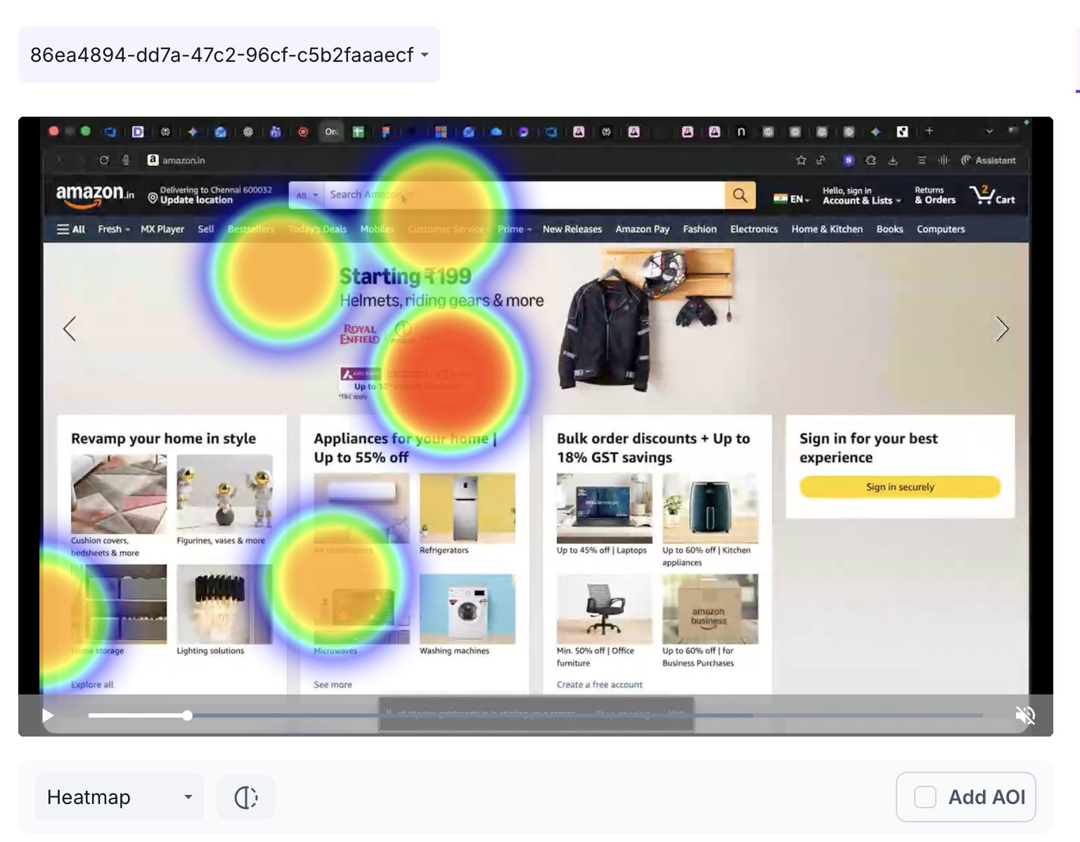
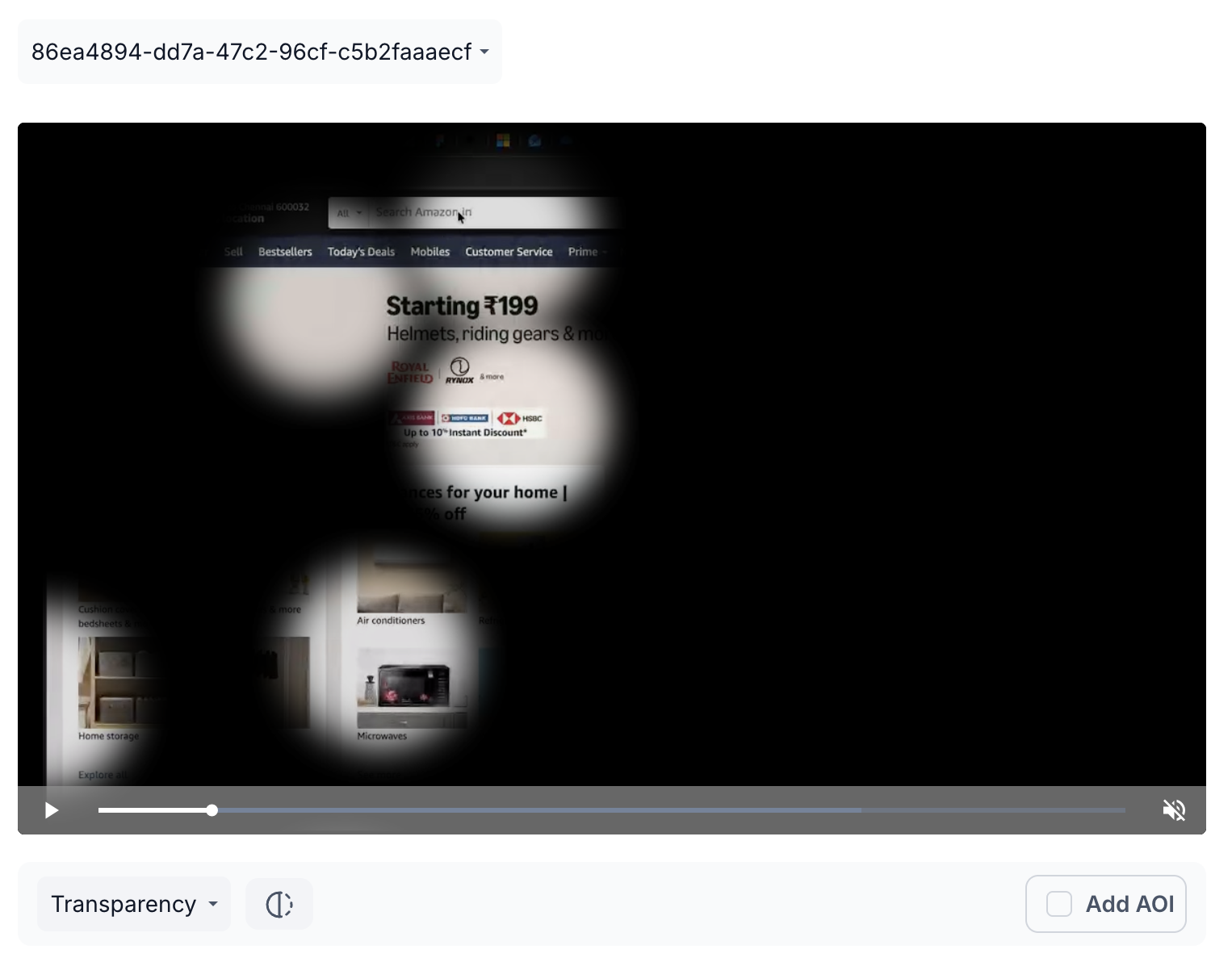
The recording is displayed with a visual overlay. Use the view selector to switch between two views.
Heatmap: Displays aggregated gaze intensity using a colour gradient from cool to warm. Warmer colours such as red and orange highlight areas that received the most visual attention during the session. Use this to understand where the participant focused most while navigating the website.
Transparency Map: Makes areas of the recording more transparent where the participant looked most, providing a clear view of attention distribution without the colour overlay of the heatmap. Use this when you want to see attention patterns without the distraction of colour.
Areas of Interest
Click Add AOI to draw a box over a specific area of the recording. Give the AOI a name and set the duration using the slider.
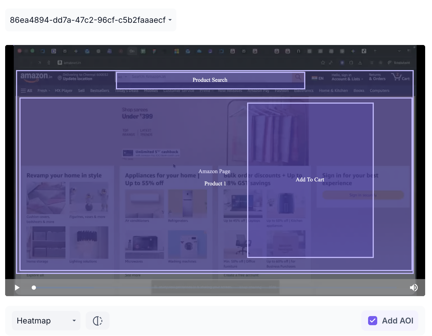
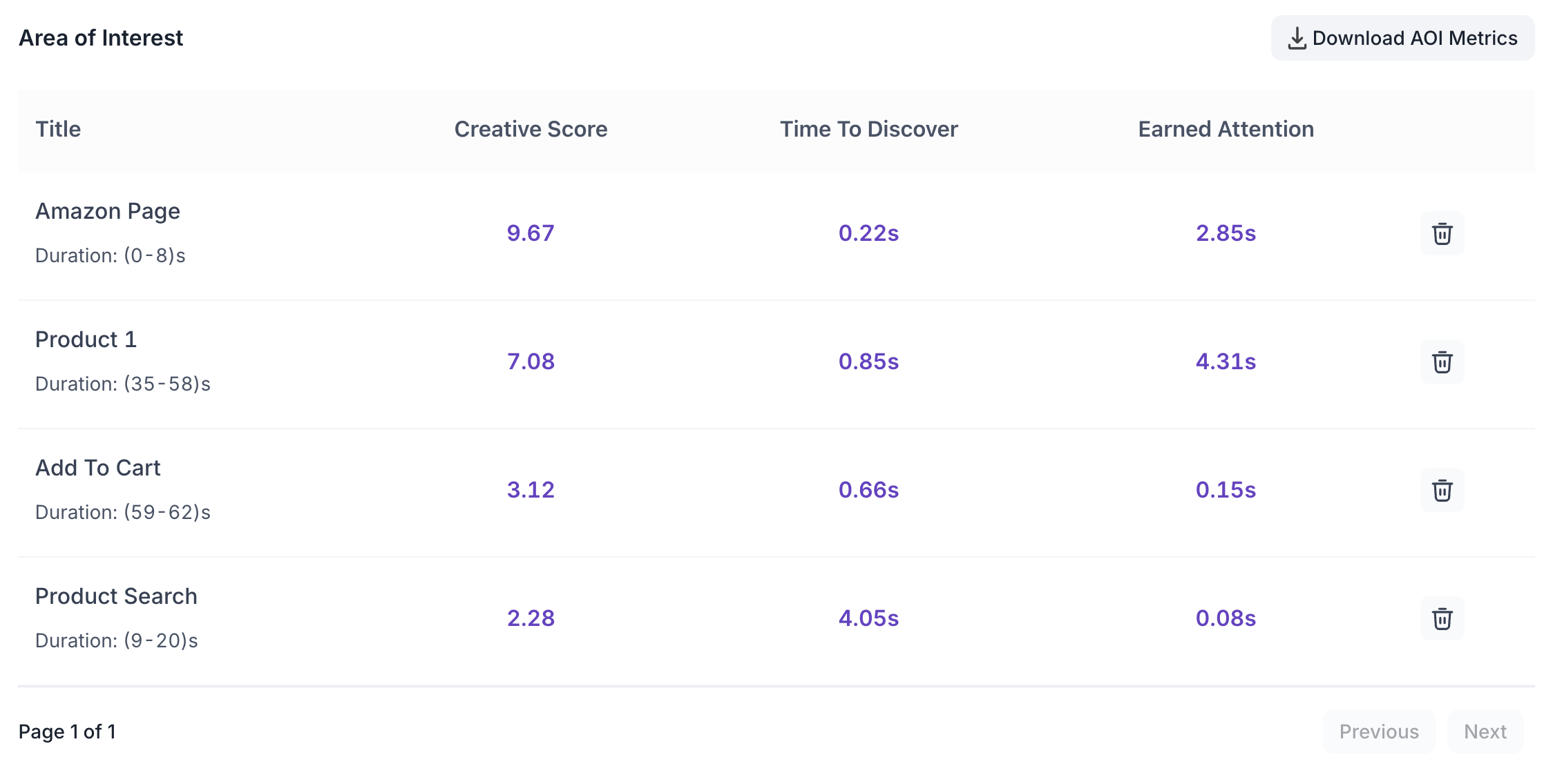
The following metrics are shown for each AOI.
- Title: The name assigned to the AOI for reference in the results table.
- Creative Score: Overall performance score for that area based on participant engagement. Use this to benchmark how well the area performed compared to similar content.
- Time to Discover: Average time taken for participants to first notice this area. A lower value indicates the area was noticed quickly. Use this to evaluate whether key elements are drawing attention at the right moment.
- Earned Attention: Total attention received within the selected area during the set duration. Use this to understand how much of the participant's focus the area captured relative to the rest of the recording.
AOI data can be downloaded using the Download AOI Metrics button.
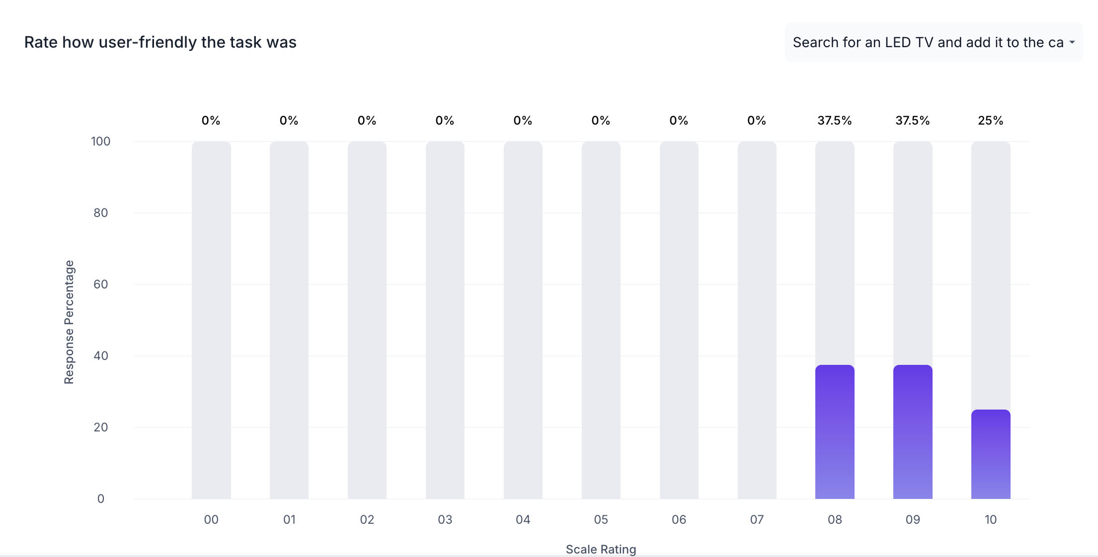
FEEDBACK RESULTS
If Collect Feedback was enabled for the task, a bar chart is shown displaying the distribution of participant ratings. The X axis shows the Scale Rating and the Y axis shows the Response Percentage as a proportion of all participants who completed the task.
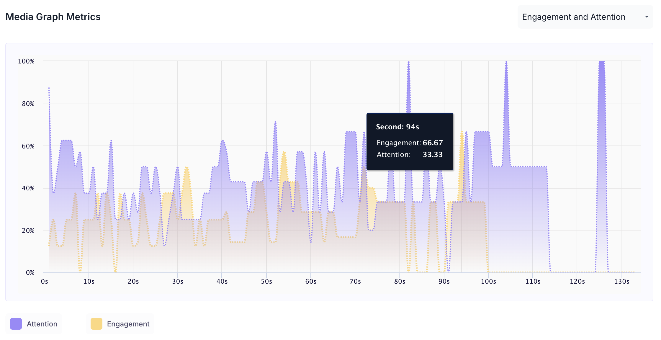
MEDIA GRAPH METRICS
Below the performance breakdown, two graphs are available. Use the dropdown to switch between them.
Engagement and Attention
Shows how attention and engagement levels changed across the duration of the session.
- Purple area: Attention Score
- Orange area: Engagement Score
- X axis: Time in seconds
- Y axis: Score from 0 to 100
Hover over any point on the graph to see the exact second and the corresponding engagement and attention scores at that moment.
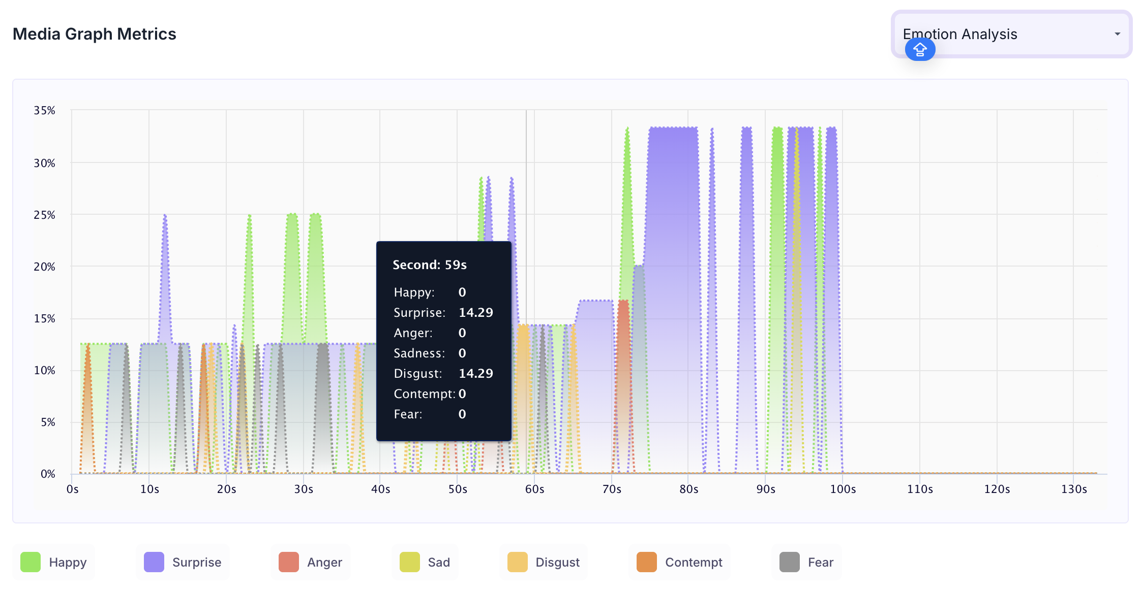
Emotion Analysis
Shows how emotional responses changed across the duration of the session. Each emotion that was expressed is shown as a separate coloured line. A colour key at the bottom of the graph identifies which colour corresponds to which emotion. Hover over the graph to see the score for each emotion at a specific second.
Note
The emotions tracked are Happy, Surprise, Anger, Sadness, Disgust, Contempt and Fear. Sankey Chart
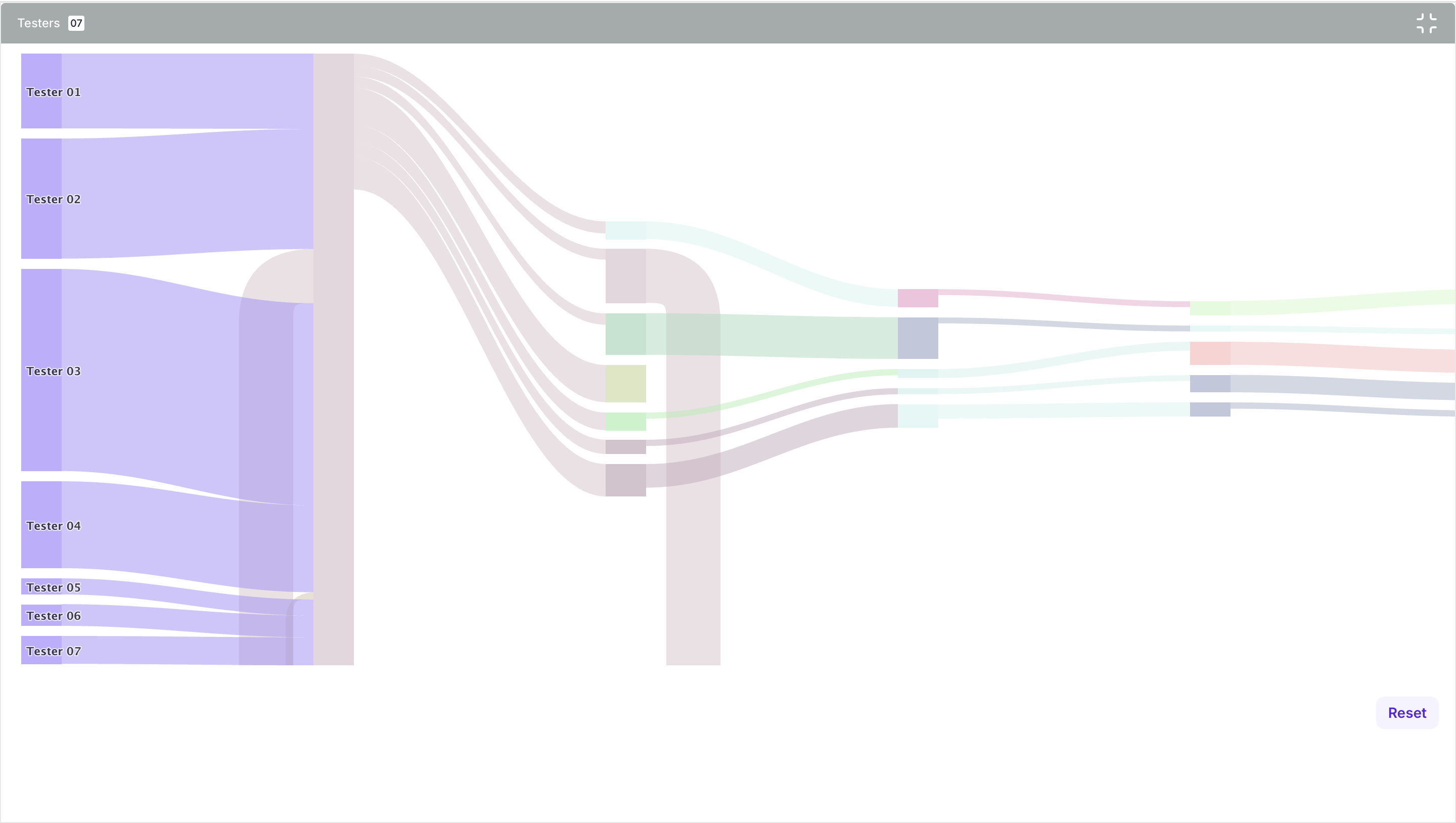
SANKEY CHART
The Sankey chart shows the navigation paths taken by all participants as a flow diagram. Each participant is shown on the left and the width of each flow represents the number of participants who took that path through the website. Wider flows indicate more commonly taken paths, helping you quickly identify the most frequent navigation patterns. Use the expand option to view the full chart in detail
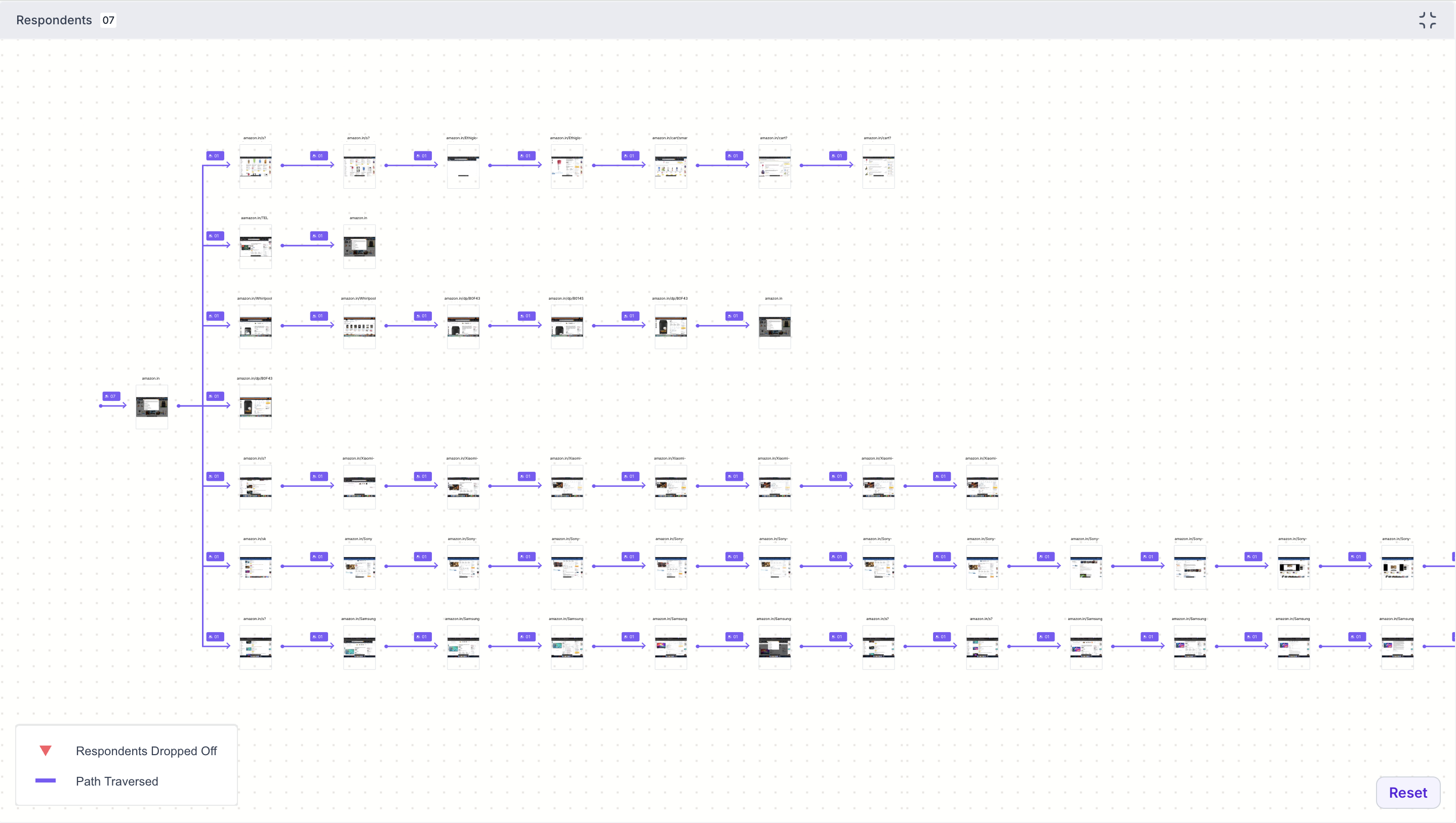
Journey Tree
The Journey Tree shows every page visited by participants during the task, displayed as a navigation map. Each page shows the number of participants who visited it and the paths taken between pages.
- Purple line: Path traversed by participants
- Red triangle marker: Number of participants who dropped off at that page
Use the expand option to view the full journey tree in detail. Click Reset to return to the default view.
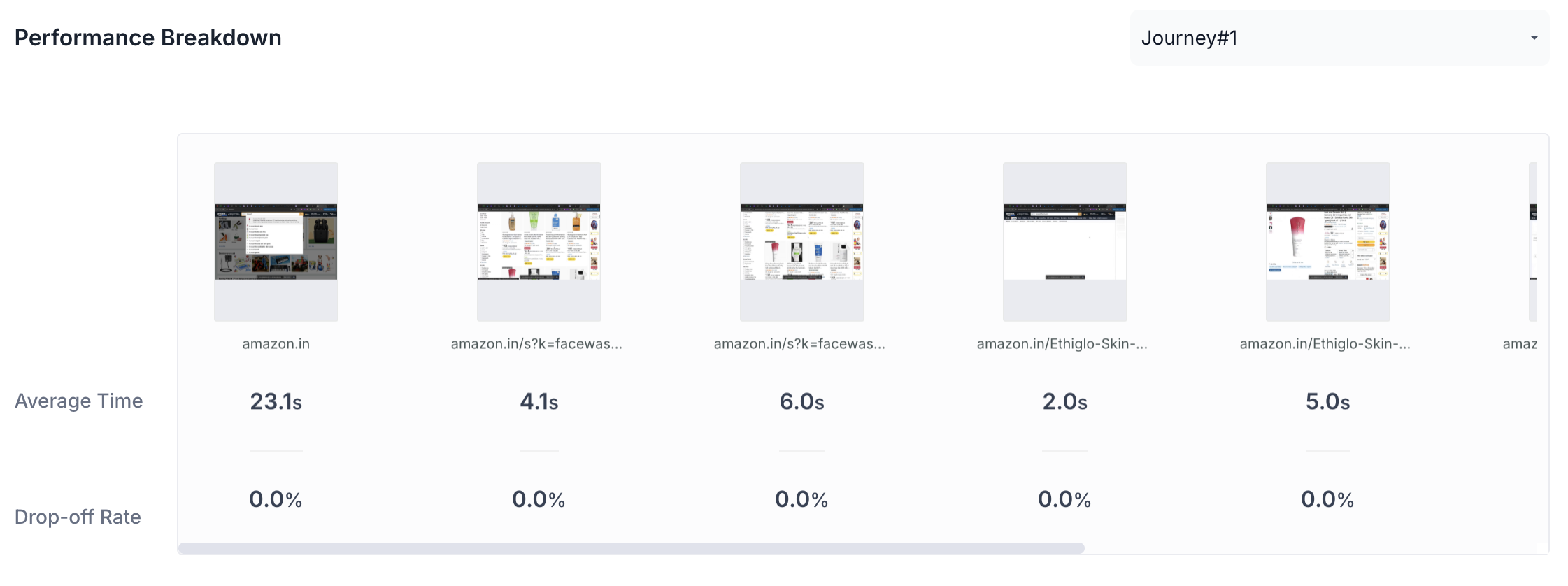
Performance Breakdown
The Performance Breakdown shows all pages visited during the task side by side. For each page, the following metrics are shown.
- Average Time: Average time participants spent on this page. A significantly higher value compared to other pages may indicate confusion or difficulty
- Drop-off Rate: Percentage of participants who exited the task from this page. A high drop-off rate highlights pages where participants abandoned the task
Use the dropdown to view the performance breakdown for a specific journey.