
Heatmap interpretation
The heatmap shows where viewers are looking across your creative. This article explains how to open it and how to read what it shows.
OPENING THE HEATMAP
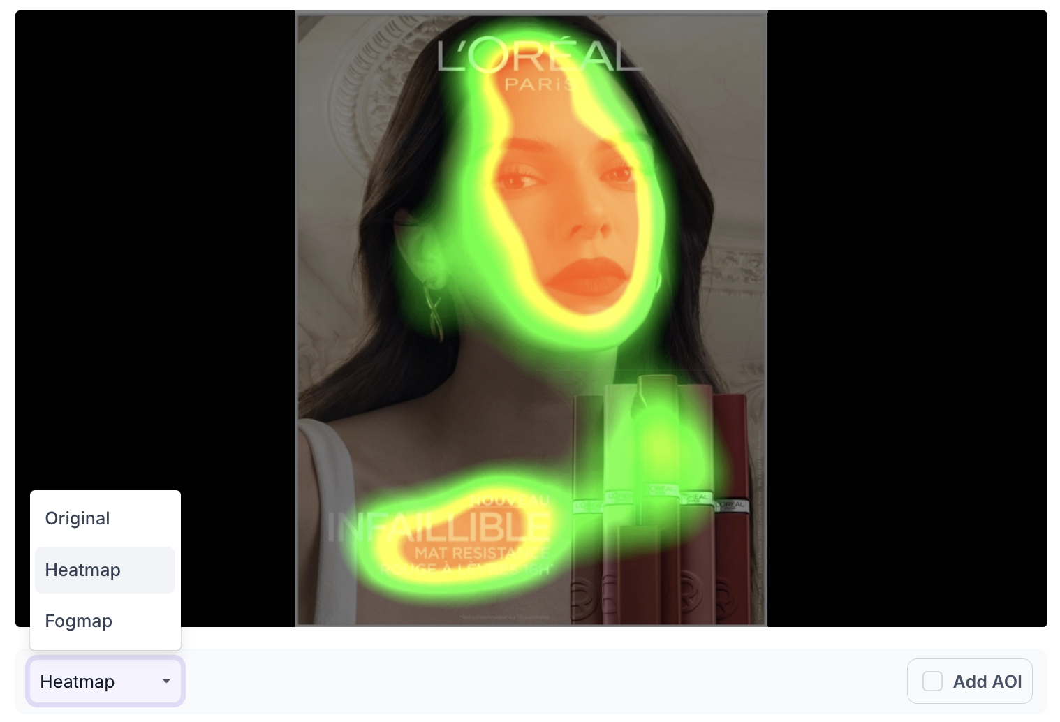
Use the dropdown below the creative in the visual view to switch from Original to Heatmap.
HOW TO READ IT
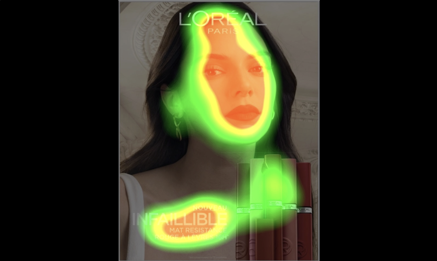
The heatmap uses colour to show how much attention each part of the creative receives. Red and yellow areas receive the most attention. Green areas receive less.
READ IT WITH THE FOCUS SCORE
Focus tells you whether attention is reaching the intended elements such as the offer, CTA or logo. It gives you the result as a number against the benchmark, but not the reason behind it.
The heatmap gives you the reason. When Focus is below the benchmark, open the heatmap to see where the red and yellow areas are actually sitting. In most cases the attention has gone to imagery, a face, or a background element instead of the elements the creative depends on.
READ IT WITH THE FOGMAP
The heatmap grades attention across the whole creative on a colour scale. The fogmap gives a straight reading of whether an element is noticed at all.
Use the heatmap to see where attention is concentrated, then switch to the fogmap to check that the elements carrying the message are not sitting in an area viewers are unlikely to look at. An element can sit in a yellow area on the heatmap and still fall under the fog. See Fogmap interpretation.
READ IT WITH AREA OF INTEREST
The heatmap shows the pattern across the whole creative. Area of Interest gives you the figures for a single element.
Use the heatmap first to see the overall distribution, then mark the specific elements you need certainty on to get their Time to Discover and Attention values. This matters when two elements sit in similar colour and you need to know which one is actually performing. See Area of Interest (AOI) setup on creatives.