
Reading Your AI Interview Results
Once your sessions are complete, all your recordings, transcripts, highlights, themes, and analytics are available in the Results tab. This article explains what each section shows and how to use it to move from raw session data to clear findings.
STUDY OVERVIEW
Three cards at the top of the Results tab summarise the study.
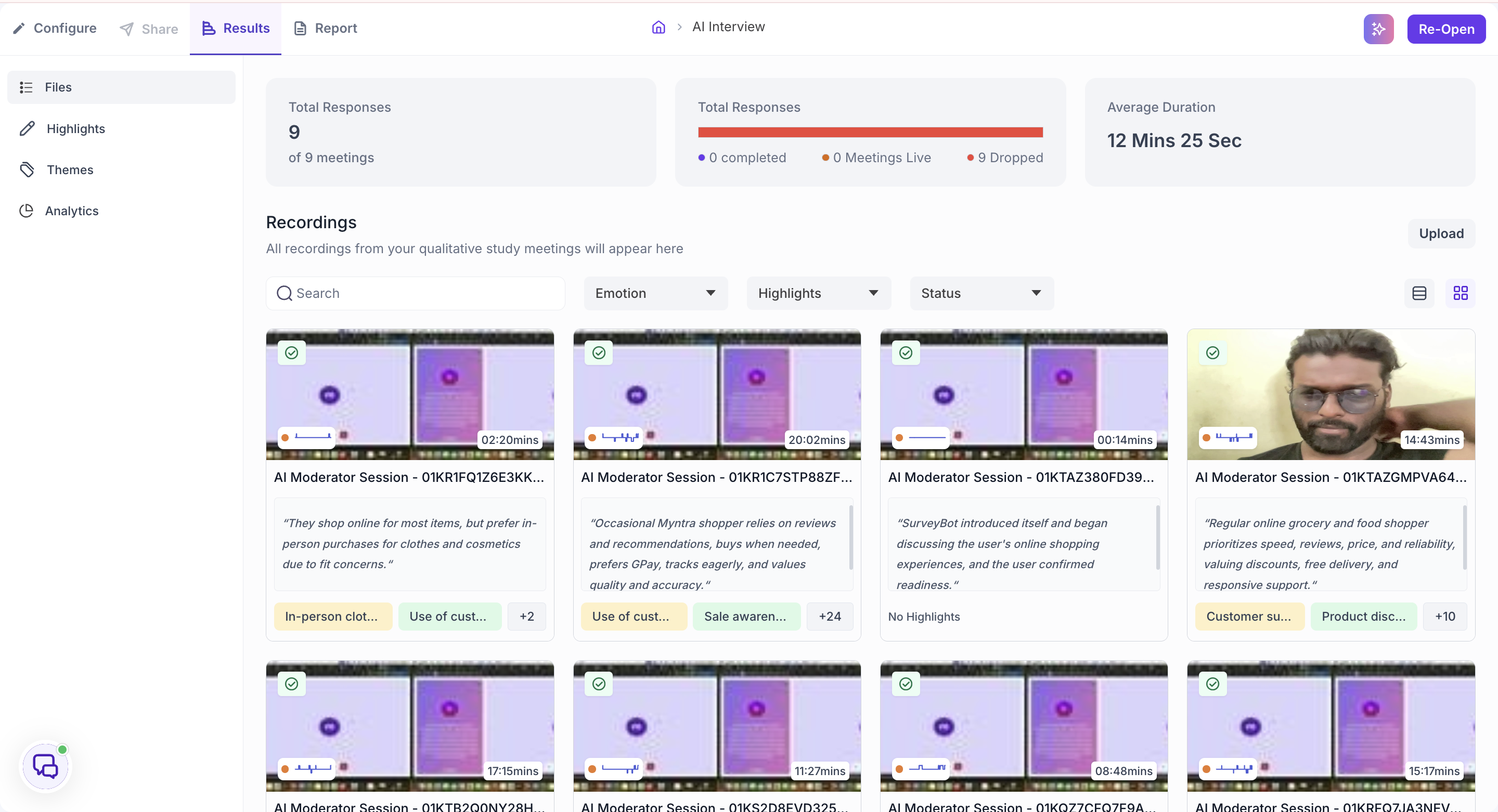
Total Responses counts the sessions conducted on the Decode platform. Recordings you upload from external platforms are not counted here, so this number can be lower than the number of files in your Files list.
The second card breaks Total Responses down by status: how many sessions were completed, how many are live right now, and how many were dropped. A session where the participant left before finishing is not counted as completed.
Average Duration shows the average length of your sessions.
FILES
The Files section shows all recordings associated with your study as thumbnails. Each thumbnail displays the file name and duration. AI Interview sessions appear here automatically once the session ends.
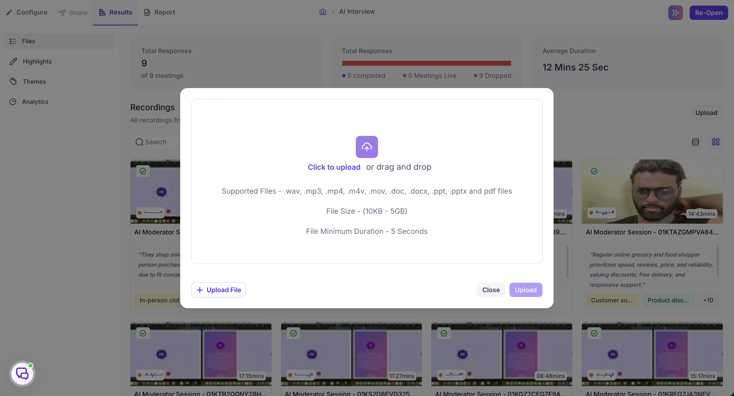
If you have a recording from elsewhere that you want analysed alongside your AI interviews, click Upload in the top right. Supported upload formats: .wav, .mp3, .mp4, .m4v, .mov, .doc, .docx, .ppt, .pptx, and .pdf. File size must be between 10 KB and 5 GB with a minimum duration of 5 seconds.
Click any recording to open it.
INSIDE A RECORDING
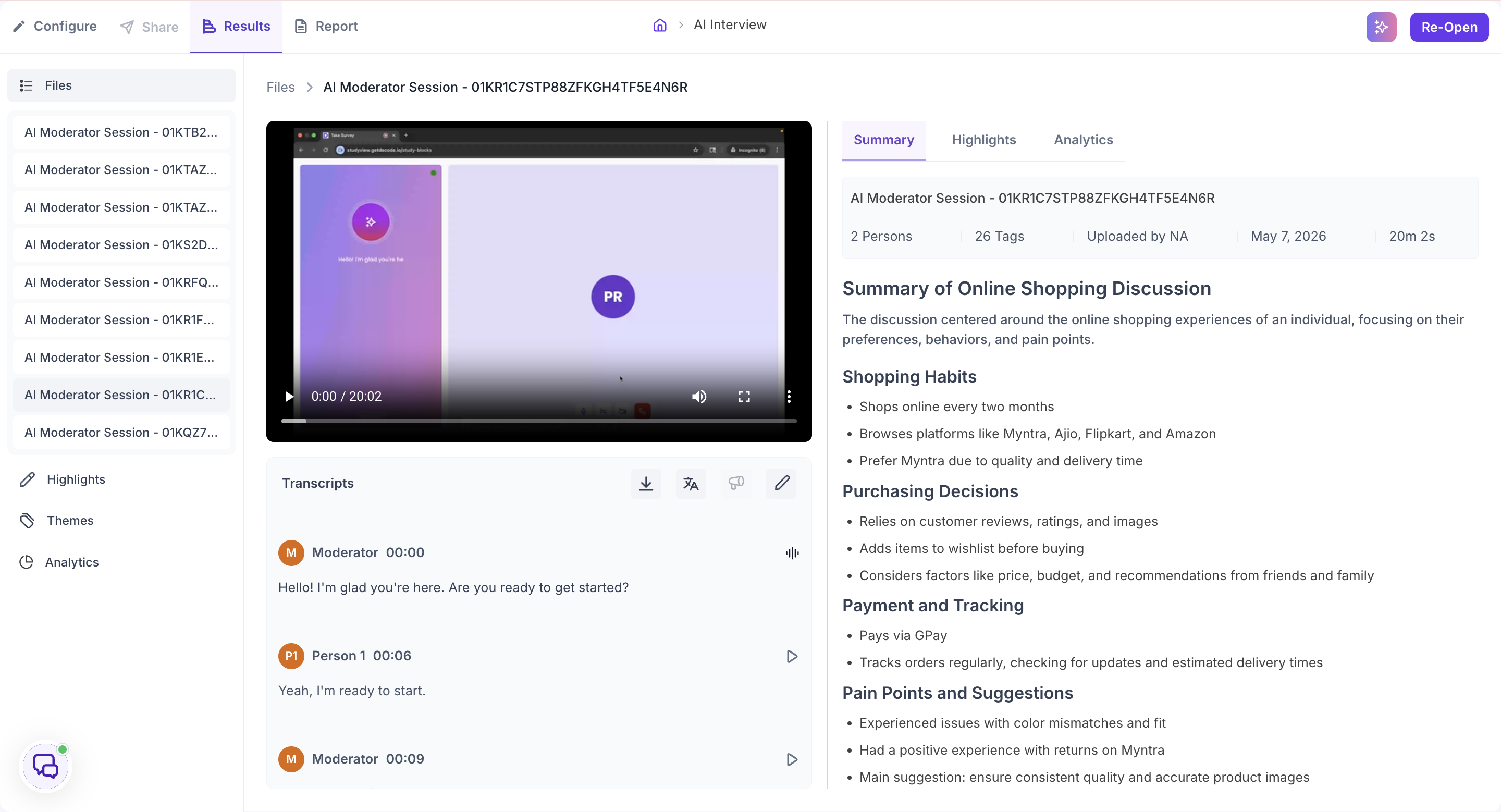
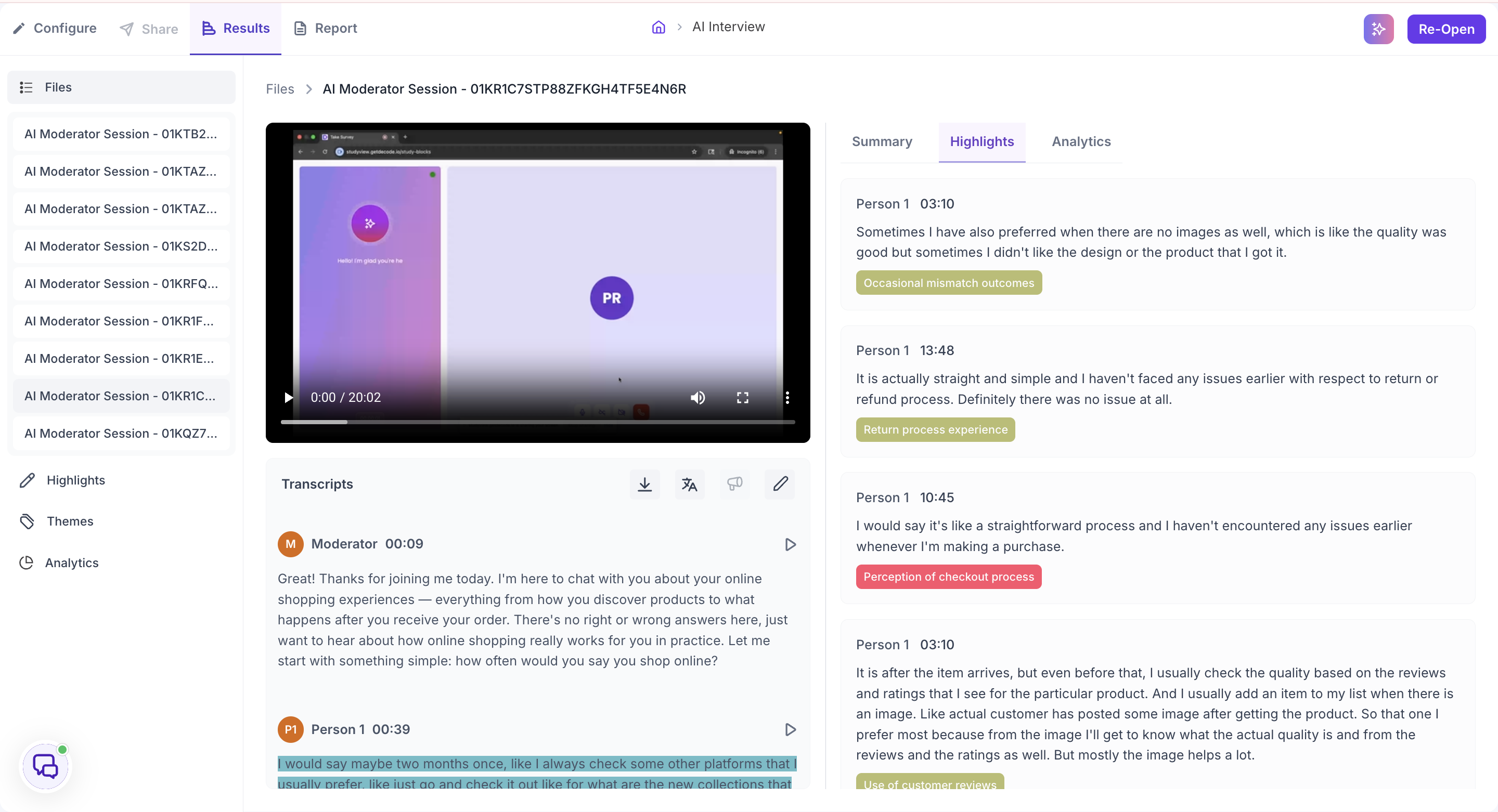
The video player sits on the left with the Transcripts panel below it. The right panel has three tabs: Summary, Highlights, and Analytics.
Summary
The Summary tab opens with the file details: how many people were detected, how many tags have been applied, who uploaded the file, when, and the duration.
Below the details is the Meeting Summary, an AI-generated overview of the session. It describes what the session was about, how it was structured, what the participant said, and the key points that came out of it. On a study with a large number of AI interviews, this is the fastest way to get the shape of a session before deciding whether to read the full transcript.
Transcripts
The Transcripts panel shows the full, timestamped record of everything said during the session. Each block of speech is attributed to a speaker, with a play button that jumps the video to that exact moment.
Four icons in the toolbar give you additional options.
- Download: downloads the transcript.
- Translate: translates the transcript into any of 100+ languages. Choose a language and click Translate, or click Default to return to the original. Use this when the interview was conducted in a different language from your working language, or when you need to share the transcript with a team that works in another language.
- Speaker Label: opens the Speakers List panel. Decode detects how many distinct speakers are present and lists each one with a sample audio clip so you can identify who is who. Assign each speaker a role and a display name. Speaker labels are used in Analytics to attribute speaking time and emotional signals correctly, so complete this step before reviewing Analytics.
- Edit: lets you correct errors in the auto-generated transcript. Use this when words were misheard in a way that changes the meaning of what was said.
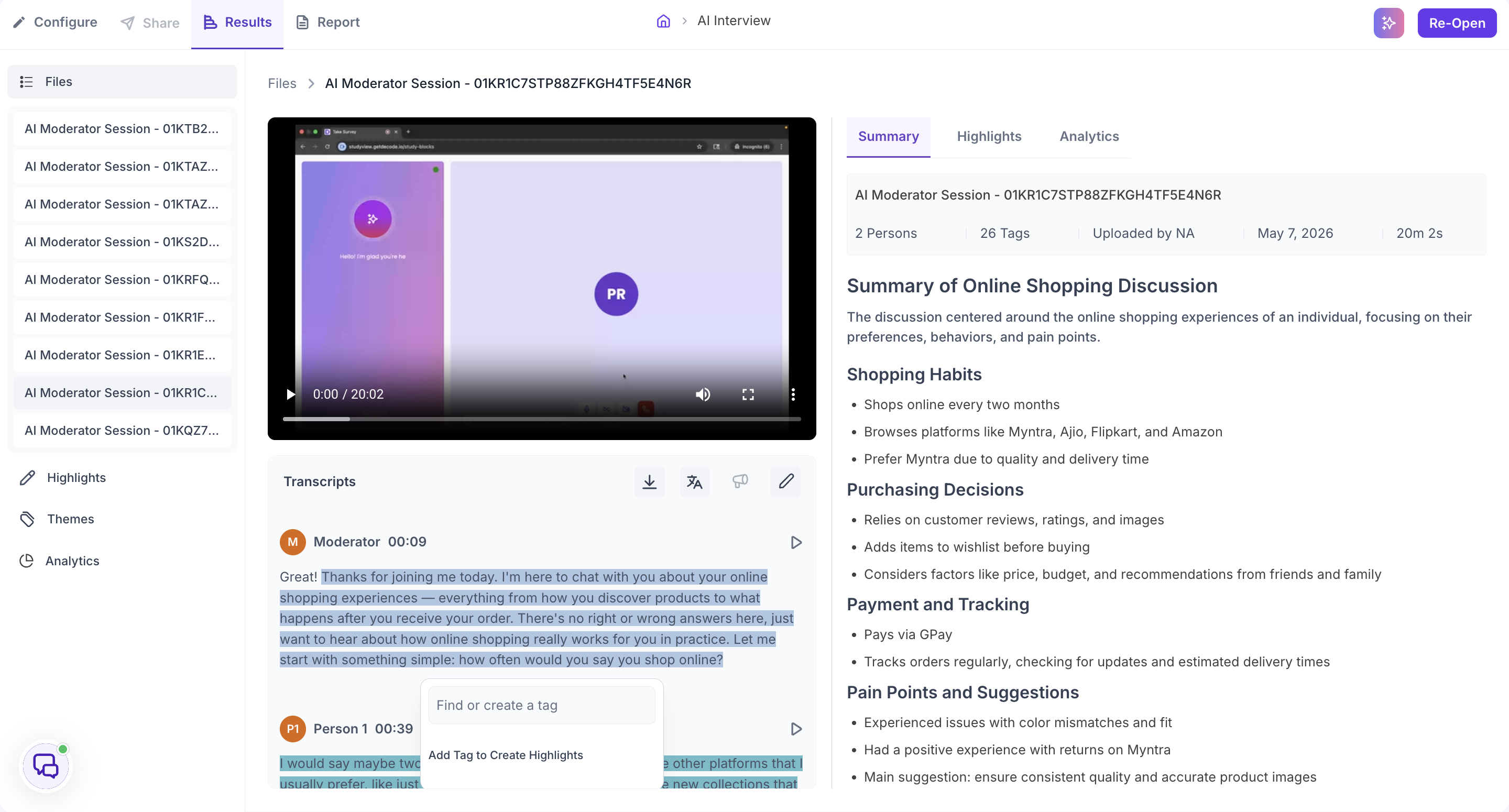
To create a highlight, select any text in the transcript. A prompt appears where you can search for an existing tag or create a new one. Once a tag is applied, that moment becomes a Highlight linked to the video at that timestamp. It appears in the Highlights tab for this file and in the Highlights section of the left navigation. Tags feed into the Themes section, where Decode shows the emotion breakdown per topic across all sessions.
Highlights tab
The Highlights tab collects every highlight created in this file. Each one shows the speaker, the timestamp, what was said, and the tag applied to it.
Analytics tab
The Analytics tab shows data derived from this recording, in two views. Use the toggle at the top right to switch between Emotion and Behavioral.
Emotion
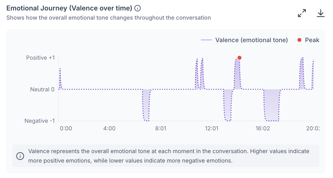
Emotional Journey (Valence over time). A chart of the overall emotional tone across the session, from Positive +1 to Negative -1. Valence represents the emotional tone at each moment: higher values mean more positive emotion, lower values more negative. The Peak marker shows the strongest moment. Hover over the chart to see the value at any timestamp, and click anywhere on the chart to jump the recording to that moment.
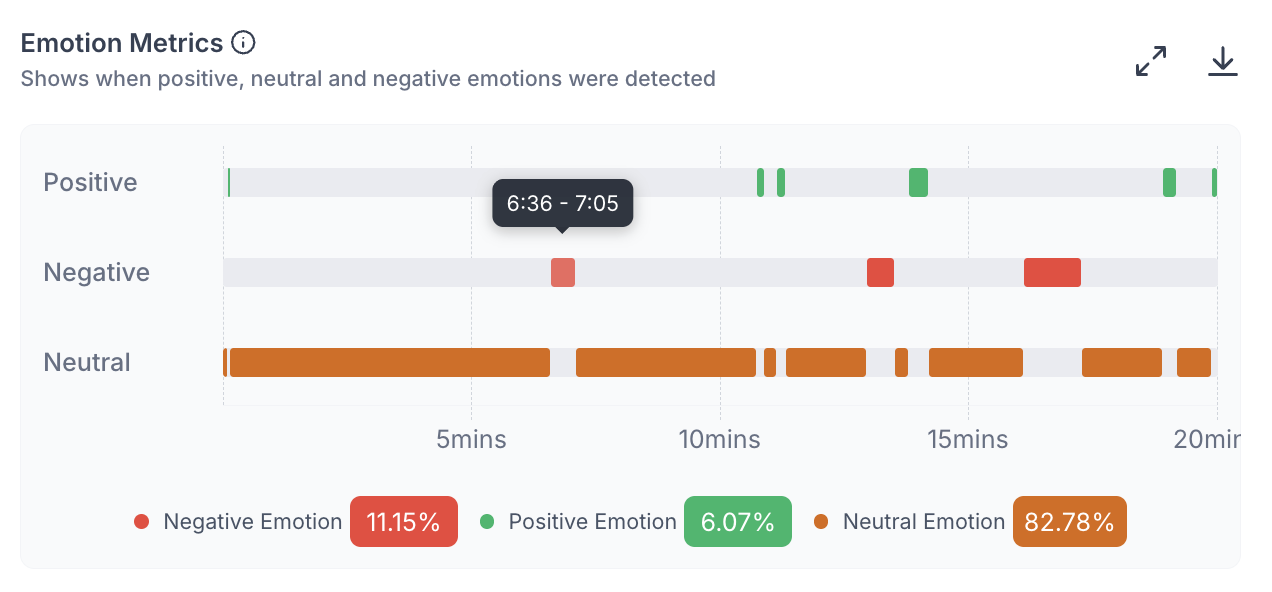
Emotion Metrics. A timeline showing when Positive, Negative, and Neutral emotions were detected, with each type on its own row and the overall percentage of each shown below the chart. Use this alongside the transcript to connect emotional reactions to specific moments. If negative emotion clusters in a particular part of the session, click that part of the timeline to see what was being discussed.
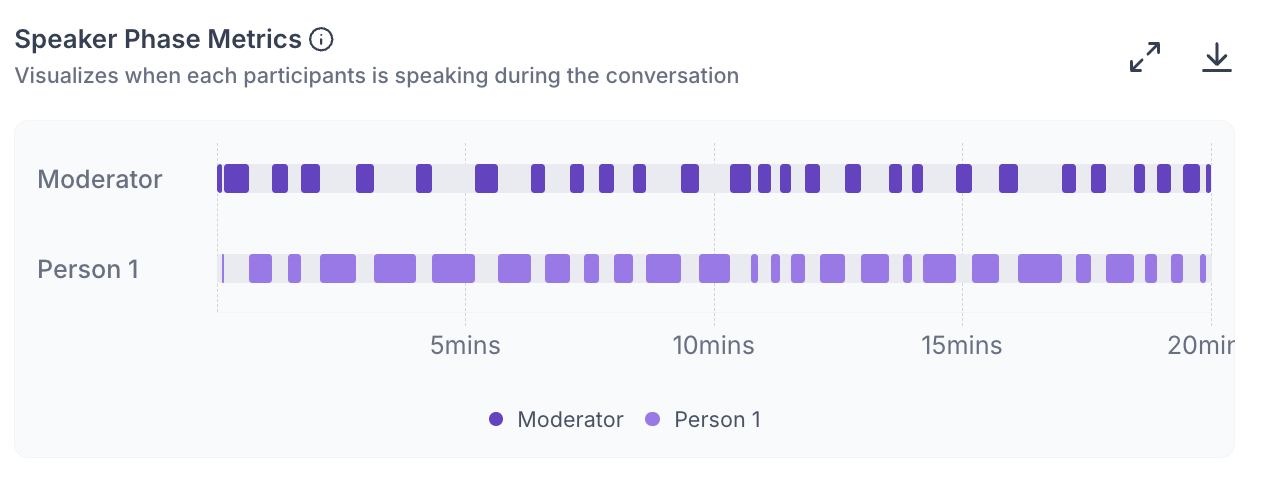
Speaker Phase Metrics. A timeline showing when each person was speaking, with a row per speaker. On an AI interview this shows the balance between the AI moderator and the participant across the session, and where the participant spoke at length.
Behavioral
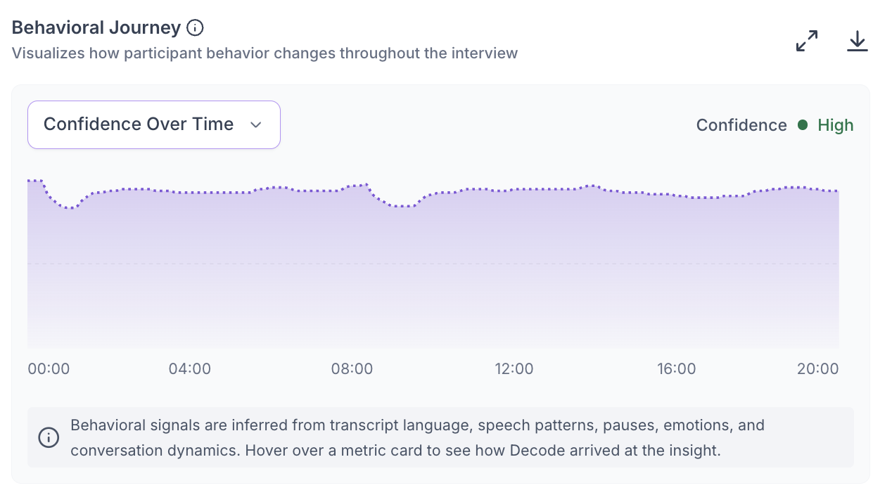
Behavioral signals are inferred from transcript language, speech patterns, pauses, emotions, and conversation dynamics.
Behavioral Journey - A chart of a behavioral signal across the session, such as Confidence Over Time. Use the dropdown to change which signal is shown, and click anywhere on the chart to jump the recording to that moment.
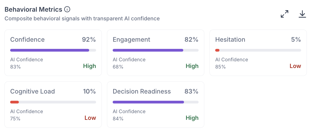
Behavioral Metrics - Five cards, each scoring one signal from the session. Every card shows the score, a Low, Moderate, or High reading, and an AI Confidence percentage showing how reliable Decode considers that inference. Hover over a card to see the signals it was derived from and, where available, a supporting quote from the session.
- Confidence: how much certainty and conviction the participant showed in their responses.
- Engagement: how involved the participant was, based on response depth, participation, and vocal energy.
- Hesitation: how much uncertainty the participant showed. A higher score means more long pauses, filler words, and self-corrections.
- Cognitive load: how much mental effort the participant appeared to spend, based on processing pauses and sentence reformulation.
- Decision readiness: how willing the participant was to commit to judgments, based on decisive language and commitment phrases.
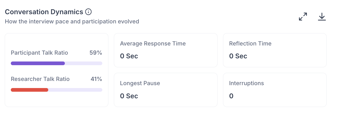
Conversation Dynamics - Pace and participation measured across the session: the Participant and Researcher Talk Ratios, Average Response Time, Reflection Time, Longest Pause, and Interruptions.
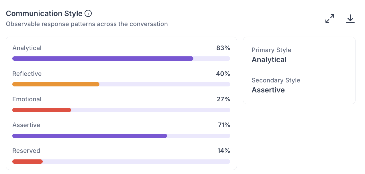
Communication Style - Rates how the participant communicated across five styles: Analytical, Reflective, Emotional, Assertive, and Reserved, and names their Primary and Secondary styles.
HIGHLIGHTS
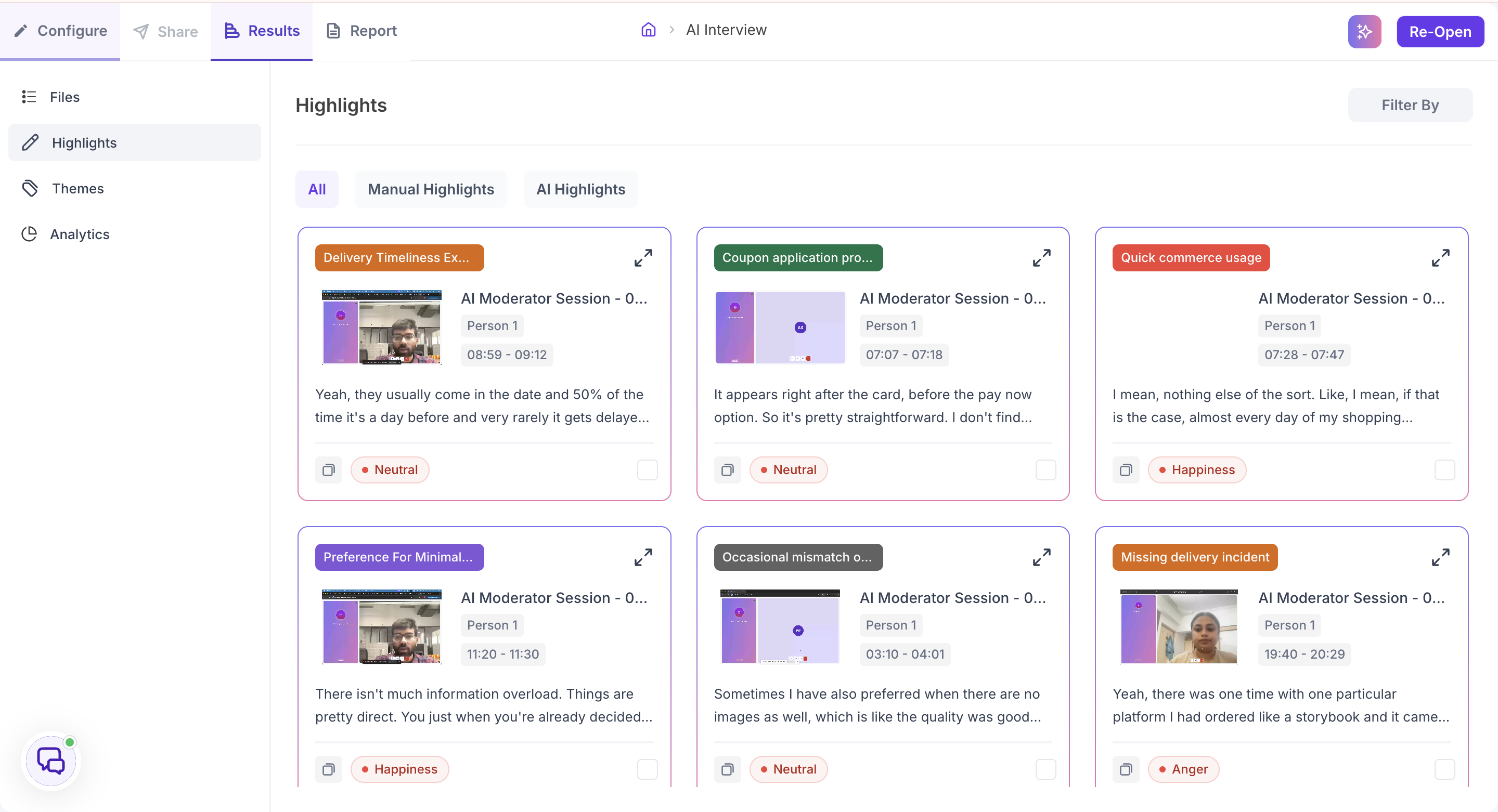
The Highlights section collects every tagged moment from every file in the study into a single view. Three tabs at the top control what you see: All, Manual Highlights for the moments you tagged in transcripts, and AI Highlights for the moments Decode tagged automatically.
Each highlight card shows the tag, the file it came from, the speaker, the time range, what was said, and the emotion detected at that moment, such as Excitement, Confusion, or Happiness. Use the copy icon to copy the highlight and the expand icon to open it in detail.
Highlights are most useful when you are preparing findings to present to your team or writing a research report. Instead of describing what a participant said from memory, you can point to the specific moment with the exact words, the speaker, the timestamp, and the emotional context in one place.
Use Filter By in the top right to narrow highlights to a single file. Leave it unset when you want to look across the full study to see which moments came up across multiple participants.
THEMES
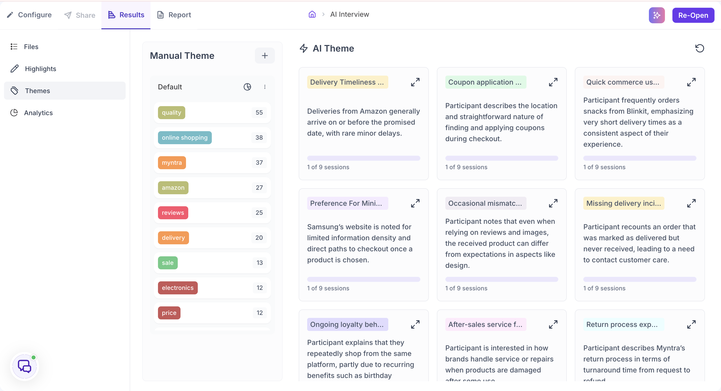
The Themes section brings together the tags you created and the themes Decode identified automatically. It has two panels: Manual Theme and AI Theme.
Manual Theme
The Manual Theme panel organises the tags you have applied across all sessions. All tags appear under a Default group automatically, and each tag shows how many times it was applied across the study. This count gives you a quick sense of how frequently a topic came up.
Click the plus button to create a new group. Groups are useful for organising tags by topic, research question, or any other category that is meaningful to your study. To move a tag into a different group, drag and drop it from one group to another. This lets you reorganise your tags as your analysis develops without losing any of the underlying highlights.
Each group has an emotion breakdown showing the proportion of Positive, Negative, and Neutral emotion across all moments tagged within it. This tells you not just how often a topic came up, but how participants felt when it did. This level of insight is only possible when tagging has been applied consistently across all files in the study.
AI Theme
The AI Theme panel shows the themes Decode identified automatically by analysing the transcripts and emotional data from every session. Each theme card shows the theme name, a one-line description of the pattern, and how many sessions it appeared in.
The session count is the most important indicator when assessing a theme. A theme that appeared in only one session reflects a single participant's experience. A theme that appeared across multiple sessions independently is a recurring pattern.
This count carries more weight on an AI interview study than elsewhere, because every session covered the same research goals at the same depth. A theme appearing in twelve of twenty sessions did so because participants raised it, not because the questioning varied between sessions.
Click the expand icon on a theme card to open the detailed theme view with tabs, filters, and the supporting clips behind each theme. The detailed view is described under Theme Analysis Panel in the Analytics section.
ANALYTICS
The Analytics section brings together AI-generated insights from across all your sessions. It covers four areas: AI Summary, Theme Analysis Panel, Question-Wise Insights, and Top Opportunity Areas and Strategic Recommendations.
AI Summary
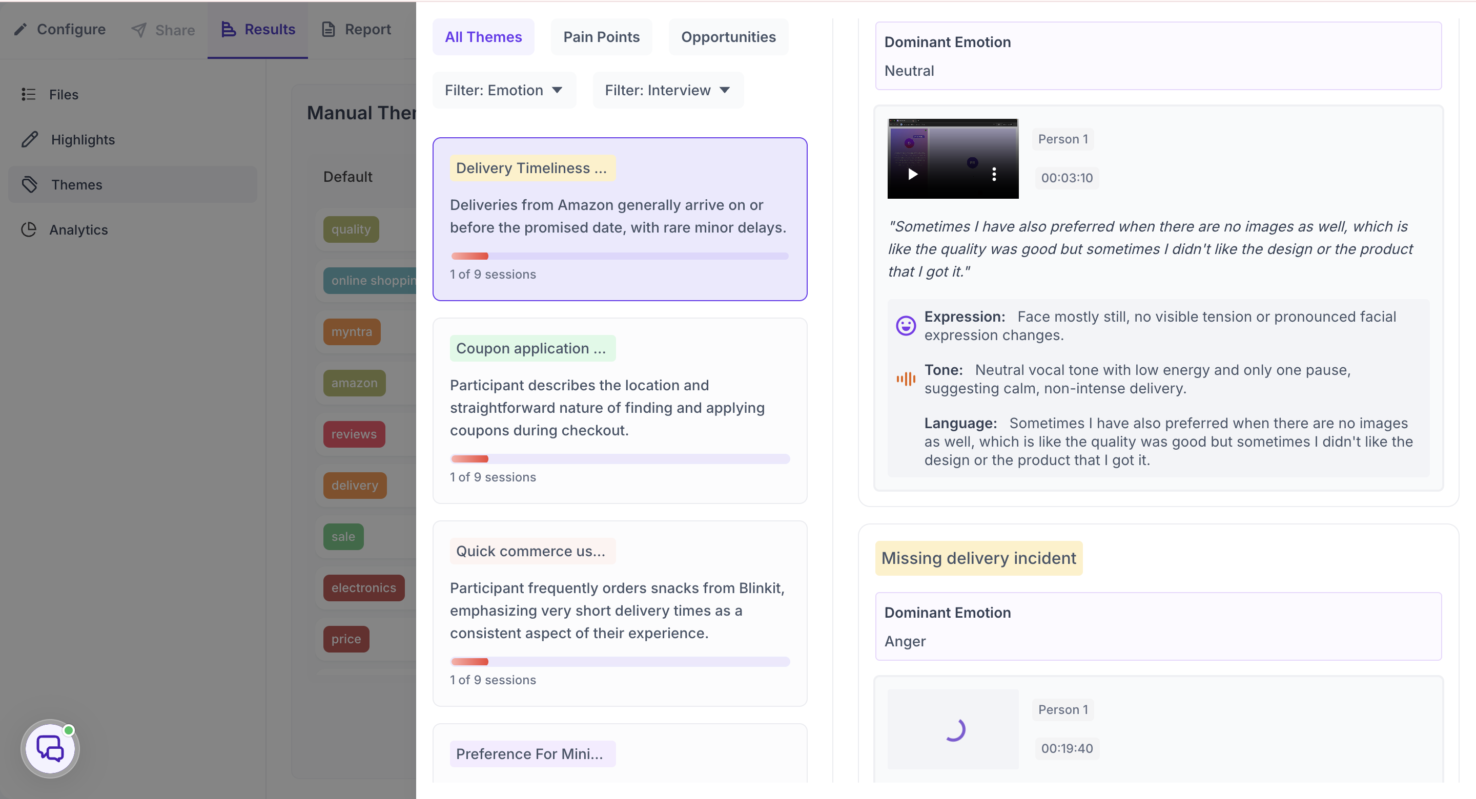
The AI Summary generates an Executive Summary of the entire study. It covers the main topics discussed across all sessions, the overall emotional sentiment, and what the data suggests is working well and what needs attention. The summary also shows the total number of participants, sessions, and combined duration. Use Show More to expand the full summary and Show Less to collapse it.
Four metrics appear alongside the summary.
Positive Emotion %. The percentage of moments across all sessions where participants displayed positive facial expressions. A high positive percentage indicates participants responded well to the topics being discussed. Use this alongside Negative Emotion % to understand the overall emotional tone of the study before going into specific themes.
Negative Emotion %. The percentage of moments across all sessions where participants displayed negative facial expressions such as confusion, frustration, or displeasure. A high negative percentage signals that certain parts of the sessions triggered strong negative reactions. Use this alongside the Emotion Metrics in the individual file Analytics tab to identify exactly when and where these reactions occurred.
Engagement Score. A measure of how actively participants engaged during the sessions, based on their facial expressions. It reflects the intensity and variety of facial movement captured throughout the recordings. A low score may mean participants showed minimal facial expression, which can happen due to poor camera quality, insufficient lighting, or sessions that did not prompt strong visible reactions. The score is shown as a percentage.
Signal Score. A composite quality rating out of 10 that tells you how reliable the emotional data from your sessions is overall. Click the expand icon on the Signal Score card to open a detailed breakdown. Three factors each contribute to the overall score.
- Facial Signal: Reflects the quality of the facial data captured. Affected by camera resolution, lighting conditions, whether the participant's face was fully visible, and how much they moved during the session.
- Voice Signal: Reflects the clarity of the audio. Poor audio quality such as background noise, low microphone volume, or overlapping speech reduces the reliability of voice-based emotional signals.
- Text Clarity: Reflects the accuracy of the auto-generated transcript. Clear speech with minimal crosstalk produces a more accurate transcript, which improves the quality of text-based analysis.
Each factor is rated individually as Low, Fair, Good, Very Good, or Excellent. The overall Signal Score follows the same scale. A score of 6 to 7 is rated Good. A score below 4 is Low, which means the emotional data has significant reliability issues.
A low Signal Score affects the emotion percentages and emotion-related analytics. Transcript-based findings are not affected. If your Signal Score is low, treat emotion data with caution but continue to rely on the transcript and highlights for your findings.
Because AI interviews are conducted remotely on the participant's own device, Signal Score is worth checking early on an AI interview study. The pre-session checklist asks participants to sit in good lighting and find a quiet space for this reason.
Theme Analysis Panel
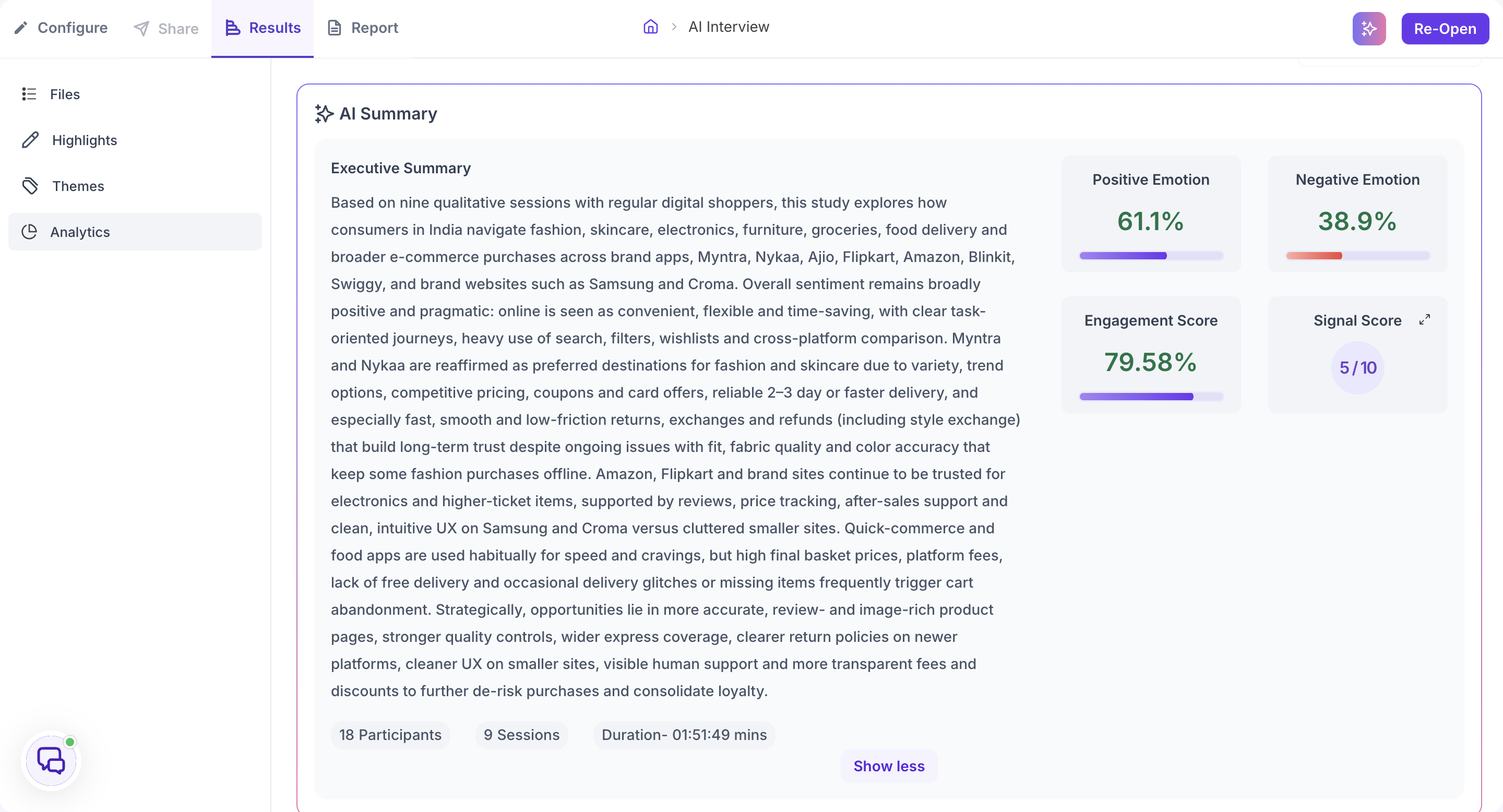
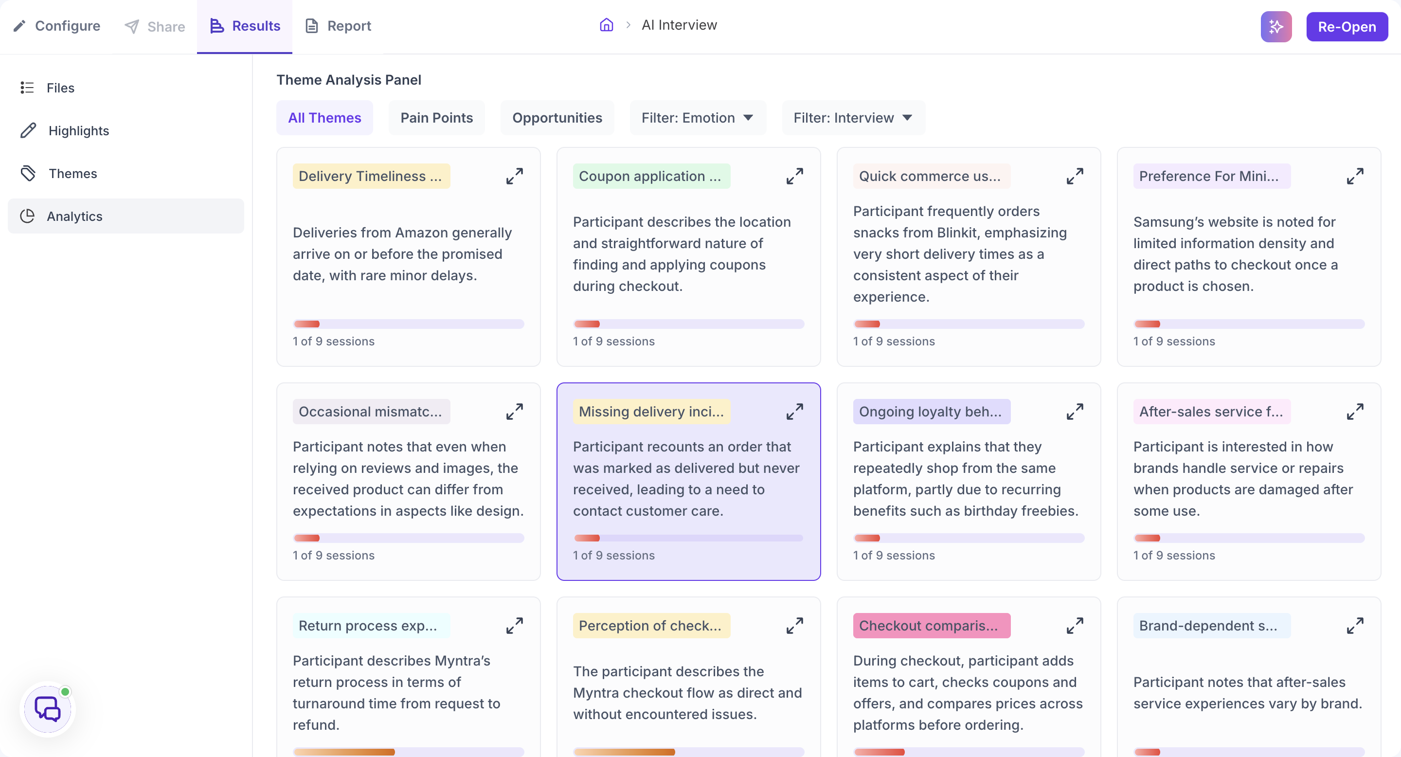
The Theme Analysis Panel shows AI-identified patterns from across all your sessions as individual theme cards. Decode analyses the transcripts and emotional data from every session and groups recurring patterns into named themes automatically. Each theme card shows a theme name, a one-line description of the pattern, the number of sessions it appeared in, and a bar indicating the strength of the emotional signal associated with it.
The session count on each card is the most important indicator when assessing a theme. Always check it before deciding how much weight to give a theme in your findings.
Use the tabs and filters at the top of the panel to narrow the themes shown.
- All Themes: Shows every theme Decode identified across all sessions.
- Pain Points: Shows only themes that reflect difficulty, frustration, or problems participants encountered.
- Opportunities: Shows themes that suggest areas where the experience worked well or where there is potential for improvement.
- Filter: Emotion: Narrows themes by the dominant emotion detected within them. Use this when you want to find specifically where participants expressed confusion, frustration, or positive reactions.
- Filter: Interview: Narrows themes to a single session. Use this when you want to understand one specific participant's experience in depth.
Click the expand icon on any theme card to open the detailed view. The detail view shows the theme name, the dominant emotion detected, and supporting video clips with timestamps. Each clip shows a breakdown of the participant's Expression, Tone, and Language at that moment. The video clip options allow you to view in Full screen, Download, Mute, adjust Playback speed, or switch to Picture-in-picture mode.
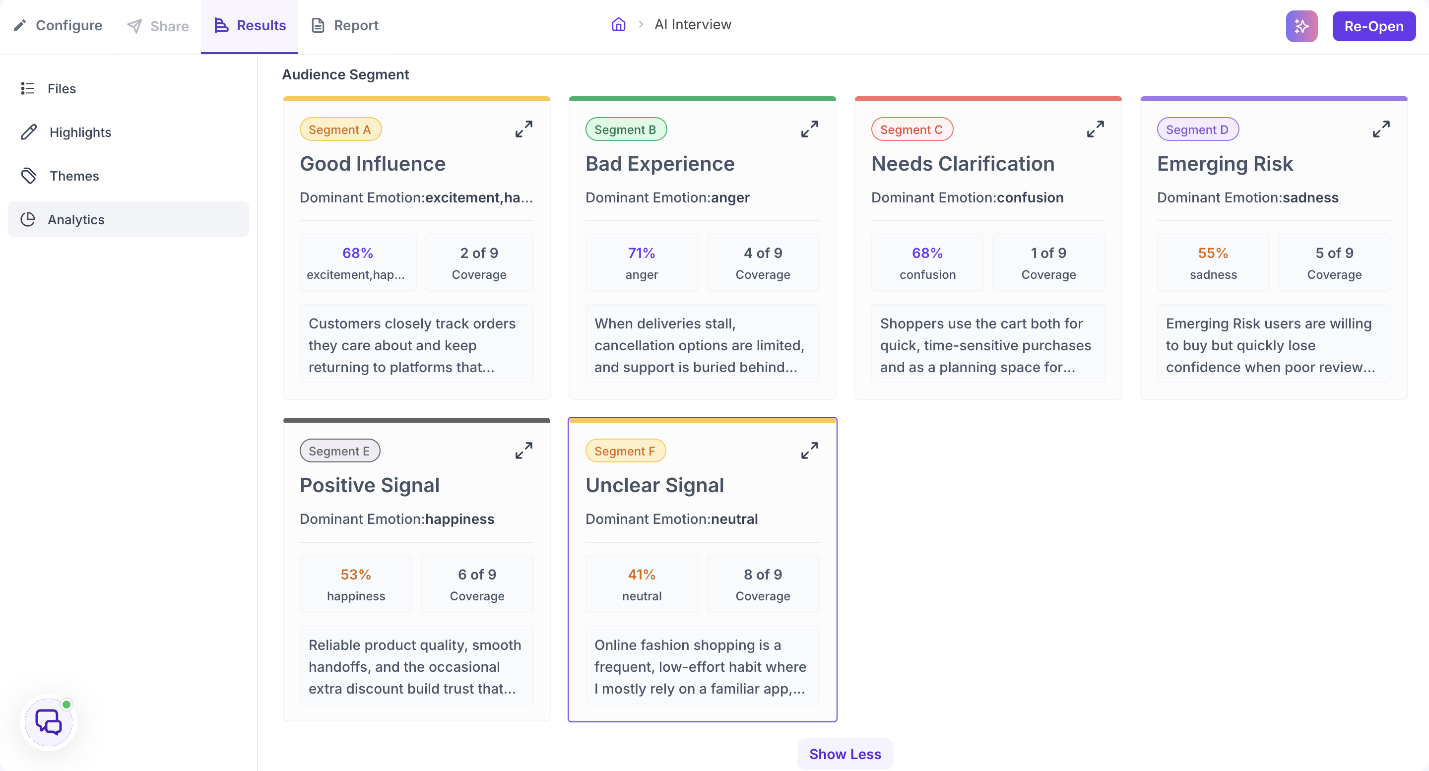
Audience Segment
Decode groups the participants in your study into audience segments based on shared patterns in how they responded. Each segment card shows a segment name, the dominant emotion for that segment with its strength as a percentage, Coverage showing how many sessions the segment draws from, and a short description of the pattern. Click Show More to see additional segments.
Click the expand icon on a segment card to open the detailed view. It shows the supporting moments behind the segment. Each moment includes the participant, the recording it came from, a video clip with a timestamp, the quote, and a breakdown of the participant's Expression, Tone, and Language.
Read Coverage the same way as the session count on themes. A segment drawn from multiple sessions reflects a pattern across participants rather than one person's reaction.
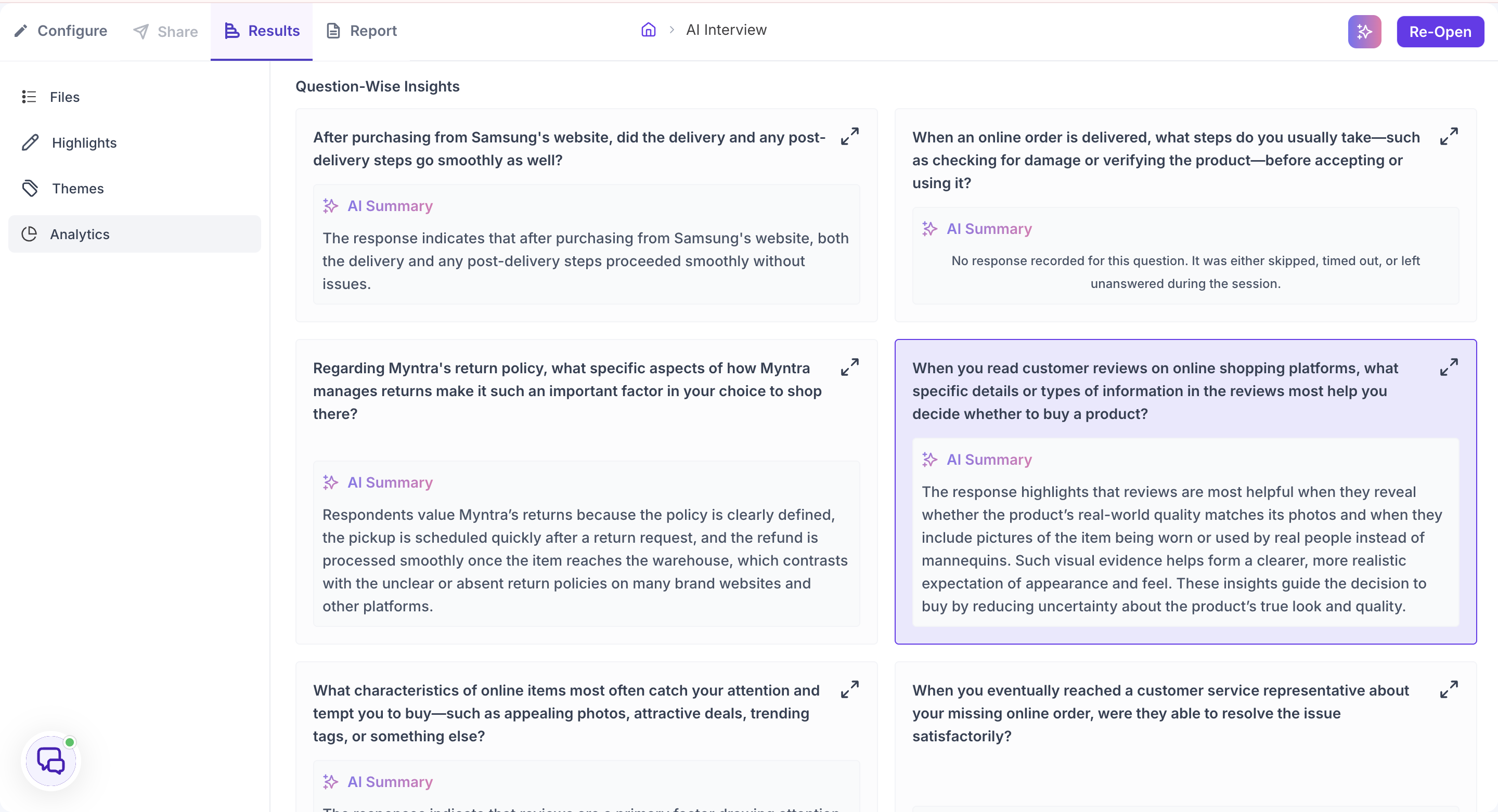
Question-Wise Insights
The Question-Wise Insights section shows how participants responded across all sessions, with each question in its own card in the main view alongside an AI Summary of the collective responses. If no response was recorded, the card indicates the question was skipped, timed out, or left unanswered during the session.
Click the expand icon on any question card to open the detailed view. The left panel shows the full list of questions. Click any question on the left to see its results on the right. The right panel shows the AI Summary for that question at the top, followed by the full verbatim response from each participant. Read the summary first to understand the overall pattern, then read the individual responses to see the full range of what was said across participants.
Top Opportunity Areas, Top Contributing Emotion Moments and Strategic Recommendations
At the bottom of the Analytics section, Decode generates three AI-powered outputs based on everything collected across all sessions.
Top Opportunity Areas. The areas where participant feedback points to the greatest potential for improvement. Each one is drawn from patterns identified across themes, pain points, and participant responses throughout the study.
Top Contributing Emotion Moments. The behaviours and moments that drove the strongest emotional responses across the study. Read this alongside the opportunity areas: the opportunity areas tell you what to fix, and this tells you what participants reacted to most strongly when it came up.
Strategic Recommendations. Specific, actionable suggestions for how the team could respond to the opportunity areas. These are generated from the full body of evidence across the study and are intended to give the team a starting point for planning next steps.
Use Export Analytics at the bottom of the section to take the analytics out of Decode.